Communication strategy of the brand: «Potok»
Communication theory in jewelry design
In contemporary jewelry design, the focus is not only on the aesthetic or material aspects of the object, but also on its communicative potential. From a communication theoretical perspective, jewelry can be seen as a system of symbols that creates, transmits, and interprets meaning within specific cultural and social contexts.
Communication, as we understand it in this course, is a process of making meaning through symbolic interaction. It involves a sender, a message, a medium, and a receiver all situated within a specific context. Jewelry, as a form of communication, uses symbols to convey meaning and create a connection between the wearer and the message. Jewelry design operates within the interpretive paradigm of communication theory, where meaning is negotiated between the designer and the wearer. Unlike mass communication, jewelry engages with personal memory, identity, and emotional experience on an intimate level. The designer encodes meaning into material form through shape, texture, references, and symbols, while the wearer interprets these meanings based on their background, experiences, and cultural memories.

The semiotic approach, as described by Craig’s seven traditions of communication, is particularly relevant to the field of jewelry design. This approach views communication as the exchange of meaning through the use of signs and symbols. Jewelry objects function as signs, rarely expressing their meaning explicitly, but rather suggesting, evoking, and alluding to deeper concepts. Materials, shapes, and visual references act as signifiers, pointing towards ideas such as nostalgia, belonging, time, and identity. The effectiveness of this communication depends not only on clarity, but also on the ability of the viewer to recognize and interpret these symbols within a shared cultural context. Additionally, jewelry design draws on the phenomenological tradition, which focuses on lived experience and personal perception. Wearing jewelry is a physical and emotional experience, where meaning emerges from direct interaction with the object. This is in line with the idea that communication is not just transmission, but a dialogue between individuals, where they relate their memories and emotions to the message encoded by the designer.
Therefore, jewelry design can be seen as a form of communication that bridges material form and symbolic meaning. Through the application of communication theory, designers can gain a structured understanding of how objects communicate, how meanings are interpreted, and how they can intentionally create spaces for dialogue instead of fixed statements. This theoretical framework forms the basis for analyzing and designing communication strategies for conceptual jewelry brands.
Presentation for a general audience
Potok is a young local jewelry brand that approaches adornment as a form of communication and reflection. Each collection sparks a conversation about what matters most — time, memories, the beauty in everyday surroundings.
The first collection of the brand, «I Saw This as a Child, ” is built around familiar yet often forgotten images from childhood: printed bus tickets, the coiled wire of an old landline phone, burned elevator buttons. The shapes aren’t perfect, but they’re alive with imperfections that feel real, raw, and deeply personal. This collection stirs warm longing for simpler times, transforming childhood relics into elegant, wearable treasures. Perfect for gifting or treasuring personally. Each one is uniquely hand-forged, imperfectly perfect, ready to become part of your everyday flow.
We celebrate the imperfect beauty of handcrafted art — the swirl of thoughts, the hunt for meaning in the ordinary. We’re driven by love for manual techniques that breathe soul into metal and form. Our pieces embrace the crooked lines of life: a whirlwind of emotions, a nod to the simple joys and quiet complexities around us. We believe true strength lies in authenticity. Wearing Potok means carrying a piece of your story, crafted with care and curiosity.
We speak through jewelry about the ephemeral. Our core values are attention to everyday life, respect for memory, emotional honesty, and slowness, the poetry of daily routines. Our mission is to highlight what’s vital yet overlooked: the rush of memories, the texture of lived moments. We aim to build a community of dreamers who pause to cherish the now, fostering deeper connections with yourself and others. Our goal is to grow alongside you, expanding collections that evolve with shared stories, reaching hearts worldwide while staying true to our local roots and handmade ethos.
Presentation for a professional audience
Potok relies on shared cultural memory as this context, allowing the audience to recognize and emotionally decode these signs. Targeted at young, creativity-immersed tastemakers who crave niche fashion with backstory, Potok communicates on equal footing—conversational, enthusiastic yet earnestly reflective.
Conceptual design principles
The collection «I saw this in childhood» interprets common material traces from past everyday life — such as bus printed tickets, the old phone wire, and elevator panel buttons — and transforms these into abstracted, refined forms for jewelry. Each piece thus functions as a sign: its material and form invoke personal memories while simultaneously engaging culturally shared references learned through embodied experience. This strategy aligns with semiotic communication models, where the signifier (visual form) interacts with the signified (memory and emotional resonance) to create meaning beyond literal representation. The pieces are codes designed to be decoded by wearers based on their lived histories.Material, form and tactility
The choice of materials (e.g., metal finishes, patina, texture treatments) is not arbitrary. Metals are manipulated to mirror impressions of memory. This reflects an understanding that form is not neutral. The silent language of surfaces, weight, and finish produces affective responses, aligning with phenomenological communication theories where perception is shaped by embodied experience, not just visual decoding.
Visual identity and brand system
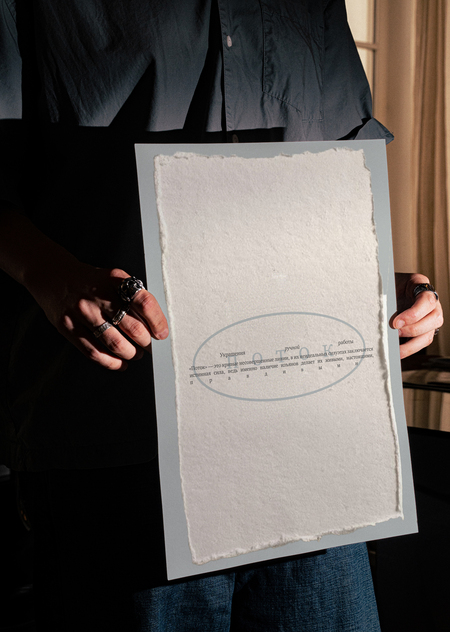
The graphic system is built around experiments with spacing rather than expressive letterforms: variable tracking and lines between characters simulate a slow inner monologue or drifting thought. This works especially well in large titles and short phrases, where pauses in the text mirror pauses in reflection. The restrained, neutral color palette (soft greys, off-whites, muted metals) leaves semantic weight to shape, texture, and negative space instead of color drama, aligning print and digital with the quiet, observational character of the jewelry. This system scales seamlessly across digital touchpoints, fostering organic shareability in social-media.
Photo style supports this mental «flow»: calm, compositions, lots of air, focus on surface detail and traces of use. Close-ups emphasize micro-defects, tool marks, and tactile qualities, making the handcrafted process a key part of the image. The brand refuses glossy perfection and instead aestheticizes process and wear as primary visual content.
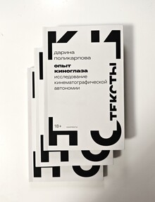
Beyond jewelry, the brand extends its language to small-format printed objects: postcards as collectible souvenirs and posters. Packaging echoes this handmade ethos too. Rough edges and visible folds carry the same imperfect authenticity from bench to unboxing, reinforcing the narrative across every touchpoint.
Communication strategy through visual interaction
The most important aspect is the strategic use of ambiguity and interpretive openness. Potok avoids literal storytelling. Instead, it activates the audience’s cultural memory. This aligns with the interpretive model of communication, where the receiver co-constructs meaning through context and experience.
Comparative positioning
Unlike fashion-driven accessory brands that emphasize trend or beauty, Potok positions itself within a conceptual and narrative design space. This places the brand closer to object art and conceptual jewelry. The meaning is performative and relational rather than merely decorative. This strategy positions Potok not only as a commercial entity but also as a cultural communicator, where each object is a dialogue starter rooted in shared human experience.
Theoretical part
The communication strategy of the Potok brand was developed through a conscious application of communication theory as an analytical and practical framework.
Semiotic framework
The semiotic tradition understands communication as the creation and interpretation of meaning through signs and symbols. Items such as bus tickets or elevator buttons were selected not for their aesthetic value, but for their symbolic potential within a shared cultural context. During the design process, these objects were not copied literally. Instead, their essential visual and tactile characteristics were extracted and transformed into jewelry forms. In this way, the strategy avoids direct storytelling and instead relies on the audience’s ability to decode meaning based on personal and cultural knowledge.
Phenomenological Perspective
The phenomenological tradition further shaped the strategy by prioritizing lived experience over explicit explanation. Jewelry is worn on the body, interacted with through touch, weight, and proximity. This perspective led to design choices that encourage emotional recognition rather than intellectual comprehension. Meaning emerges not through reading a description, but through the physical experience of wearing the object and associating it with personal memories. Communication here unfolds as a dialogue between the object and the wearer, reinforcing the idea that understanding is experiential and subjective.
The Elaboration Likelihood Model
The Elaboration Likelihood Model by Griffin structures the brand’s design choices across two processing routes, tailoring visual and material elements to varying audience involvement levels. For low-elaboration viewers encountering Potok casually, the peripheral route dominates through imperfect silhouettes of bus tickets and phone cords, evoking instant nostalgia through tactile cues that signal authenticity without demanding analysis. High-elaboration designers, however, engage the central route through the typographic experiments with variable kerning, where breathing spaces between letters invite scrutiny of the quiet mental stream, rewarding deeper inspection with conceptual depth.
Relationship Management Theory
Relationship Management Theory’s continuum elevates Potok from exploitative or contractual exchanges to symbiotic and mutual communal bonds. Imperfect packaging with rough edges and folds extends the jewelry’s narrative into unboxing and the recipient co-owns the handmade story. Postcards as micro-artefacts shift from manipulative promotion to covenantal reciprocity, their standalone typography and neutral palettes inviting personal reinterpretation, building long-term affinity among niche fashion enthusiasts who value conceptual continuity across carriers.
Dialogic Theory
Dialogic Theory manifests in Potok’s design as an ethical invitation to negotiated exchange, where elements like drifting kerning and nostalgic motifs prompt honest interpersonal dialogue. Photography’s compositions create space for the viewer’s truths to emerge alongside the brand’s, fostering positive regard through unpolished authenticity. This process turns carriers into dialogic platforms and encourages publics to contribute their own memories to the brand’s evolving narrative of reflection.
Overall, the strategy of the brand follows the course’s understanding of theory as a practical tool — a way to describe, explain, and intentionally shape communication processes. The Potok brand demonstrates how theoretical concepts such as symbolic exchange, context-dependence, and interpretive meaning can be translated into concrete design practices that operate coherently across product design, branding, and audience engagement.
the text is based on materials from the course «Communication Theory: Bridging Academia and Practice»
Я в детсве это видел // portfolio hse URL: https://hsedesign.ru/project/ya-v-detstve-eto-videl-df996d1fc881427fa488acb9c0862b22 (дата обращения: 08.12.2025)
Поток // portfolio hse URL: https://hsedesign.ru/project/eaf6df6197d14f5c8be8ea3eeedb0e50 (дата обращения: 08.12.2025)


