
Introduction: Thrasher
Thrasher is an American skateboarding magazine and media brand founded in 1981 in San Francisco by Fausto Vitello and Eric Swenson. Originally, Thrasher existed as a print magazine about skateboarding, but over time it developed into a broader media ecosystem: an official website, video content, social media, print issues, an apparel shop, and a cultural platform for the skate community. Thrasher’s core positioning is not built around fashion, but around the authenticity of skate culture. The brand does not speak as an outside observer, but as a participant in the scene. Its communication is based on street photography, skate videos, sharp typography, raw aesthetics, a punk attitude, and the image of an independent culture. As a result, Thrasher is perceived not simply as a magazine or a clothing brand, but as a sign of belonging to the skate community. The main visual symbol of the brand is the Thrasher logo, especially its flame version. This sign has become recognizable far beyond skateboarding: it is worn not only by skaters, but also by streetwear and fashion audiences. This is where the brand’s main communication conflict appears: for the core audience, Thrasher is a symbol of real skate culture, while for the mass audience, it is a fashionable graphic sign.
Thrasher’s target audience can be divided into two levels. The first and primary audience consists of skaters, members of local skate scenes, fans of skate videos, street culture, punk aesthetics, and independent media. For them, Thrasher is a source of information, recognition, and cultural status. The second audience is a broader streetwear and fashion audience, which perceives the brand through hoodies, T-shirts, the logo, and visual «coolness», without always being directly connected to skateboarding.

From the perspective of communication theory, Thrasher is interesting as an example of a brand that creates meaning through symbols, context, and group identity. Within the course, communication is understood as the process of meaning-making through interaction and symbolic exchange in different contexts. Thrasher operates exactly according to this logic: its photographs, videos, logo, covers, and merchandise do not simply transmit information, but help the audience read who belongs to the culture, which values are important within it, and where the boundary between «insiders» and «outsiders» is drawn.
Communication Channels
Thrasher does not operate like a classic fashion brand or a traditional media outlet. Its public field is built across several channels: the official website, the print magazine, Instagram*, YouTube, the online shop, events, awards, and collaborations. Together, these channels shape Thrasher’s image as a cultural center of skateboarding, rather than simply as an apparel producer.
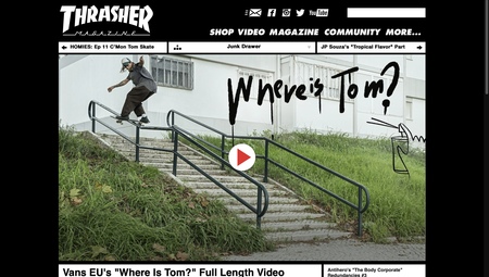
Official Website
The official Thrasher website is the main communication hub of the brand. It brings together news, videos, photography, clothing, materials about skateparks, events, and music. The website itself describes Thrasher as a space for «skateboarding news, videos, photos, clothing, skateparks, events, music and more», which means that Thrasher positions itself as a full-scale media platform for skate culture, rather than only as a magazine or a shop. The website is important for the analysis because it shows the cultural context of the brand: riders, local scenes, videos, events, and visual archives. Here, Thrasher does not simply sell products; it documents and structures skate culture.

YouTube
YouTube is Thrasher’s key channel for video format. The channel publishes skate parts, documentary videos, team videos, premieres, and regular formats such as Skateline. For Thrasher, video is not just content, but a mechanism of cultural recognition. When a skater appears in a Thrasher video, it functions as a sign of status within the skate community. Through YouTube, the brand performs the role of a gatekeeper: it does not only show the culture, but also confirms who is significant within it.
Thrasher x Spitfire Present: SAN FRANCISCO BURNING
Print Magazine
The print magazine remains an important part of Thrasher’s communication, even in the digital environment. It maintains the brand’s connection with its history and strengthens the feeling of authenticity. For the audience, the print version is not just an information carrier, but an archive of skate culture and a collectible object. Magazine covers are especially important: they capture heroes, tricks, cities, moments, and the visual style of a specific era. Appearing on a Thrasher cover is a form of recognition within the skate scene.
Trasher magazine covers
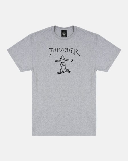
Online Shop and Merchandise
The Thrasher online shop is a commercial channel, but it works as an extension of the brand’s media identity. T-shirts, hoodies, caps, and accessories with the logo turn Thrasher’s visual code into a wearable symbol. The flame logo is especially important: it has become the brand’s most recognizable sign and has moved beyond skateboarding into streetwear and fashion culture. This is where communication tension appears: for skaters, the logo can mean belonging to the culture, while for a wider audience it may simply be a fashionable graphic sign. Materials about the brand separately highlight this debate: the Thrasher logo has grown from a skate subculture symbol into a global fashion phenomenon, especially after celebrities started wearing it.
Thrasher’s PR Strategies
Thrasher does not follow a typical corporate PR logic, where a brand constantly explains itself through press releases and advertising campaigns. Its PR is built through cultural recognition, events, awards, videos, and participation in the life of the skate community. The main PR mechanism is Skater of the Year. This annual award works as a symbolic prize and creates a strong newsworthy moment. Thrasher announces the winner itself and, in doing so, reinforces its role as an authority within skate culture. The second important mechanism is video premieres. Thrasher regularly releases and promotes videos with riders and teams. This works as PR not through direct advertising, but through cultural value: the audience comes to watch not a brand campaign, but real skate content. The third mechanism is gatekeeping. Thrasher selects which riders, videos, events, and local scenes receive visibility. This strengthens trust in the brand because it is perceived as a participant in the culture, not as an external marketer.
Theoretical Framework
Two approaches were selected as the theoretical framework for analyzing Thrasher’s communication: Social Identity Theory with Optimal Distinctiveness Theory and Semiotic Tradition with Visual Rhetoric. These theories allow us to examine Thrasher not only as a skateboarding magazine, a media brand, or an apparel shop, but as a system of visual and cultural signs through which the audience reads belonging to the skate community.
Social Identity Theory with Optimal Distinctiveness Theory
The first theoretical framework is Social Identity Theory by Tajfel and Turner, complemented by Brewer’s Optimal Distinctiveness Theory. In the course notes, Social Identity Theory explains that part of a person’s self-esteem and self-definition is formed through the groups with which they identify. A person perceives themselves not only as an individual «I», but also as part of a collective «WE». This logic is revealed through social categorization, social comparison, social identification, and the desire for positive distinctiveness of one’s group. This framework is suitable for analyzing Thrasher because the brand builds its communication around the boundary between «insiders» and «outsiders». For the core audience, Thrasher is not just a magazine, a website, or a hoodie, but a sign of belonging to skate culture. The logo, videos, covers, photographs, riders, and the «Skater of the Year» award help the audience understand who is recognized within the scene, which values are considered important, and what distinguishes the skate community from the mass fashion audience.
Optimal Distinctiveness Theory adds an important layer to this analysis. According to this theory, people want to belong to a group while also maintaining their difference from the wider mass audience. The course notes emphasize that loyalty and trust are formed more strongly within smaller, more distinctive, and more homogeneous groups. Thrasher clearly demonstrates this mechanism. Skate culture is built around a sense of separation from the mainstream: the street instead of the sports arena, risk instead of polished safety, raw visuals instead of clean fashion advertising. Therefore, the brand works as a symbol of optimal distinctiveness: it gives the audience a sense of belonging to a community that sees itself as independent and not fully mainstream. The brand’s main conflict appears exactly at this point. When the Thrasher logo becomes popular in streetwear and fashion contexts, it starts to be worn by people who are not connected to skateboarding. For the mass audience, it may be simply a stylish graphic sign, but for the core skate community, it can represent the dilution of subcultural identity. As a result, the same visual symbol can both support group identity and threaten its uniqueness.
Semiotic Tradition and Visual Rhetoric
The second theoretical framework is Semiotic Tradition and Visual Rhetoric. In the course notes, the semiotic tradition describes communication as an exchange of meaning through a system of signs and symbols. Within this logic, what matters is not only what the brand communicates directly, but also how the audience encodes and decodes visual signs. Visual Rhetoric complements this approach because it examines persuasion through visual means: composition, color, typography, visual layers, and the choice of media. The course notes on digital rhetoric also emphasize that, in the digital environment, persuasion is built through different formats: text, photography, video, social media, and interactivity. This is especially important for Thrasher because the brand communicates primarily through visuals. Its flame logo, sharp typography, black-and-red aesthetic, street photography, skate videos, falls, concrete, rails, night shoots, and documentary style work as a system of signs. They do not simply decorate the brand; they communicate values: risk, energy, independence, intensity, authenticity, and belonging to the street. From a semiotic perspective, the Thrasher logo can be read in different ways. For the skate community, it represents a connection to the real scene, the history of the magazine, and cultural authority. For an external fashion audience, it may represent streetwear aesthetics and visual «coolness». This difference between internal and external readings of the sign will be an important part of the analysis. Thus, the first theory helps explain how Thrasher creates a sense of «we» inside the skate community, while the second shows which visual signs are used to create this feeling. Together, these frameworks allow us to analyze Thrasher as a brand that communicates not so much a product, but a cultural identity.
Analysis
In the analysis of Thrasher’s communication, we apply two selected theoretical frameworks: Social Identity Theory with Optimal Distinctiveness Theory and Semiotic Tradition with Visual Rhetoric. The analysis is based on specific visual evidence: screenshots of the official website, Instagram*, YouTube, magazine covers, merchandise, audience comments, and materials about «Skater of the Year».
Flame logo as a symbol of belonging


Versions of the Trasher logo
The flame logo is one of the most recognizable visual signs of Thrasher. It works not simply as a brand mark, but as a symbol of belonging to skate culture. For a person inside the skate community, the logo is read as a connection to the history of the magazine, skate videos, riders, street aesthetics, and the brand’s cultural authority. From the perspective of Semiotic Tradition, the logo works as a sign that encodes specific meanings: risk, energy, intensity, independence, and street culture. In the course notes, the semiotic tradition describes communication as an exchange of meanings through a system of signs and symbols. Therefore, the Thrasher logo can be analyzed not as a decorative element, but as a visual code through which the audience reads the brand’s identity. From the perspective of Social Identity Theory, wearing the logo becomes a form of group identification. A person demonstrates a connection to a specific culture and visually places themselves closer to the group of «skaters». At the same time, a problem of different decoding appears: for the core audience, the logo means belonging, while for an external fashion audience, it may simply mean streetwear style. Scientific point: the same sign can create a sense of «we» inside a group, but lose part of its power when it becomes too mainstream.
Website as a cultural archive
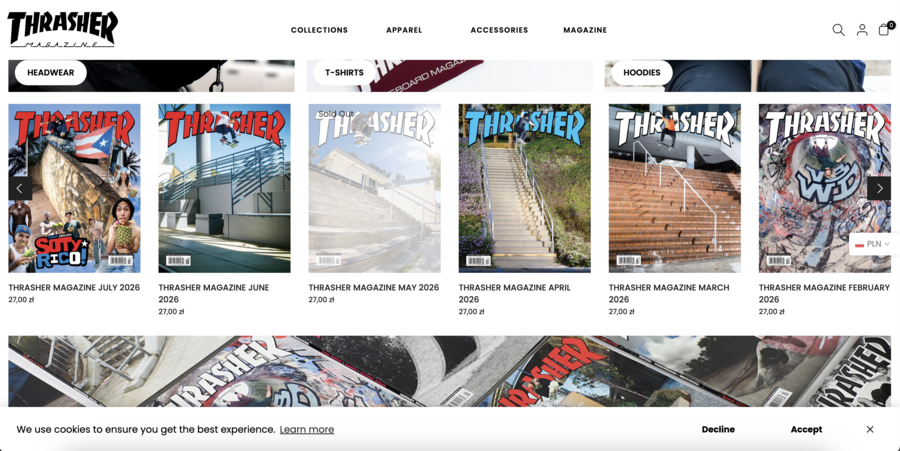
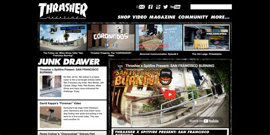
Trasher magazine landings
The official Thrasher website works as the center of the brand’s public field. It is not limited to selling apparel: the website brings together news, videos, photographs, materials about skateparks, events, music, and the shop. In this way, Thrasher builds the image of a media ecosystem, not a typical fashion brand. From the perspective of Social Identity Theory, the website helps structure the skate community. It shows who is a significant rider, which videos matter, which events deserve attention, and which visual codes belong to the culture. In this way, the website helps the audience understand the boundaries of the community and its internal hierarchy. From the perspective of Visual Rhetoric, the website uses dense visual communication: videos, photographs, sharp headlines, dynamic previews, and street scenes. This creates a feeling of constant movement, risk, and involvement in a real culture. Scientific point: the website performs not only an informational function, but also an identificational one: it gathers a shared system of symbols, heroes, and events around the brand.
Raw skate photography as authenticity
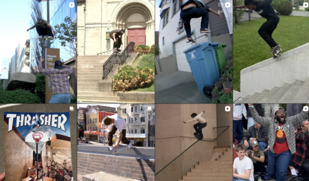
Thrasher’s visual style differs from clean fashion advertising. The brand often uses raw photography: sharp shots, street light, real locations, movement, risk, and physical tension. This aesthetic presents skateboarding not as a safe lifestyle, but as a physical, street-based, and risky practice. From the perspective of Visual Rhetoric, this kind of photography persuades through visual means. It creates trust not through a direct statement such as «we are authentic», but through the form of the image itself. The non-glossy visual style becomes evidence of authenticity. From the perspective of Social Identity Theory, these images show the norms of the group. Within the skate community, risk, technique, persistence, the ability to fall and continue are valued. Photography becomes a way to show which qualities are recognized inside the community. Scientific point: raw aesthetics work as visual evidence of authenticity. They help Thrasher appear as a participant in the culture, rather than as an external commercial observer.