LIXY: A Brand Strategy
Rubricator
- General theoretical part
- Brand presentation for a wider audience
- Presentation for a professional audience
- How we arrived at this communication strategy
- Bibliography and image credits
1. General theoretical part

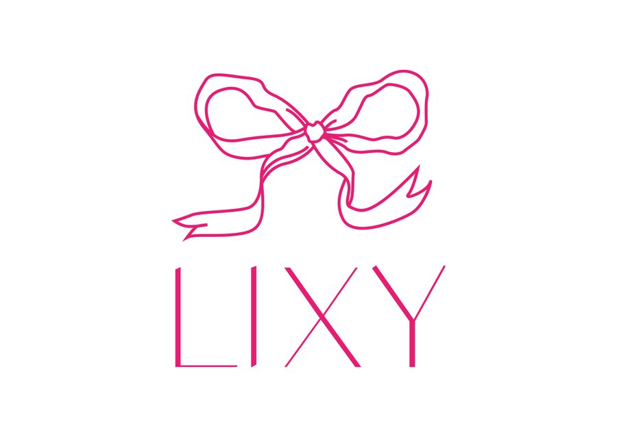
Anastasia Shipitsina | LIXY | Logo
The author’s reasoning about how communication theory works in the field of design or contemporary art:
In contemporary design, communication is not only about aesthetics but also about creating meaning and emotional resonance. According to communication theory, every design element — whether a logo, color, or shape — conveys a message, creating a visual language that interacts with the viewer’s emotions and perceptions. «LIXY», a fashion brand, expertly incorporates these principles into its identity. The brand’s logo, with its delicate bow and sleek, elegant font (Dance Regular), symbolizes freshness and optimism, resonating with the target audience’s desire for elegance and confidence.
The use of golden accents and soft, rounded shapes in product imagery, packaging, and online presence aligns with theories of symbolic interactionism, where design elements are not just decorative but serve to communicate identity and emotional connection.
Anastasia Shipitsina | LIXY | Fonts and color palette
By integrating semiotics, the brand’s visual identity communicates not just a product but a lifestyle: one of individuality, confidence, and optimism. Every element, from its minimalistic logo to its refined color palette, reinforces the brand’s values of personal empowerment and community, resonating deeply with its audience.
2. Brand presentation for a wider audience
LIXY speaks directly to active, confident women aged 25-35, living in urban areas, and embracing trends in fashion while valuing quality and style. The brand’s visual identity—featuring a delicate bow logo, a sleek Dance Regular font, and a palette of vibrant pinks and gold accents—invites women to feel empowered and beautiful in their uniqueness.
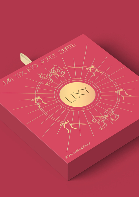
The «LIXY» name itself evokes a sense of freshness, while the brand’s «for those who want to shine» tagline, seen on its packaging, emphasizes optimism and self-expression.
Anastasia Shipitsina | LIXY | Website
In line with communication theory, LIXY’s packaging and product presentation are carefully designed to communicate not just the product but a symbolic experience. The bright pinks and gold accents visually reinforce the luxury and individuality that LIXY represents.
Every piece, from the elegant logo to the soft product photography with rounded corners on the website, ensures the brand communicates its ethos to the broader public, emphasizing sophistication and style with a playful edge.
Anastasia Shipitsina | LIXY | Website
3. Presentation for a professional audience
For professionals in the branding and design industry, LIXY serves as a case study in strategic communication and visual identity. The brand employs a semiotic approach in its design, ensuring that every element — from the elegant bow in the logo to the glossy pink packaging — communicates a set of cultural meanings that resonate with its target audience.
The use of Dance Regular font for the brand name and key packaging elements, as well as the AGAvalanche C font for body text, enhances the clarity and consistency of the brand’s message.
Anastasia Shipitsina | LIXY | Website
Anastasia Shipitsina | LIXY | Website
LIXY’s packaging (including tags, boxes, and shopping bags) in bright magenta is designed to stand out, using visual cues that reflect both the luxury and youthful energy of the brand.
This aligns with communication theory concepts like audience reception theory, where the target audience (active women) is influenced by visual elements designed to evoke specific emotional responses.
The brand’s use of rounded corners on product images and soft-focus photography adds to the inviting atmosphere, enhancing the overall visual coherence of the brand’s identity.
Anastasia Shipitsina | LIXY | Packaging
Anastasia Shipitsina | LIXY | Packaging
Anastasia Shipitsina | LIXY | Packaging
Anastasia Shipitsina | LIXY | Tag
4. How we arrived at this communication strategy
In creating the LIXY brand, communication theory played a central role in shaping its visual identity and overall messaging. Drawing from semiotic theory, the brand’s logo — featuring a delicate bow — functions as a symbol of femininity and elegance, resonating with the brand’s target audience. The use of Dance Regular typography for the brand name, coupled with gold accents in the packaging, symbolizes both luxury and confidence, reflecting the core values of the brand. These visual elements were chosen deliberately to communicate deeper meanings and to evoke an emotional response, in line with the theory that symbols hold power beyond their aesthetic appeal.
Audience reception theory informed the choice of colors and design aesthetics for the brand’s visual identity. The vibrant magenta used throughout the branding is known to evoke feelings of energy and empowerment, while the glossy finish of the packaging and soft-focus imagery in product displays communicate a sense of sophistication and approachability. These elements were designed to connect emotionally with the target demographic of young, confident women, aligning with the communication theory’s focus on how audiences interpret and respond to visual stimuli.
Anastasia Shipitsina | LIXY | Overall
Additionally, the LIXY brand applies principles from symbolic interactionism by ensuring that its visual language fosters a sense of personal connection and individuality. The design choices, such as the rounded corners on product images and the carefully selected typography, encourage consumers to identify with the brand’s message of empowerment and self-expression. By using symbolic communication to convey the brand’s values, LIXY ensures that its messaging is not just received but also deeply internalized, fostering long-lasting connections with its audience.
5. Bibliography and image credits
Concept, design and art direction: Anastasia Shipitsina. Identity for the ANTOYS and LIXY brands. 2025. URL: https://portfolio.hse.ru/Project/249607#
Communication Theory: Bridging Academia and Practice. Course syllabus. HSE University, 2024.
Craig, Robert T. Communication Theory as a Field. 1999.
Griffin, Em, Ledbetter, Andrew, Sparks, Glenn. A First Look at Communication Theory. 2019.
Petty, Richard E., Cacioppo, John T. Communication and Persuasion: Central and Peripheral Routes to Attitude Change. 1986.
Festinger, Leon. A Theory of Cognitive Dissonance. 1957.
Habermas, Jürgen. The Structural Transformation of the Public Sphere. 1989.
Adorno, Theodor W., Horkheimer, Max. Dialectic of Enlightenment. 1997.
Concept, design and art direction: Anastasia Shipitsina. The LIXY identity. URL: https://deziiign.com/project/c8e3dfb4cfe843e7b737a555e0bc9f38


