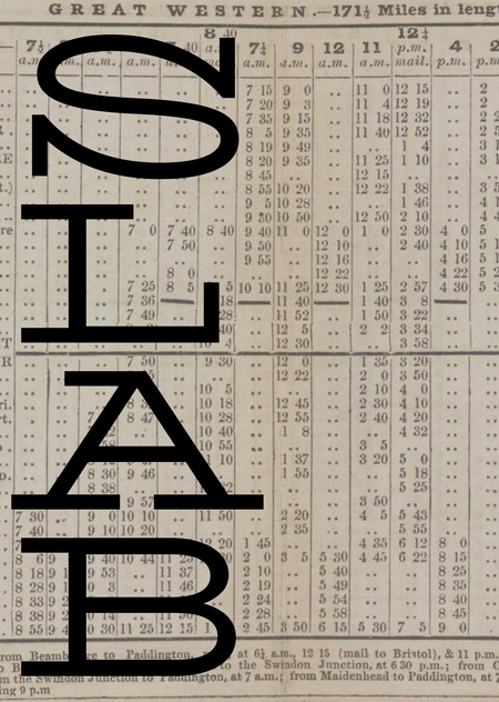
David Jonathan Ross / Job Clarendon / 2021
Концепция
Брусковый шрифт — это шрифт, сочетающий в себе черты гротеска и антиквы. Такой шрифт имеет засечки зачастую прямоугольной (или трапециевидной) формы, но при этом толщина вертикальных и горизонтальных штрихов в нем приблизительно равна, что добавляет шрифту веса. Брусковая антиква обычно имеет равноширинные пропорции прописных знаков, вертикальную ось овалов, симметричность и крупное очко строчных.
Брусковые шрифты также называют Slab Serif, Square Serif или Egyptian, что по-русски означает «египетский». На такое название повлияло несколько факторов. После экспедиции Наполеона в 1798 году, все египетское стало модным, а все новое стало считаться египетским. Это правило распространилось и на шрифты. Также это явление связывают с захватом англичанами французского фрегата Egyptienne, который привезли в Лондон в 1802 году.
Развитие технологий печати из-за промышленной революции конца XVIII века привели к изменениям в области экономики и эстетических предпочтений общества, что отразилось и на разработке шрифтов. Механизация повлияла и на отношение дизайнеров к печатному ремеслу. Вошли в обиход свободное сочетание элементов разных стилей, что оказало влияние и на рисунок шрифтов. Начали создаваться новые стили.
Брусковая антиква появилась в начале XIX века в Англии. После жирных шрифтов словолитчикам захотелось продолжить эту тенденцию и в новых гарнитурах. Основная идея брусковых шрифтов заключалась в переносе веса на скелет буквы, когда вертикалям в шрифте решили добавить столько же толщины, сколько и горизонталям. В результате этого появились шрифты с упрощенной формой засечек и с практически отсутствующим контрастом между штрихами.
Для не привыкшего зрительского глаза решение добавить массивных засечек в шрифт, делало его слишком темным и, разумеется, распределяло его в класс акцидентных. Брусковую антикву можно было встретить на вывесках, объявлениях на улицах Лондона, она цепляла взгляд прохожих. Из-за своей монументальности, активности и выразительности считалась слишком яркой и использовалась в рекламных целях. Однако со временем ситуация изменилась.
Гипотеза исследования заключается в том, что шрифт, изначально использовавшийся только для акциденции, стал самым утилитарным, неприхотливым и удобочитаемым текстовым шрифтом. В работе будет рассмотрена история развития брусковых шрифтов и ключевые гарнитуры. Через эволюцию брусковых шрифтов в разных временные периоды — от их появления до современности — будет показано каким модификациям подвергался шрифт на всем своем пути.
Ранние шрифты. XIX век
Первый брусковый шрифт появится только в 1815-м году, однако, не задокументированные официально брусковые буквы начали использовать намного раньше. Они появлялись на листовках, рекламных вывесках, архитектурных надписях. Например, есть лотерейный билет с использованием Slab-Serif 1810-го года.
Более того, есть сведения, утверждающие наличие надписей египетского типа еще в 1754-м году. Алан Бартрам зафиксировал их на здании в Бервик-апон-Туид.
Прикрепить карточку В это время начинает формироваться особый стиль в дизайне букв и печатных изданий. На одном листе объявления появляется свободное сочетание рисунков разных шрифтов в разных размерах и начертаниях.
Unknowed author / Unknowed slab-serif / 1835
Винсент Фиггинс считается первым словолитчиком, создавшим брусковый шрифт. В 1815 году под его авторством появилась гарнитура Antique, означающая «древний». Она состояла только из прописных букв, отлитых из металла.
Геометричность в ранних гарнитурах появлялась только в круглых знаках. Их контур был приближен к форме идеального круга.
Vincent Figgins / Antique / 1815
В 1820-м году в словолитне Thorowgood появились шрифты Роберта Торна. Его версии уже получили название Egyptian. Из-за жирности самого шрифта и концепции монолинейности массивные квадратные засечки выглядят очень тяжелыми и напоминают рельсы.
Robert Torn / Egyptian / 1820
Robert Torn / Egyptian / 1820
Типографическое сообщество по-разному относилось к новшествам. Кого-то привлекал вес брусковых шрифтов, а кому-то подобные эксперименты казались чем-то вроде неуважения. При печати на низкокачественной бумаге все антиквы с тонкими засечками пропадали, поэтому многие печатники быстро отдали предпочтение брусковым шрифтам. Однако, например, Thomas Curson Hansard жестко критиковал египетские шрифты:
«Мода и фантазия обычно колеблются от одной крайности к другой. От острых как бритва тончайших линий и серифов, наблюдаемых у сверхжирных шрифтов, свершился поворот, именуемый „Antique“ или „Egyptian“, сущность которого в том, чтобы штрихи каждой литеры были одной толщины! После такого — у кого не будет мысли, что возможна ещё большая экстравагантность? ‥ О, священные тени Моксона и ван Дейка, Баскервиля и Бодони! Что вы сможете сказать о представленных типографических чудовищах (monstrosities), которых произвела мода нашей эпохи?»
С 1821 года начали развиваться строчные буквы. Встал вопрос о форме окончаний выносных элементов: делать их прямыми, скругленными или добавлять капли. Примерно в это время литейные заводы выпускали брусковые шрифты с заглавными и строчными буквами в текстовых размерах. Однако, учитывая их жирность можно сделать выводы о том, что они не использовались для наборных текстов. Разве что для коротких фраз мелким кеглем на рекламных объявлениях и титульных листах книг.
В Antique No. 2 Фиггинс добавил больше контраста, просвет между засечками стал практически неразличимым, что придало шрифту более сложный вид. Такое ощущение создают и двухчастные строчные ''a'' и ''g''.
V. & J. Figgins / Antique No. 2 / 1825
Specimen of Modern Printing Types by Edmund Fry / 1828
До 1825-го года курсив был только для маюскульных знаков. Курсивное начертание в минускульных буквах ввел Caslon.
Caslon / Antique-No-6 / 1825
Hugh Hughes / Italic Antique / 1830
В 1830-х годах начали появляться узкие брусковые антиквы. Первым таким шрифтом считается образец Thorowgood 1832 года. Внешний контур букв имеет скругленные углы, а внутренний просвет в буквах узкую форму. Встречаются варианты, где в круглых знаках как внешний, так и внутренний контур плоские. Благодаря своим вытянутым, компактным формам узкие египетские шрифты быстро получили популярность среди печатников из-за возможности размещать большее количество слов в строке. В будущем они подвергались большому количеству модификаций.
Robert Besley and Co. [поздний Wm Thorowgood and Co.] / Condensed Egyptian / 1851
В 1840-х годах начали появляться более светлые начертания. В варианте Antique 1840-го года Фиггинса в шрифте присутствуют удлиненные засечки, которые придают шрифту выразительности, при этом он сохраняет свою твердость и плечистость. Появляются капли в строчных, загнутый хвостик у ''t'', апертура знаков закрытая.
V. and J. Figgins / Antique / 1840
Clarendon — брусковая антиква с контрастом и немного скругленными засечками. Она была выпущена в 1845 году Робертом Бесли. Этот шрифт цепляет легкостью и дружелюбностью в отличие от геометрических брусковых антикв.
После выхода Clarendona у подобных шрифтов даже появилось название шрифты «кларендоновского» типа или «ионические» шрифты.
Robert Besley / Clarendon / 1845
Первые брусковые шрифты были очень фигурными, живыми и часто декоративными. В них присутствовали капли, скругленные засечки и плавные присоединения горизонтальных штрихов к стэмам. Их использовали в рекламе, листовках, набирая каждую строчку новым шрифтом, создавая пестрый, разнородный дизайн.
Antique (из каталога Caslon & Livermore) / 1830
Геометрические брусковые шрифты. Первая половина XX века
После Первой мировой войны требовался новый взгляд на визуальную культуру. В моду вошли шрифты, основанные на простейших геометрических формах: круг, квадрат, треугольник. После успеха шрифтов Futura и Kabel типографы подумали о том, чтобы дорисовывать комплементарные засечки к этим гротескам и таким способом создавать брусковые шрифты. Memphis Рудольфа Вольфа, созданный для немецкой фирмы Stempel в 1929 году, стал первым таким шрифтом.
Уже в период появления геометрических брусковых шрифтов начали печатать и наборный текст. Стало понятно, что из-за отсутствия сильного контраста шрифт хорошо воспринимается с дальнего расстояния, а мощные засечки хорошо ведут себя при печати.
Rudolf Wolf / Memphis / 1929
После выхода шрифта Memphis типографы начали создавать подобные гарнитуры. В 1931 году вышел Beton под авторством Генриха Йоста, которую тот создал для словолитни Bauer. Она отличается очень короткими засечками и почти идеально круглыми знаками.
Тогда же немецкая фирма Ludwig & Mayer выпустила шрифт Welt Antiqua, а Роберт Миддлтон спроектировал Karnak для американской фирмы Ludlow. В 1933 Intertype выпустили шрифт Cairo.
Генрих Йост / Beton / 1931
Ludwig & Mayer / Welt Antiqua / 1931
Робертом Миддлтон / Karnak / 1931 // Intertype / Cairo / 1933
Однако, в США такой шрифт появился еще в 1910 году под названием Litho Antique от Уильяма Шраубштедтера. Он стал прародителем шрифта Rockwell и многих других шрифтов и в будущем подвергался множествам изменений со стороны разных студий.
William Schraubstädter / Litho Antique / 1910
Разные дизайнеры работали с Litho Antique, добавляя ему начертаний, меняя некоторые знаки и выпуская под новыми названиями.
Моррис Бентон выпустил в 1931 году Rockwell Antique добавив гарнитуре альтернативных знаков, но преобразовав его в более узкий вид переименовал в Stymie. Потом он дорисовал дополнительные начертания и эта версия получила наибольшее распространение.
Уильям Шраубштедтер / Rockwell Antique (Litho Antique) / 1910 + альтернативные знаки / Моррис Бентон / 1931
Моррис Бентон / Stymie / 1931
В 1934 году для студии Monotype Foundry был выпущен Rockwell, спроектированный на основе Litho Antique. Rockwell имеет более узкие пропорции, более крупное очко строчных, удлиненные вертикальные засечки и чуть более выраженный контраст, что хорошо заметно в его строчных знаках.
Monotype Foundry / Rockwell / 1934 // William Schraubstadter / Litho Antique / 1910
Фрэнк Пирпонт / Rockwell / 1934
Геометрический брусковые антиквы часто используются в акциденции, а мощные, угловатые засечки делают математически выверенный, точный рисунок чуть более живым.
Брусковая антиква. Вторая половина XX века
В 1950-х годах на основе гарнитуры Candida Якоба Эрбара советскими дизайнерами создается кириллическая версия шрифта под названием Baltica. Ее нельзя полноправно назвать брусковым шрифтом из-за высокого контраста и разницы в толщине засечек и горизонтальных штрихов, однако, из-за своей удобочитаемости и широкого применения, все же кто-то выделяет ее в класс брусковых. Она хорошо работает в заголовках и наборном тексте.
Вера Чиминова, Исай Слуцкер / Baltica Book / 1951-1952
Адриан Фрутигер выпустил шрифт, основанный на гарнитуре Univers — твердый, прямой, геометрический и уверенный Serifa в 1967. Он многофункциональный и подходит как для газет, так и для фирменных стилей. Через 10 лет в 1977 вышел шрифт Glypha с увеличенным x-heignt.
Adrian Frutiger / Serifa / 1967
Adrian Frutiger / Glypha / 1977
В 1980-м вышел Geometric Slabserif 712 — интерпретация шрифта Rockwell американской студией Bitstream. В 2000 году дизайнеры Исай Слуцкер, Манвел Шмавонян разработали кириллическую версию шрифта Bitstream Geometric Slabserif 712.
Кириллическая версия: Исай Слуцкер, Манвел Шмавонян / Geometric Slabserif 712 / 1999
Современные брусковые шрифты
На сегодняшний день существуют оцифрованные версии металлических брусковых шрифтов, таких как Rockwell, Memphis, Beton и Styime. Но также много создается и новых брусковых шрифтов.
Например, Liberteen — современное прочтение шрифта Clarendon. Выпущен в студии Паратайп в 2015 году, разработан Александром Любовенко. Очень выразительная акцидентная гарнитура, подходящая для набора заголовков. Характерные длинные и при этом косые, загнутые вовнутрь вертикальные засечки придают шрифту непоседливости и ироничности. При многочисленных деталях выглядит крепким и уверенным.
Paratype / Liberteen / 2015
В 2018 году Паратайп выпустил гарнитурe Lehmann Egyptian, разработанную на основе рисунков дореволюционных шрифтов петербургской словолитни Лемана и Бертгольда. Она хорошо работает в наборе коротких текстов, но больше подходит для акциденции и заголовков. Разработана Альбертом Капитоновым совместно с Дмитрием Кирсановым. Имеет вытянутые пропорции и узкие просветы между засечками, что делает набор плотным и тяжелым.
Paratype/ Lehmann Egyptian / 2018
Можно рассмотреть шрифты Российской студии TypeType. Например, брусковый шрифт с широкими пропорциями TT Globs. Он выглядит необычно, свежо, пластично и дружелюбно. В шрифте длинные вертикальные и горизонтальные засечки, интересные «кривые» ноги в прописных и «хвосты» в строчных знаках.
TypeType / TT Globs / 2021
Есть и более скромные варианты, например, TT Rationalist. Его современный, аккуратный вид делает шрифт многофункциональным. Он имеет трапециевидные, короткие засечки придают ему открытости, тем самым смягчая характер.
TypeType / TT Rationalist / 2021
Еще одна гарнитура с широкими пропорциями — TT Slabs — это геометрический брусковый шрифт. Он имеет короткие квадратные засечки без скруглений и довольно круглые знаки «о», «е», «с».
TypeType / TT Slabs / 2015
Немного сумасшедшим характером обладает брусковая антиква TT Cometus, которую также можно назвать акцидентной. В ее особенности входит не только массивность засечек и вытянутые пропорции, но и замысловатые разрезы.
TypeType / TT Cometus / 2024
Заключение
Брусковые шрифты за почти два столетия успели набрать вес, сбросить его, побывать не только широкими, но и узкими, как иметь плавные соединения между горизонтальными и вертикальными штрихами, так и не иметь их вовсе. Начиная брусковым шрифт стал абсолютно универсальным и многофункциональным.
В начале своего пути они воспринимались исключительно акцидентными и использовались для привлечения внимания в заголовках рекламы и различных вывесках. Однако, по мере развития технологий, шрифт начали создавать из металла в мелких кеглях и, совершив путь к упрощению и отказу от декоративности, пришли к тому, что брусковая антиква из-за низкого контраста хорошо воспринимается на дальнем расстоянии и отлично работает в наборе.
Николет Грей в своей книге «Орнаментированные шрифты девятнадцатого века» называет брусковые засечки «самым блестящим типографским изобретением века».
Источники
Chris Han. Serifa Typeface // Сайт medium.com 29.09.20. (URL: https://chrisyhan.medium.com/serifa-typeface-1b1434c3d754) Просмотрено: 23.11.2024
Jonathan Cunningham. slab serif Rockwell // Сайт meaningfultype.com. (URL: https://www.meaningfultype.com/rockwell.html) Просмотрено: 23.11.2024
Jonathan Cunningham. slab serif clarendon // Сайт meaningfultype.com. (URL: https://www.meaningfultype.com/clarendon.html) Просмотрено: 23.11.2024
Paratype // Сайт Paratype.ru. (URL: https://www.paratype.ru/catalog/font/pt/lehmann-egyptian) Просмотрено: 23.11.2024
Paul Barnes. Antique No 6 // Сайт Commercialtype.com. (URL: https://commercialtype.com/about/collections/antique_no_6) Просмотрено: 23.11.2024
Paul Barnes. Thorowgood Grotesque // Сайт Commercialtype.com. (URL: https://commercialtype.com/about/collections/thorowgood_grotesque) Просмотрено: 23.11.2024
Tim Ripper. Successor // Сайт Commercialtype.com. (URL: https://commercialtype.com/about/collections/successor) Просмотрено: 23.11.2024
Typefounder. The Nymph and the Grot, an update // Сайт Typefoundry.com. 6 января 2007. (URL: https://typefoundry.blogspot.com/2007/01/nymph-and-grot-update.html) Просмотрено: 23.11.2024
Ефимов В., Шмелева А. Великие шрифты. Шесть из тридцати. — 2007.
Королькова А. Шрифтовая история и классификация: брусковая антиква // Сайт info.paratype.ru. 22.12.2021. (URL: https://info.paratype.ru/type-classification-egyptian/) Просмотрено: 23.11.2024
David Jonathan Ross. March’s font of the month: Job Clarendon// Сайт djr.com. 16 марта 2021. (URL: https://djr.com/notes/job-clarendon-font-of-the-month) Просмотрено: 23.11.2024
EquipoEscat. Tipografías más usadas en Diseño Gráfico #NoticiasESCAT // Сайт blogs.uninter.edu.mx. 6 июня 2019. (URL: https://blogs.uninter.edu.mx/ESCAT/index.php/tipografias-mas-usadas-en-diseno-grafico/) Просмотрено: 23.11.2024
Identifont. Clarendon // Сайт Identifont.com (URL: http://www.identifont.com/show?2SA) Просмотрено: 23.11.2024
Identifont. Glypha // Сайт Identifont.com (URL: http://www.identifont.com/show?MD) Просмотрено: 23.11.2024
Identifont. Memphis // Сайт Identifont.com (URL: http://www.identifont.com/show?RJ) Просмотрено: 23.11.2024
Identifont. Serifa // Сайт Identifont.com (URL: http://www.identifont.com/show?29V) Просмотрено: 23.11.2024
Paratype // Сайт Paratype.ru. (URL: https://www.paratype.ru/catalog/font/pt/lehmann-egyptian) Просмотрено: 23.11.2024
Paratype // Сайт Paratype.ru. (URL: https://www.paratype.ru/catalog/font/pt/liberteen) Просмотрено: 23.11.2024
Paul Barnes. Antique No 6 // Сайт Commercialtype.com. (URL: https://commercialtype.com/about/collections/antique_no_6) Просмотрено: 23.11.2024
Paul Barnes. Thorowgood Grotesque // Сайт Commercialtype.com. (URL: https://commercialtype.com/about/collections/thorowgood_grotesque) Просмотрено: 23.11.2024
Period Paper. 1936 Ad Norman Taurog LeRoy Prinz Paramount Pictures — ORIGINAL MOVIE
// Сайт periodpaper.com (URL: https://www.periodpaper.com/products/1936-ad-norman-taurog-leroy-prinz-paramount-pictures-original-advertising-043416-movie-081?_pos=9&_sid=9ebe31e8d&_ss=r) Просмотрено: 23.11.2024
Tim Ripper. Successor // Сайт Commercialtype.com. (URL: https://commercialtype.com/about/collections/successor) Просмотрено: 23.11.2024
Ефимов В., Шмелева А. Великие шрифты. Шесть из тридцати. — 2007.


