Welcome! My name is Elena
about me
I specialize in visual identity, typography, and illustration.
My approach: I believe thoughtful design begins with understanding. I delve deep into each project’s context, conducting research to uncover meaningful insights. I enjoy exploring unconventional approaches and experimenting with visual forms and typography to create purposeful design solutions.
My value: I look beyond aesthetics to find what makes each project unique. My goal is to translate its character, values, and ideas into a visual language that feels authentic and memorable.
Tools: Figma, Adobe Illustrator, Photoshop, InDesign, Procreate
Museum of Lost Villages
student project
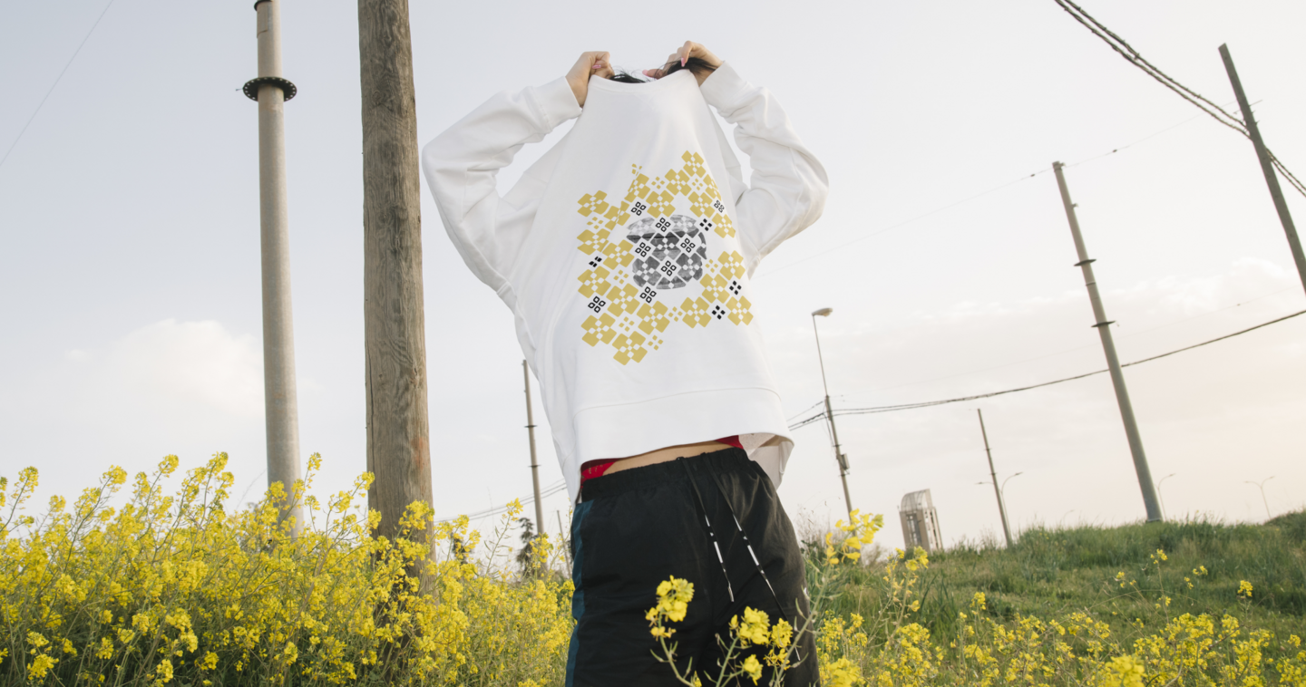
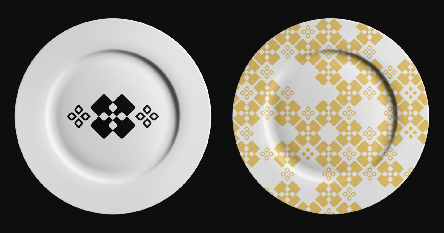
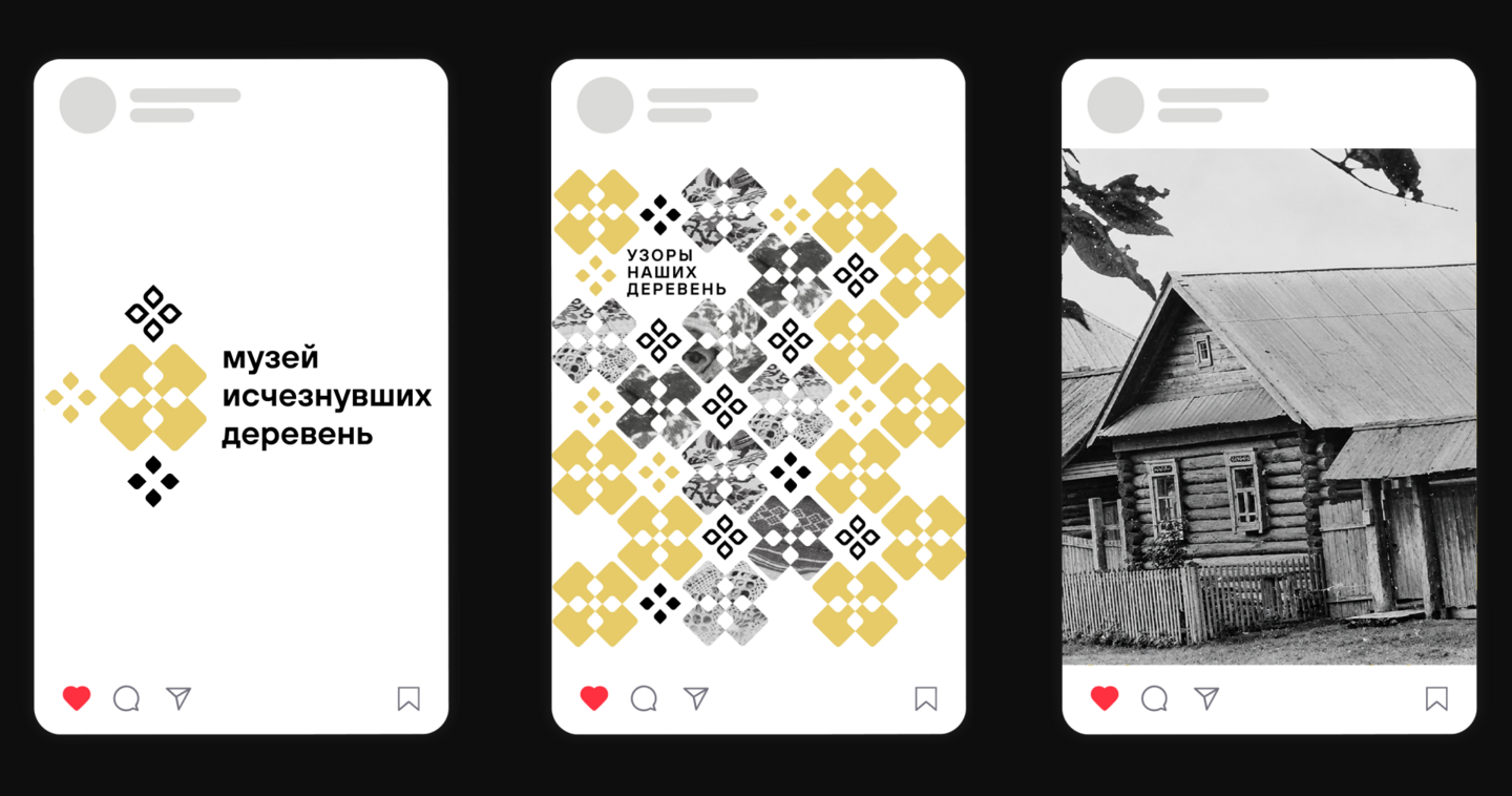
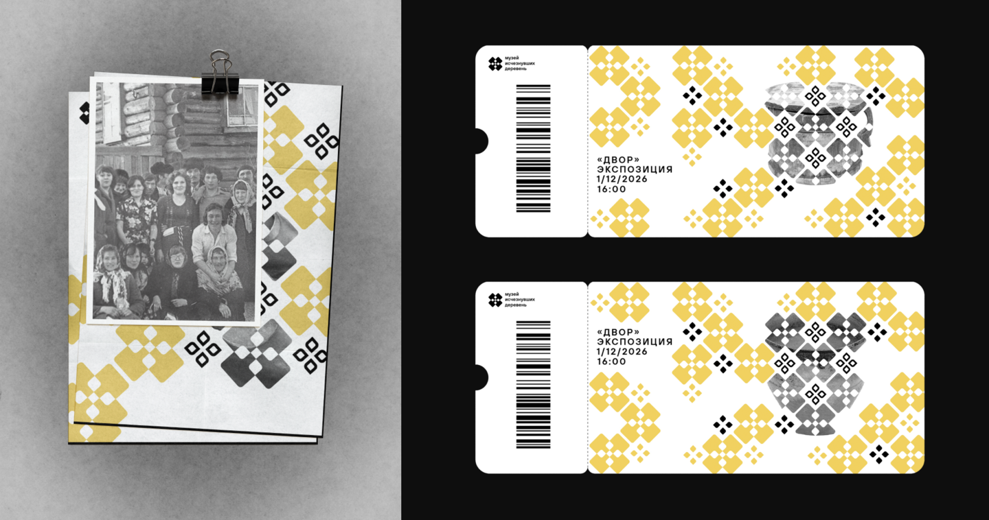
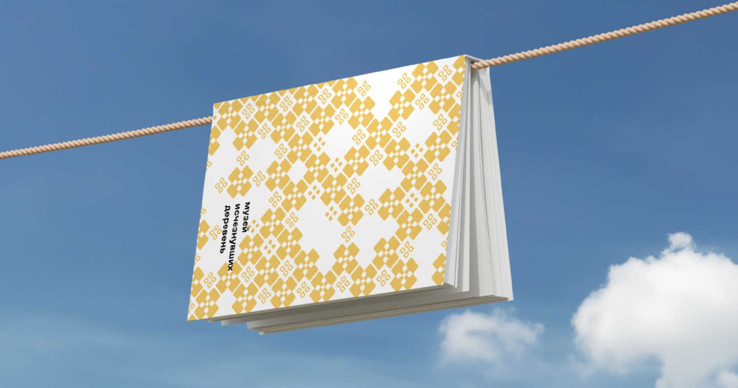
Brief: Refresh the visual identity of the Museum of Lost Villages while preserving its distinctive character and incorporating yellow as a key color.
Concept: The identity is inspired by italmas, a local flower and symbol of Udmurtia. Its shape was simplified into geometric forms to create the museum’s branding.
Result: A refreshed visual identity that preserves the museum’s unique character while introducing a modern, recognizable design system rooted in local cultural heritage.
dafes typography festival
student project
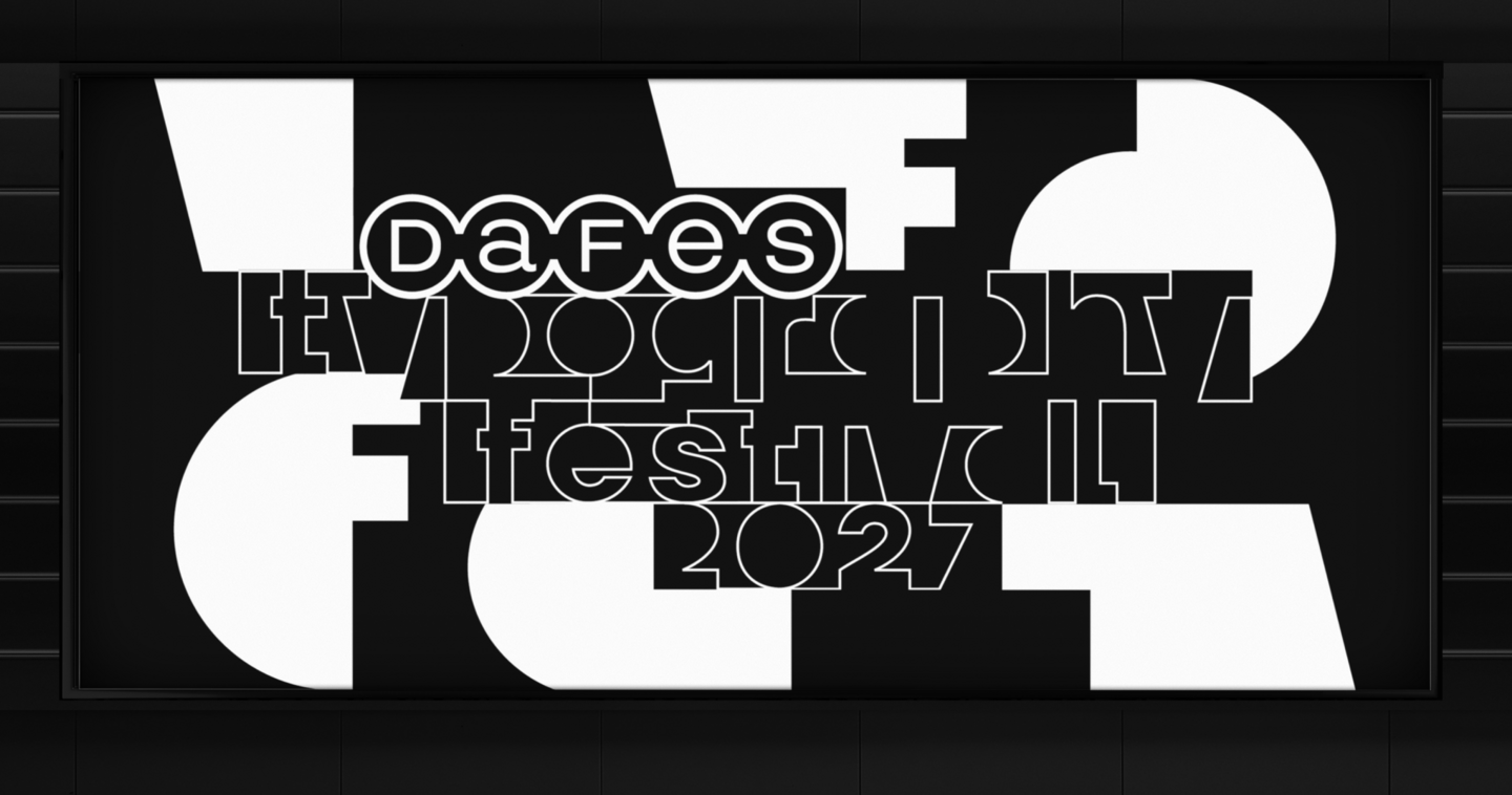
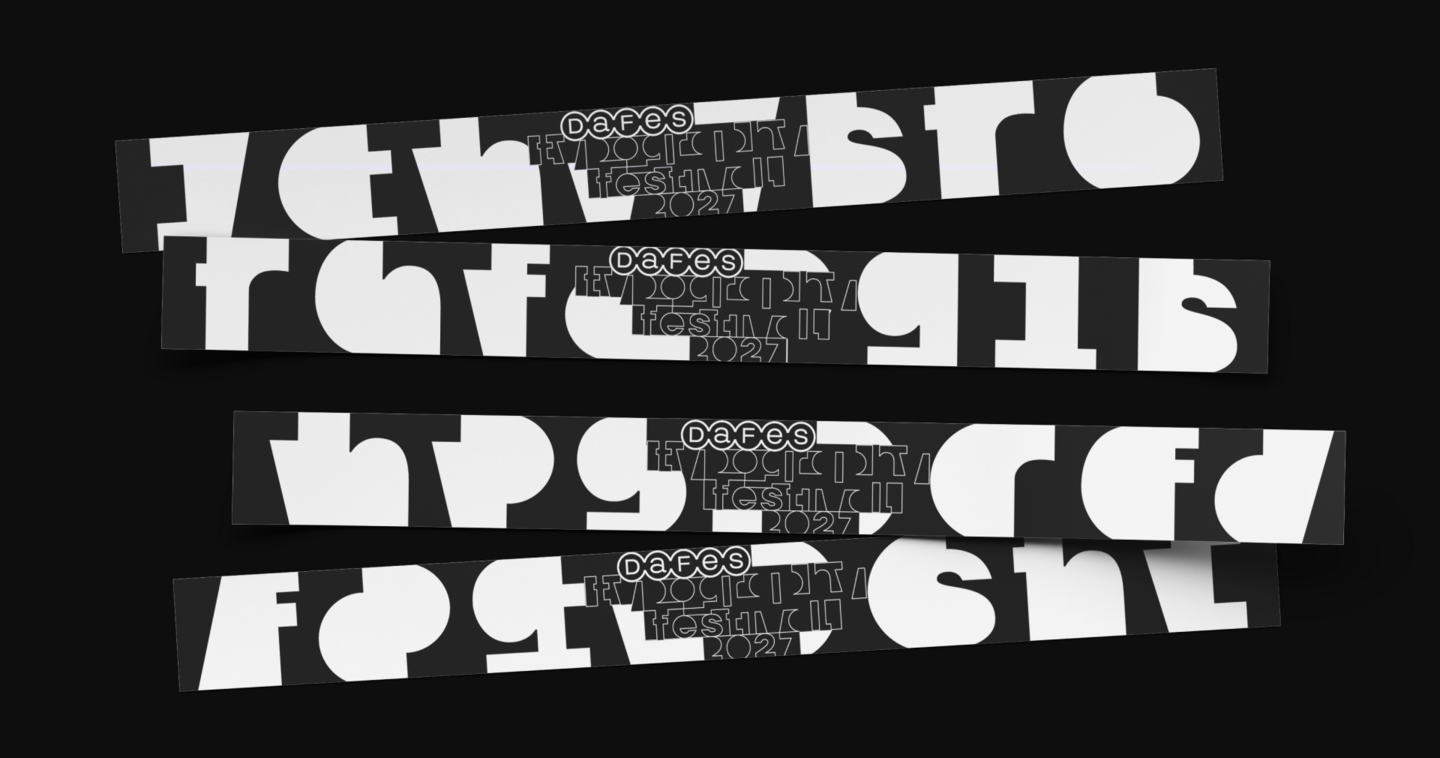
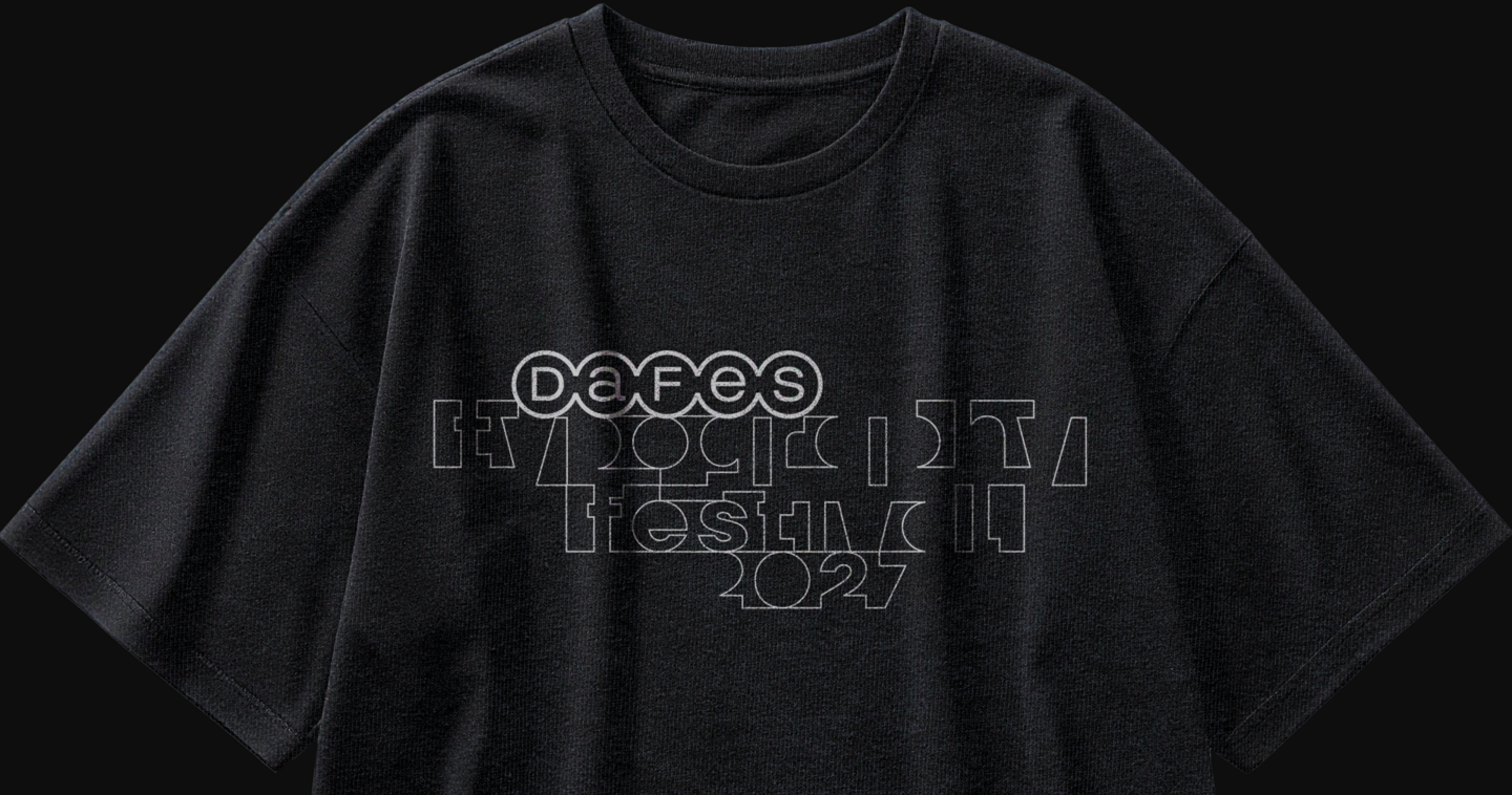
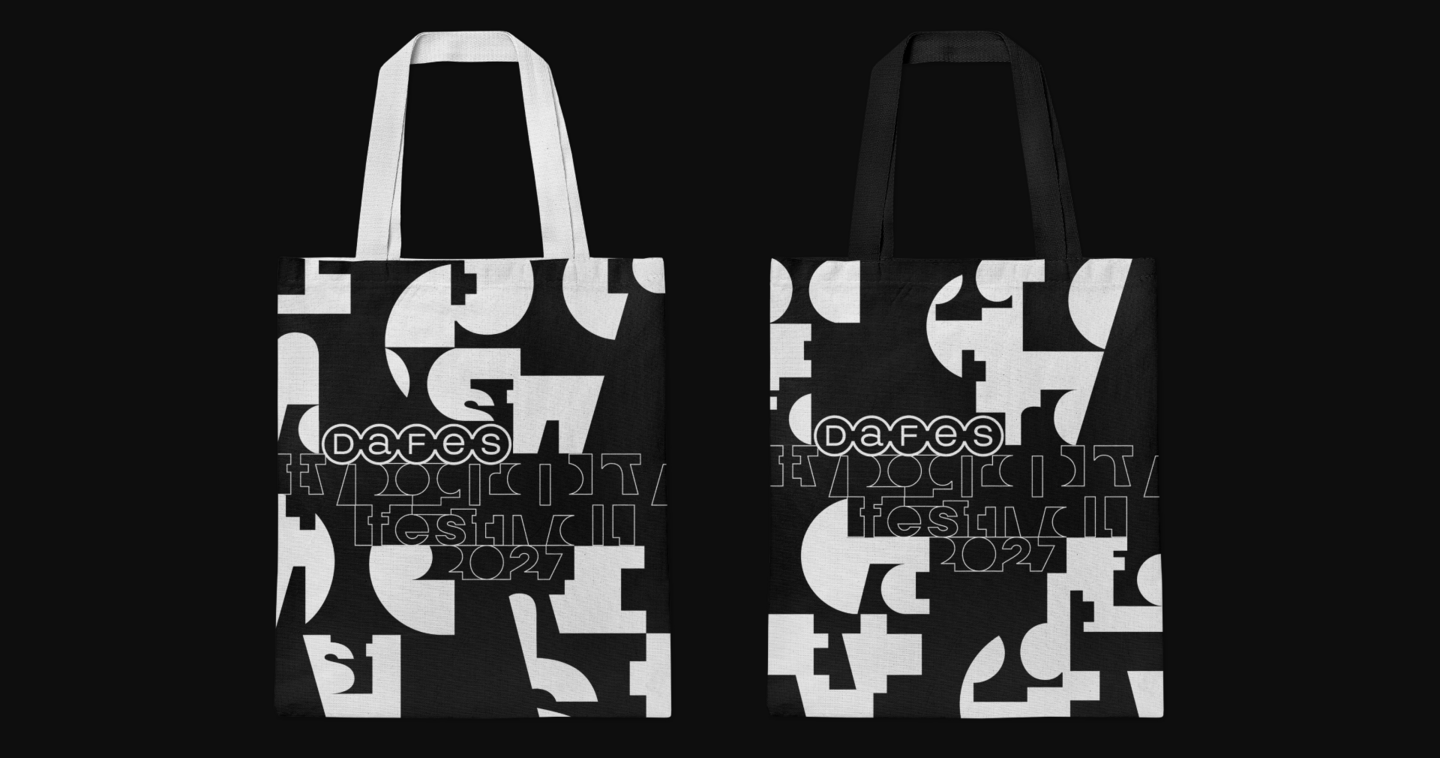
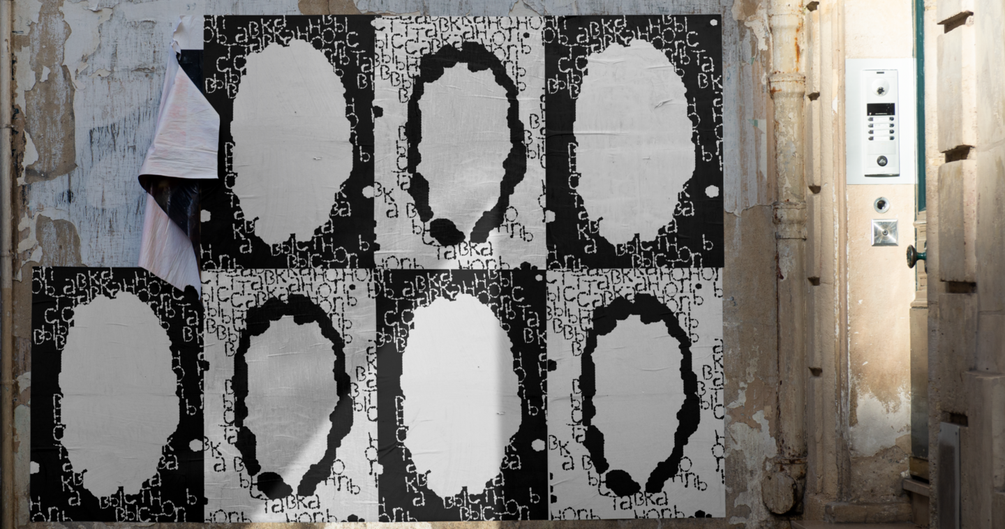
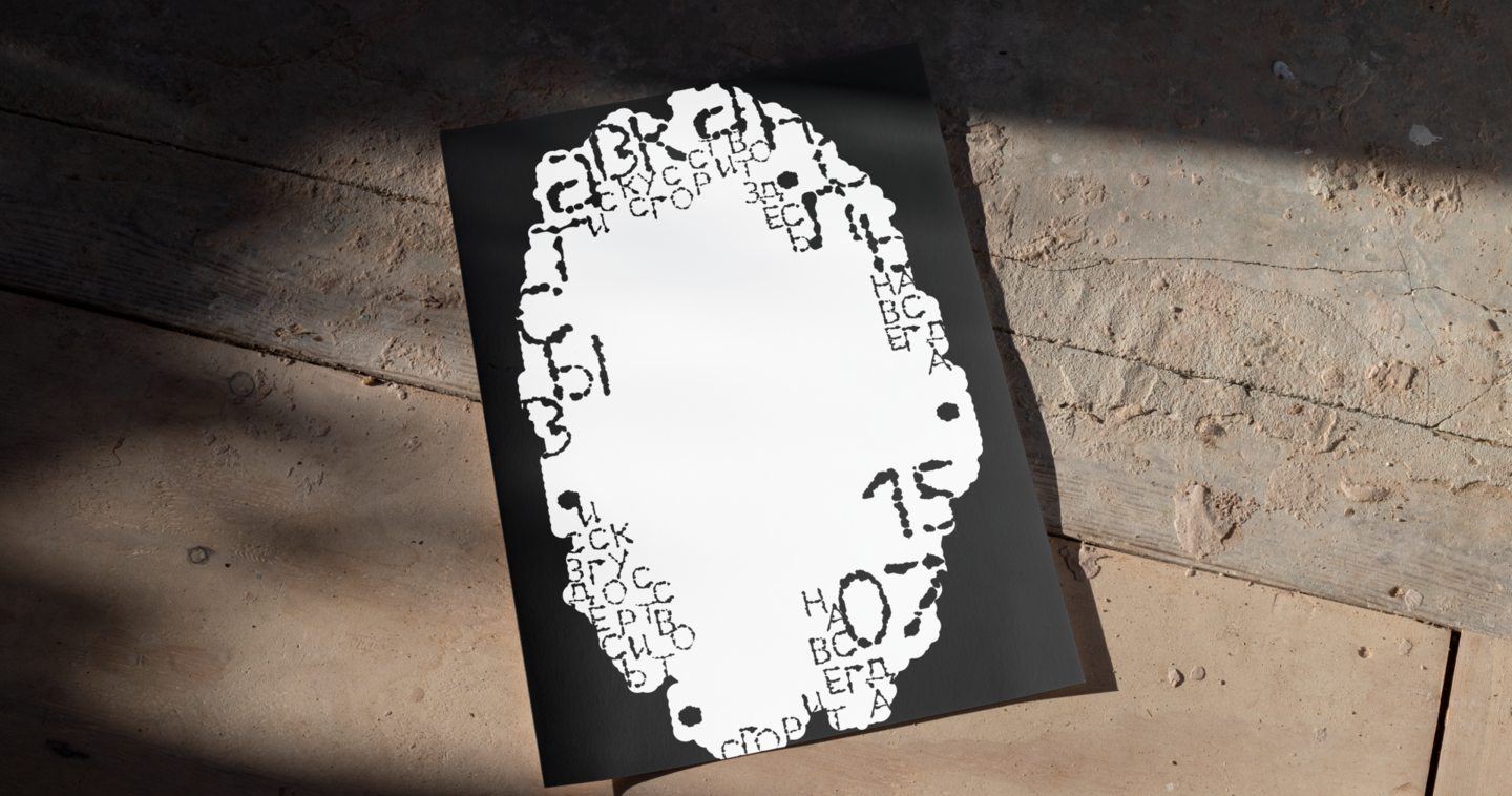
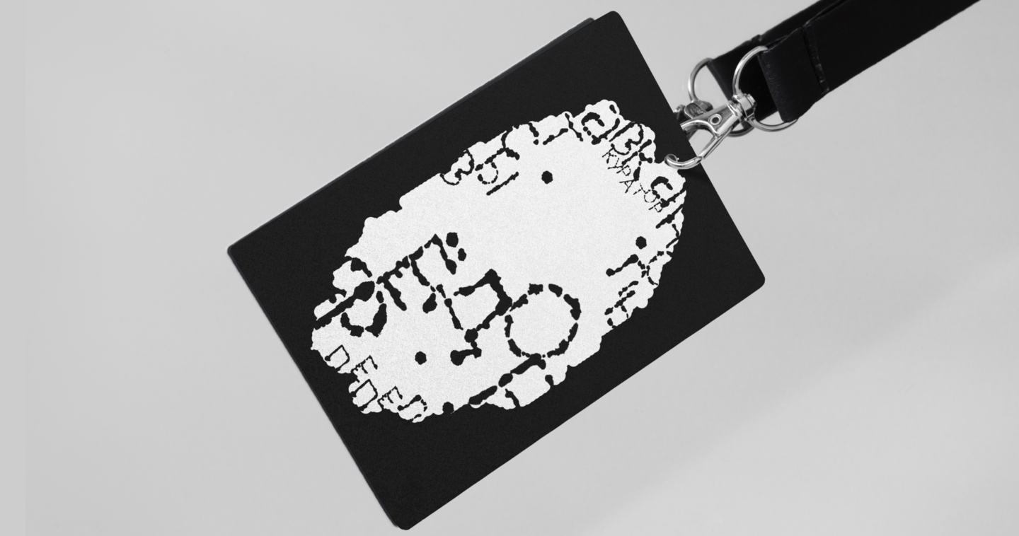
Brief: Develop a typography-driven visual identity that reinterprets Russia’s typographic heritage and represents the country on an international stage.
Concept: The concept explores the negative space between letters. Letterforms connect, overlap, and merge into new shapes and meanings, creating a dynamic visual rhythm.
Result: A flexible visual system built around the interaction of letterforms, creating a recognizable graphic identity that adapts across different formats and media.
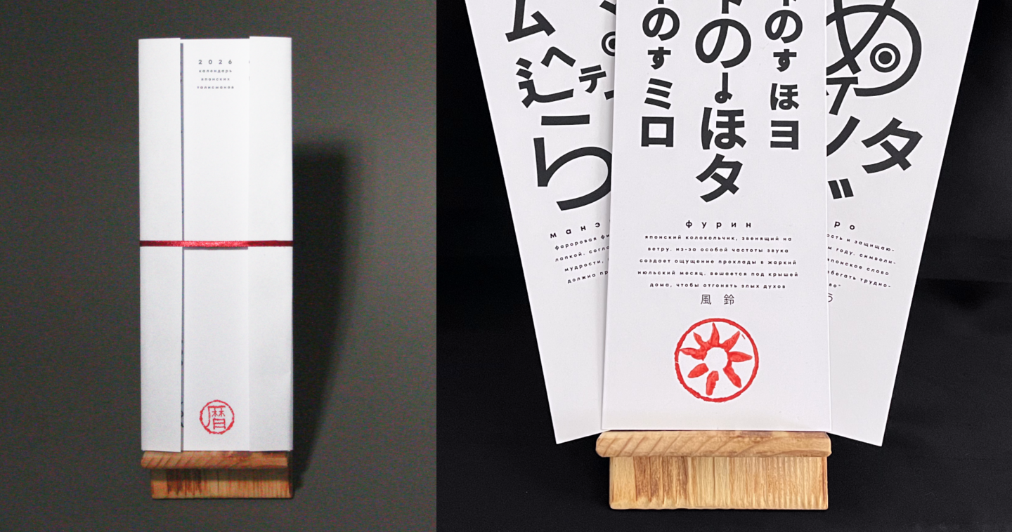
Calendar of Japanese Talismans
student project
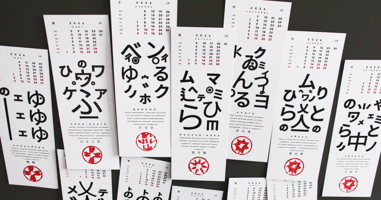
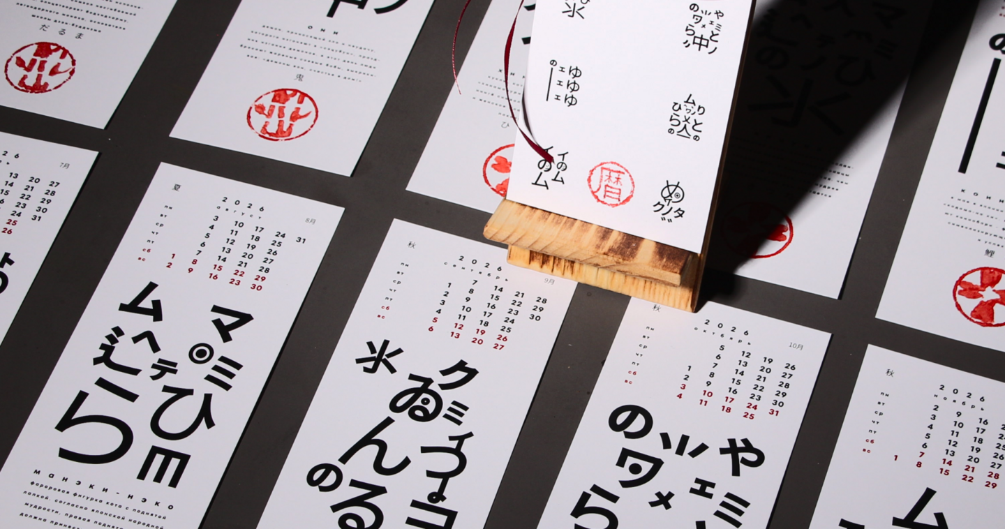
Brief: Design a calendar based on a theme of your choice.
Concept: The calendar is inspired by Japanese talismans associated with luck and prosperity. Each month features a different talisman represented through Kanji characters, drawing on the tradition of sacred inscriptions found on ofuda paper amulets.
Result: An illustrated calendar that bridges Japanese cultural traditions and contemporary typographic design, offering a modern interpretation of traditional symbols.

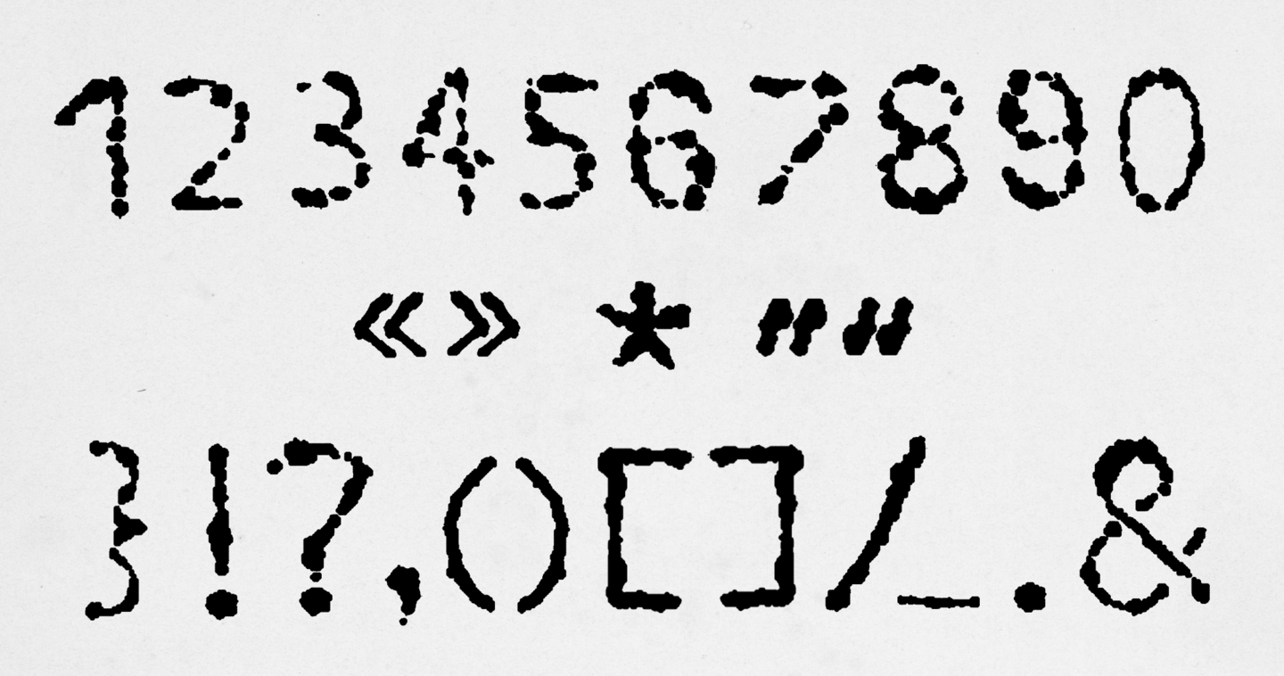
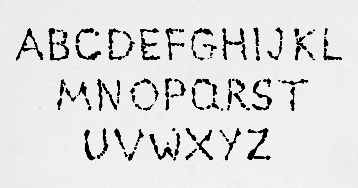
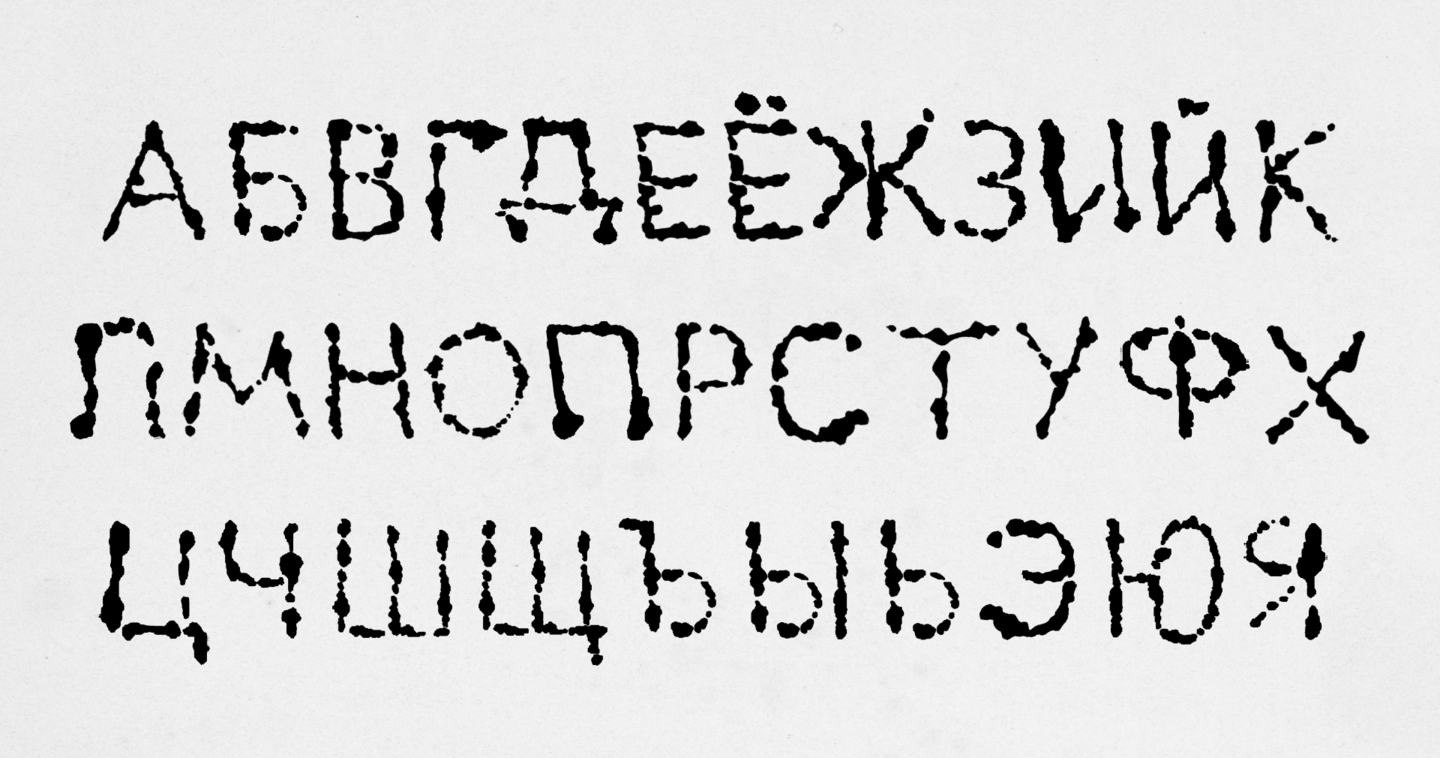
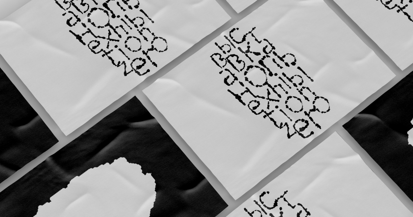
burnt font
student project
Brief: develop an experimental typeface
Concept:
Burnt is an experimental typeface created by burning paper. Rather than being drawn or printed, each character emerges through heat and material destruction, making every form unique
Result: an experimental typeface that transforms destruction into a visual language, designed for exhibitions, performances, and creative projects exploring themes of disappearance and impermanence
indentur font
student project
brief: design an original typeface adhering to established principles and rules of typography
concept:
Inspired by the written and legal culture of early printed documents, Indentur takes its name from contracts featuring serrated edges used to verify authenticity. This idea is reflected in the shape of the serifs and the structure of the letterforms.
result: A functional serif typeface designed for extended reading, merging historical references with contemporary readability. It is suitable for books, legal documents, archival materials, and research publications.