Sonya Mukherjee. Portfolio
Graphic design for small brands
Hi, I’m Sonya Mukherjee, a graphic designer.
I help small brands project the same strength as their product. I design identities, packaging, and social media visuals that are instantly recognizable and easy to use every day.
Selected Projects
01 Sports Hall. Fitness club rebranding
02 Aquarium. Beer packaging and city merchandise
03 Tune Tonic. Soda packaging
01 Sports Hall
Fitness Club Rebranding
Task
Palestra Sport is a fitness club featuring a gym, group classes, and a swimming pool. Older members already love it for its fair prices and comfortable atmosphere. Now the club wants to appeal to younger audiences as well. My task was to create a new identity that feels modern and fresh for a younger demographic.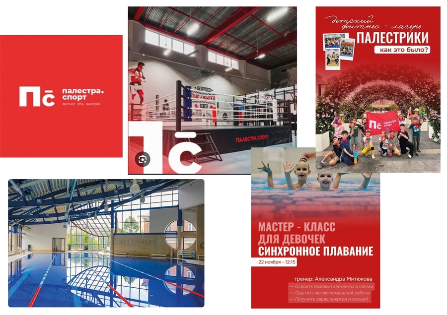
Original size 2281x1610
Research
I studied modern fitness brands and how young people choose a gym. Most of them use large, bold typography, high contrast, and images of people in motion. The new design had to feel dynamic and confident.Original size 2281x1610
Concept
The new style is built on speed and movement. A wide italic wordmark suggests a sprint, while warm orange conveys energy and light blue evokes the pool. I tested several Photoshop logo sketches, ranging from a strict geometric design to a fast italic one.Original size 2281x1390
Solution
The new identity encompasses a logo, a color palette, typography, and graphic elements.Original size 2281x1610
Original size 2281x1610
Application and Results
Here is how the new style works on wristbands and T-shirts. Result: a club that speaks to young people while remaining welcoming to its regular visitors.
02 Aquarium
Beer packaging and city merchandise for Nizhny Novgorod
Task
Aquarium is a beer brand from Nizhny Novgorod. Each flavor tells its own story, inspired by local symbols, place names, and city imagery. Every can needed its own unique accent and color, yet the entire line had to maintain a cohesive visual identity. The second part of the project was city merchandise that captures the spirit of Nizhny Novgorod and its heart, the Kremlin.Research and Concept
I gathered local symbols and locations: the Nizhny Novgorod Kremlin, the city’s Soviet mosaics, and the local Khokhloma pattern. One system, many stories: every can features the same distorted logo and layout, while each flavor receives its own vibrant color and a softly rendered silhouette of its main ingredient.Solution
A series of cans, each with its own color and narrative.Original size 1412x759
Merchandise and Outcome
City merchandise: a tote bag, a plate, and a pen featuring the Kremlin and a red Khokhloma pattern, along with an NH logo for the city. Outcome: a beer line that functions as a small guide to the city.Original size 1412x759
03 Tune Tonic
Soda Packaging Inspired by Music
Task
Tune Tonic is a soda brand where each flavor aligns with a music genre, evoking bright associations. My task was to design packaging that visually reflects the aesthetic of each genre.Concept and Solution
Flavor = genre: strawberry is pop music, lime is techno, and blueberry is rap. Every can features the same tall, condensed logo, with the genre and flavor written above it.Original size 1412x759