Communication Theory: VITREO

Communication theory in the design field
Communication theory defines design as the process of creating and transmitting messages, where semiotic and rhetorical traditions (according to Robert Craig’s classification) emphasize the role of signs and beliefs in shaping perception. In design, communication works through models like Berlo or Emmert-Donaghy, where context, elements (color, shape, text), and feedback ensure that the audience interprets meaning, turning the product into a tool for social dialogue. This is especially true for branding, where objective (tested hypotheses of influence) and interpretative (value matching) approaches help to overcome noise and achieve an emotional response.

For VITREO, the general theory of communication allows to position the brand as a reliable partner in solving skin problems, using visual codes to convey the ideas of purity and protection. This approach integrates the cybernetic tradition, transmission channels, with the phenomenological one, consumer experience, ensuring the unity of form and content.
VITREO packaging communicates the solution of skin problems, minimizing the «noise» of competitors and enhancing brand identity through omnichannel strategies. The positive perception grows due to feedback: consumers interpret minimalistic design as premium protection, increasing loyalty. This turns the product into a symbol of caring, where communication theory bridges the path from identity to image.
Presentation for a general audience
Vitreo is a Italian skincare brand created for skin prone to rashes, redness and sensitive to high humidity. The formulas are based on Sicilian citrus extracts and vitamin C: hydration, regeneration, protection from inflammation and tone leveling. The name «VITREO» (meaning «glassy» or «vitreous») reflects the core promise: skin as clear, smooth, and radiant as glass.
Key Visual
- Simplified drawing of different types of citrus fruits: oranges, lemons and limes - A custom font, drawing inspiration from the intricate beauty of stained glass - Bright colors paired with white connect the natural zest of citrus with the clean, sophisticated aesthetic common in premium skincare brands - Light, «sunny» shots of coastal Italy: lemon groves, seashore at sunset, textures of water and drops of moisture. - Emphasis on natural ingredients (citrus fruits), clean modern packaging and visual metaphors of restoration (water films, soft light).
Italian care based on Sicilian vitamin C — protects, restores skin and evens out tone, adapting to high humidity and seasonal variations
Target Audience
Young adults 20-35 years old (women and men) who care for the skin and are looking for a combination of scientific efficiency and aesthetics. They value regular care, prevention, protection from UV and scar healing.
Attributes - Affordable, soothing, protective, moisturizing, regenerating Benefits - An effective skin care product enriched with citrus extract and vitamin С Personality - Young, bright, creative, bright Brand’s core «Italian cosmetics based on citrus fruits»
Core Values
Heritage & Nature: We celebrate our Italian roots by using local Sicilian citrus extracts, grounding our science in the natural wealth of our land.
Transparency: Like our name suggests, we believe in transparency—both in our ingredients and in the results we promise.
Vitality: We believe skincare shouldn’t just repair; it should energize. Our «Re-Vive Your Skin» philosophy is about empowering you to face the day with confidence.
Presentation for professional audience
The Core Metaphor & Visual Identity
The visual identity of VITREO is built upon a dual metaphor that bridges the brand’s Italian heritage with its active ingredient (Vitamin C/Citrus).
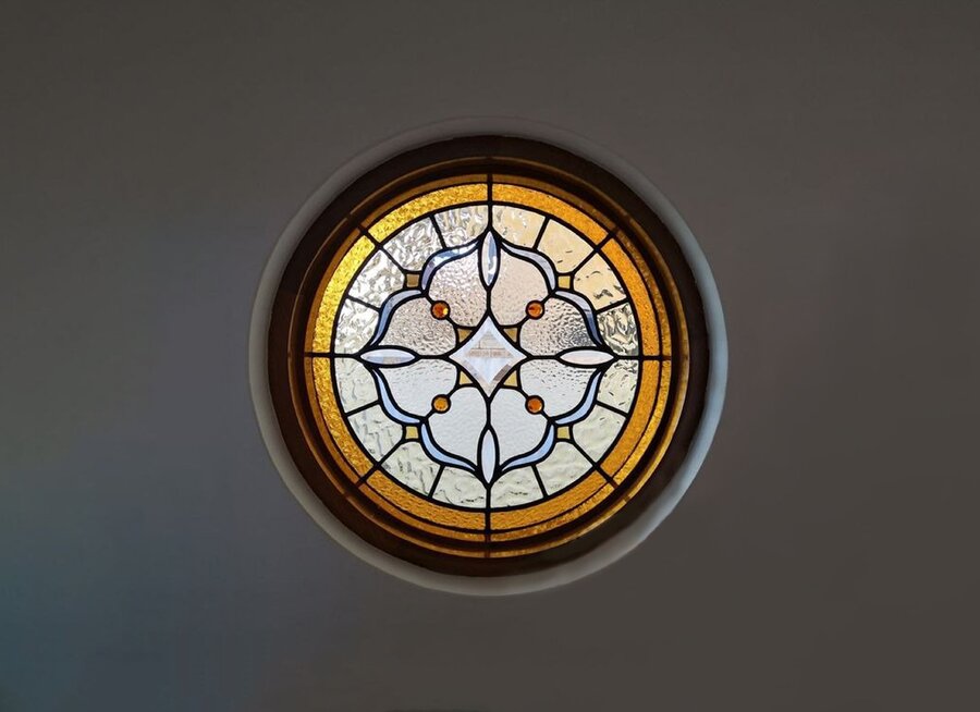
- Logomark Construction: The logo is a geometric synthesis of a citrus slice and a Gothic stained glass window (Rosette) typical of Italian architecture (specifically referencing regions like Florence and Venice).
- Grid System: The mark is constructed on a radial grid, maintaining equal weight between the internal «segments» to ensure scalability from small print to large signage.
- Typography: A custom display typeface was developed for the brand. It features high-contrast strokes with sharp, incised terminals that mimic the precision of glass cutting while retaining a modern, fashion-forward aesthetic.
- Color Palette: The primary palette is energetic, utilizing a saturated Orange (FF7F00) and Yellow (FFD700) to signal Vitamin C content, anchored by high-contrast Black and White for premium positioning.
Packaging design
Materials: Preference is given to recyclable, environmentally friendly materials that emphasize the sustainability and usefulness of the brand.
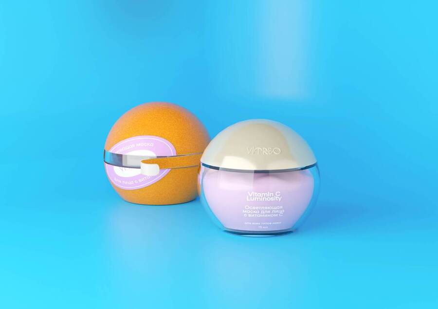
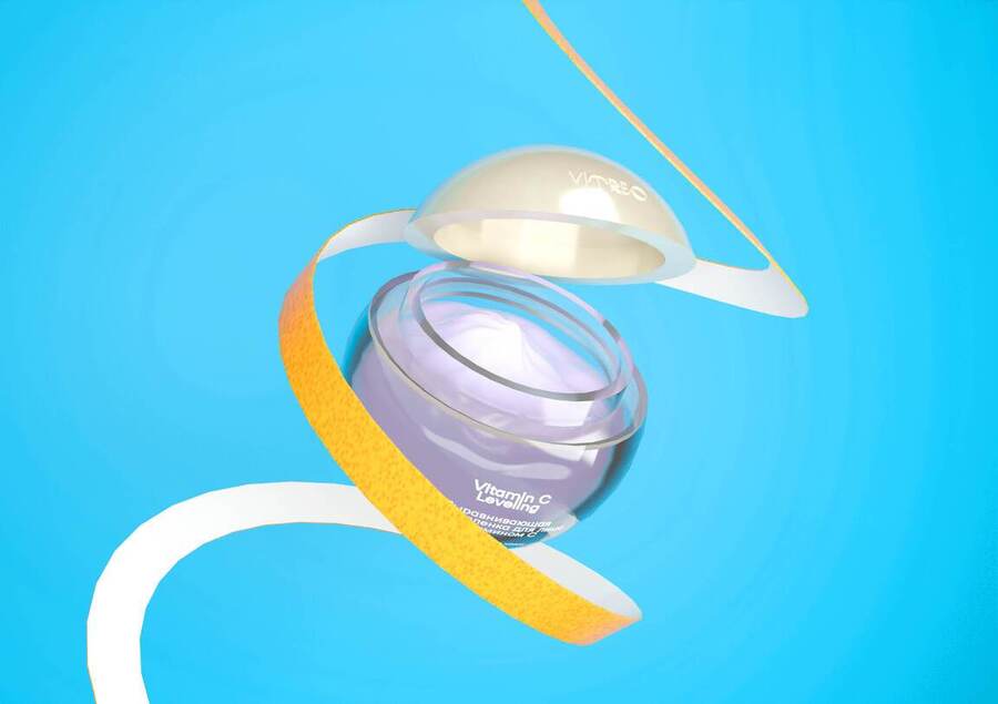
Design: The outer packaging is designed to be removed in segments, replicating the sensory experience of peeling an orange. This creates a ritualistic unboxing moment for the consumer. There are five ways to open the package, each method corresponds to a separate cream and a separate color to differentiate the models in the line. Modular grid system supports AIDA (Attention-Interest-Desire-Action) flow, with citrus motifs as repeatable patterns for adaptations for different lines. Once «peeled,» the inner jar is revealed as a spherical unit containing the product. This shape breaks the shelf monotony of standard cylindrical jars.
Brand Integration & POS Materials
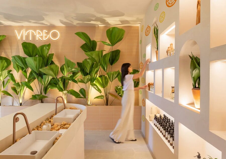
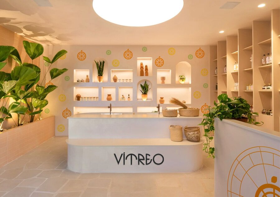
The design system extends beyond packaging into physical and digital touchpoints, ensuring a cohesive brand environment.
- Digital Integration: The website utilizes the radial grid of the logo for navigation elements and product display, reinforcing the «stained glass» motif.
- Merchandising: In-store displays utilize the spherical packaging to create geometric stacking patterns, mimicking fruit displays in Italian markets but with a clean, clinical finish.
- Ad Campaign: OOH (Out of Home) advertising utilizes extreme close-ups of the «Peel» texture and the typographic elements, focusing on the slogan «REVIVE YOUR SKIN» overlaid on high-fashion photography.


How it works from the point of view of communication theory
- Encoding/ Decoding (Stuart Hall): the brand encodes the message as «scientific + natural + Italian» (a combination of the provable properties of vitamin C and the image of the place of origin). When forming content, we lay down the dominant reading (trust, security, efficiency) and at the same time provide for possible negotiation/opposition decoding (for example, doubts about «naturalness» or effectiveness)
- Framing & Agenda‑setting: VITREO focuses on the climate problem (high humidity, temperature fluctuations) and shows the brand as an expert solution, thereby forming the «climate—adapted care» agenda and the «prevention + recovery» framework.
- Two‑step flow / Opinion leaders: we use opinion leaders (dermatologists, cosmetologists, local beauty bloggers) to increase distribution and trust.
- Rhetoric (ethos, pathos, logos): ethos — confirmation by expertise/certification; logos — scientific facts about vitamin C and hydration; pathos — visual stories of confidence and ease of life in coastal regions.
How communication theory formed the basis of the project
VITREO’s strategy blends three key ideas from communication theory, linking academic concepts to real-world skincare branding for Italy’s humid coasts.
1. Theoretical Foundation: The Elaboration Likelihood Model (ELM)
To ensure the packaging not only stands out on the shelf but also convinces the consumer to purchase, the strategy relied heavily on the Elaboration Likelihood Model (ELM). This theory suggests there are two routes to persuasion: the Central Route (logic, facts, ingredients) and the Peripheral Route (visual cues, emotions, attractiveness).
- Peripheral Route Strategy: The packaging’s vivid orange color and unique spherical shape serve as strong «peripheral cues» to trigger an immediate emotional response—energy, freshness, and citrus—before the consumer even reads the label. The «peeling» unboxing experience acts as a sensory hook, bypassing logical skepticism to create instant delight.
- Central Route Strategy: Once attention is captured, the «Central Route» is engaged through the clinical positioning of the Vitamin C content and the specific skin benefits (e.g., «Regenerating,» «Whitening») displayed on the inner jar. This appeals to the «motivated» consumer looking for actual efficacy against acne and humidity.
2. Research Basis: The «Humidity» Gap
The strategy was grounded in specific environmental and demographic insights regarding the Italian market:
- The Environmental Problem: Research identified a specific pain point for residents of Italian coastal regions (Venice, Florence): high humidity (up to 78-85%) combined with seasonal temperature fluctuations causes specific skin issues like breakouts and redness.
- The Competitor Gap: Analysis of competitors like Acqua di Parma and Borghese Roma revealed they focus largely on «luxury spa» or «body/hair care» positioning, often at a very high price point. There was a lack of a «youthful,» «bright,» and «facial-focused» brand that specifically addressed the humidity/acne niche for young adults.
3. Making Friends with Practice: Visual Rhetoric & Semiotics
To bridge the theory and research into a tangible design, we employed Visual Rhetoric and Semiotics—the study of signs and symbols.
- The «Stained Glass» Metaphor: We needed a symbol that communicated «Italian Heritage» without being old-fashioned. We selected the Rosette (Gothic stained glass window), a cultural signifier of Italian architecture (Venice/Florence).
- The «Citrus» Synthesis: By visually merging the geometric grid of the Rosette with the anatomy of a citrus slice, we created a new logomark. This visual synthesis acts as a rhetorical device, instantly communicating the two core pillars of the brand: Italian Tradition + Vitamin C Efficacy.
- Structural Storytelling: The decision to make the packaging peelable was an application of the Narrative Paradigm. Instead of just «using» a product, the user enacts a mini-story of «picking and peeling a fruit», transforming a routine skincare step into a tactile ritual that reinforces the brand’s natural origins.
Communication Theory: Bridging Academia and Practice (URL: https://edu.hse.ru/course/view.php?id=133853)
Student project Italian brand of skincare VITREO || HSE DESIGN URL:https://hsedesign.ru/project/d8ac350e89f34d388dd1fb6d627a9284) URL:https://hsedesign.ru/project/d8ac350e89f34d388dd1fb6d627a9284)

