
Communication strategy: BOTTLE REMEDY
1. Author’s Reflection: How Communication Theory Operates in Design and Contemporary Art
2. Brand Presentation for a Broad Audience (General Public)
3. Brand Presentation for a Professional Audience Brand Concept
4. How Communication Theory Became the Basis of the Project
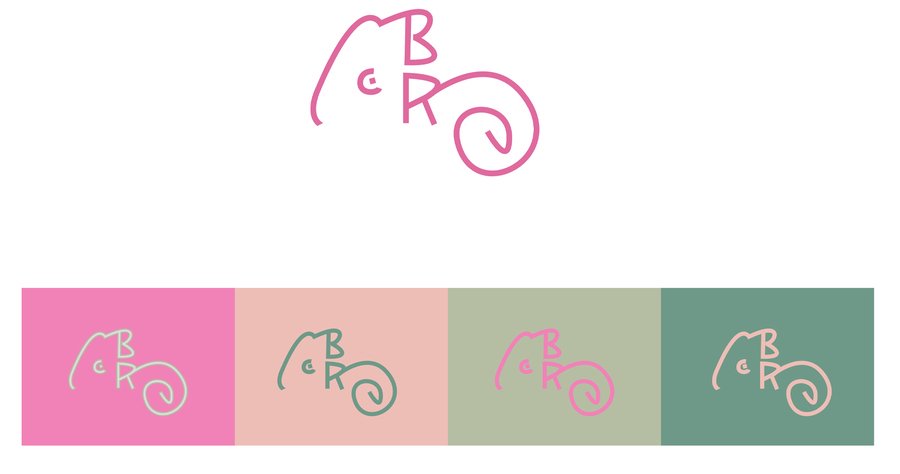
Logo
Fonts
1. Author’s Reflection: How Communication Theory Operates in Design and Contemporary Art
The contemporary concept of communications in design is no longer a visual conveyance of messages but, rather, the development of a system of signification, making it possible for the viewer to decode a product via emotions, cultural codes, metaphors, and experiences. In modern times, design is now a language that has a grammar of its own, namely form, colors, fonts, textures, symbols, which are transformed into messages. In semiotic theory, graphic design elements can be considered as messages that carry meaning, such as denotations, as well as connotations. Communication theory explains this phenomenon as a process of message transmission from sender to receiver, but interpretation plays a very significant part in design. The viewer is not merely decoding form but is actually assigning layers of meaning according to his/her sociocultural practices, experiences, etc. The designer is thus creating a paradigm within which a message is either clearly understandable or, on the contrary, readily susceptible to interpretation.
Brand idea
In the Bottle Remedy brand, visual communication occurs through:
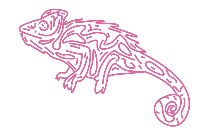
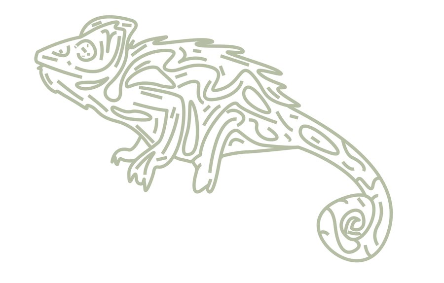
The Chameleon Metaphor The chameleon is used because of its capacity to change color, texture, and mood—it is a direct visual metaphor for what the product does (tanning, shining, matting, roughness, highlighting). The chameleon is a semiotic sign that is recognized in an instant as a transformation marker.
Visual form
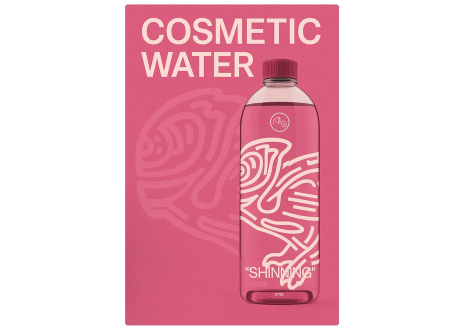
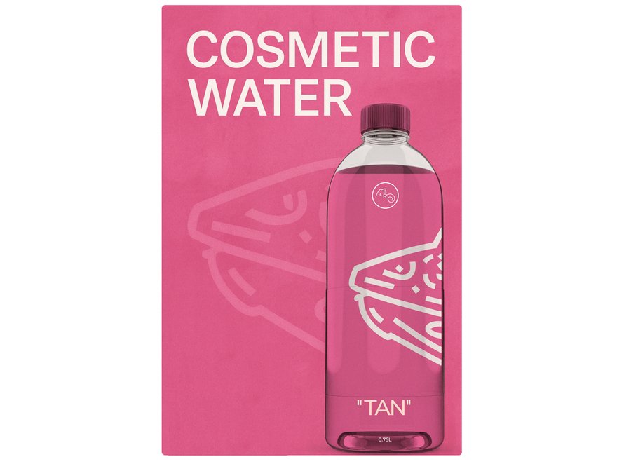
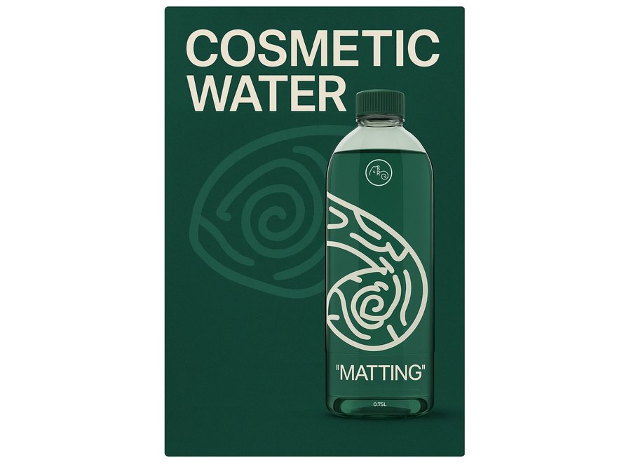
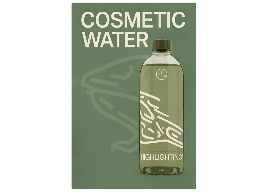
Color Codes: Every product is characterized by a palette that corresponds to the effect: — Tan — Soft Pink Tan — Shinning — glow with semi-transparent hues — Roughness — matte, textured tones — Accenting — light, airy colors — Matting — deep green, matte colors Such color palettes serve as a language that is structured in a visual form, making identification easier.
Colors
Sensory And Tactile Codes The textures on bottle labels are linked to corresponding effects, such as shine with high-gloss, matting with a velvety coat, and so on. It extends the means of communication from the visual to touch, thus forming a semiotic system that is multi-sensory. Communication theory enables the designer to develop a consistent system of signs wherein every element, whether color, shape, texture, or type, is a message that enhances the brand’s value proposition.
Effects
2. Brand Presentation for a Broad Audience (General Public)
Brand presentation
BOTTLE REMEDY — Cosmetic Water That Transforms Your Appearance.
We all want to change — to look brighter, fresher, more confident. Bottle Remedy is a series of therapeutic cosmetic waters that enable you to temporarily change your skin condition safely. It is a product that brings together the functionality of cosmetics with the emotional attribute of make-up.
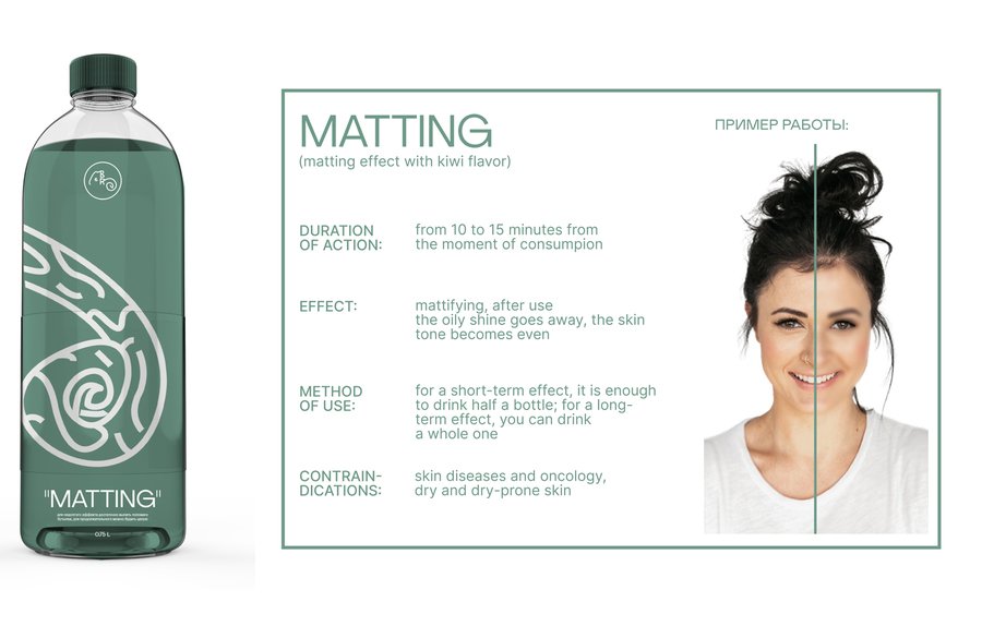
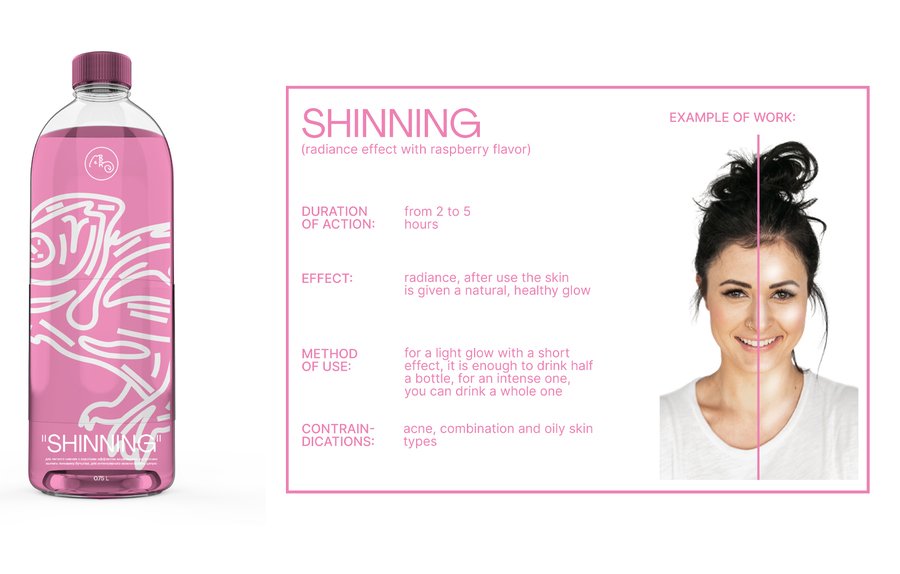
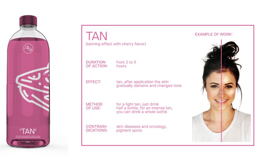
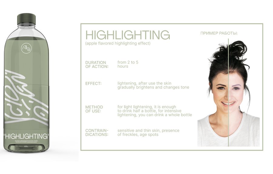
What sets BOTTLE REMEDY apart from Fast and controlled effect (2-5 hours).
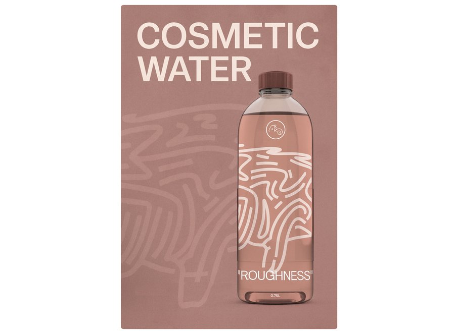
Five methods of transforming the skin: tan, shine, brightening, mattify, roughness.
Delicious fruit-based formulae that are a pleasure to use. Textured labels — so that you can see and feel the result beforehand.
Who is the brand for? The intended audience consists of individuals who: — love changing their appearance — want an instant visual effect — engage in experimentation with appearance with no serious long-run repercussions Examples: young mothers, actors, creative teenagers.

3. Brand Presentation for a Professional Audience Brand Concept
By Bottle Remedy is a line of products which has a modular structure, with a common metaphor of skin transformation.
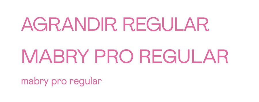
1. Communication Image — the Chameleon symbol of transformation expressive skin texture recognizable silhouette «flexible interpretive potential The bottle design is generated from the chameleon’s silhouette, which is very minimal, modern, and contemporary. 2. Style Constants Typography: Agrandir (Latin), Mabry Pro Color schemes dictated on a product-by-product basis. Illustrative, chartlike sign language generated from chameleon imagery 3. Communication Message The overriding theme is that of controlled transformation, where skin can transform into anything, similar to a chameleon changing colors. This is underscored by the use of rhetorical devices such as contrast (before/after), sensory description, and emotive framing. 4. Product Design: Sensor-Based Branding Textured labels provide a multi-sensory experience boosts engagement, improves product recognition 5. System Approach The product line is organized in a way that makes any grouping of bottles look cohesive as a unit.
Assembly options
Posters
Posters
4. How Communication Theory Became the Basis of the Project
The project uses theories from visual, marketing, and digital communication.
1. Metaphorical Communication The chameleon is a sign with a universal meaning of transformation that works as a cognitive metaphor. 2. Multimodal Communication It employs visual (color, shape, design), tactile, and gustatory (scent of fruits) modes of engagement. 3. Encoding/Decoding Theory (Stuart Bottle Remedy supports the «preferred meaning»: «Beauty is play, experimentation, expressive freedom.» «Beauty is play The consumer decodes this message based on context. 4. Visual Syntax Brand elements are used as constituents of visual grammar: color = meaning texture = effect illustration = metaphor typography = Structural Logic 5. Symbolic Interaction Theory It establishes a sense of affiliation with individuals who are interested in playing with their image. 6. Critical Communication Perspective (new) Bottle Remedy is also a product of the ideology inherent in contemporary beauty culture, which is that of a need for instant, reversible change. Additionally, the project is aware of how consumer identity is constructed through aesthetics. 7. Digital Rhetoric (new on different online platforms, the brand’s convincing tactics, such as visual identity, emotional connections, and sense language, enhance recognition to be adaptable on social platforms. which is that of a need for instant, reversible change. Additionally, the project is aware of how consumer identity is constructed through aesthetics.
Hall, S. (1980). Encoding/Decoding. In Centre for Contemporary Cultural Studies (Ed.), Culture, Media, Language: Working Papers in Cultural Studies, 1972-79 (pp. 128–138). London, UK: Hutchinson.
Barthes, R. (1972). Mythologies (A. Lavers, Trans.). New York, NY: Hill and Wang. (Original work published 1957).
Kress, G., & van Leeuwen, T. (2006). Reading Images: The Grammar of Visual Design (2nd ed.). London, UK: Routledge.
Cobley, P. (Ed.). (2010). The Routledge Companion to Semiotics and Linguistics. London, UK: Routledge.
McLuhan, M. (1994). Understanding Media: The Extensions of Man. Cambridge, MA: The MIT Press. (Original work published 1964).
The project is based on materials from the Communication Theory course. entrance examination student Golenkova Valeria.
Chat gpt for creating industrial items.


