Using Communication Theory in our project
In our course we’ve discussed that a medium is essentially a message in itself. Examples like books and newspapers demonstrate this (Griffin, 2009). But can a scent also be considered a message? Absolutely. Each new medium creates a unique «symbolic environment» with distinct sensory effects that reshape our perceptions, behaviors and social dynamics more profoundly than the actual content it delivers. The form of a medium often influences society and individuals more than the information it conveys. (Griffin, 2009)
For animals, a sense of smell is their primary language — no words, just scents conveying meaning. I see smells as a kind of «hot media» — immediate and direct. If someone smells unpleasant to you, it’s a quick signal that may prevent close contact, much like visual cues. Additionally, certain smells — for example, freshly cut grass or old books — can act as social catalysts, providing common ground for conversations with strangers. In this way, scents have become sophisticated tools of communication that transcend spoken language.
In the context of communication theory in design, design is realized as a means of transmitting information from the designer to the audience (from a sender to a receiver). For such communication, it is essential to consider various non-verbal means—such as the form, composition, color, lighting, and so forth. Communication theory assists designers in expressing what they wish to communicate in a more precise visual manner. This allows viewers to understand not only the product but also its significance through vivid and accessible imagery. The principles of communication help create a design that ensures a coherent connection between emotions, meanings, products, and their functional aspects.
Theory of communication not only improves understanding of the product and draws more focus to it but also provides insights into the target audience, helps find common ground, and influences the viewer. Moreover, it accelerates the process of reaching the necessary objectives.
Presentation for the general audience
Nowadays more and more people find themselves overcome with the feeling of nostalgia. As the world around us changes faster than ever, sometimes all you want is to go back to being a carefree kid — when you didn’t have to worry about difficult things and could spend the whole day watching cartoons and reading fairytales.
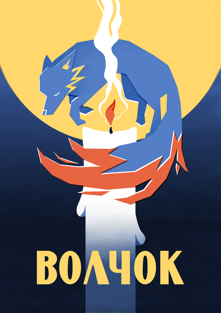
Our product — organic fairytale-based candles «Volchok» — specialises in embracing this nostalgia, and while time-travel doesn’t exist yet, with our candles you will find a way to feel like you’ve returned to this era — all the while becoming more relaxed and in tune with your inner child.
Every candle in our collection is unique. Each scent is dedicated to a different fairytale, with smells ranging from a comforting flower meadow to a grounding cedar tree near the lake or even a sweet symphony of the Flame-Bird’s apple orchard. These candles are designed to bring back memories from your childhood, allowing you to dive into a world of fantasy and magic once again.
Our customers can also fill in a suggestion form to help choose our newest scents — if there is a particular character or story you want to see, submit your idea to us and it might become the very next candle in the «Volchok» collection.
Of course, our candles aren’t just for adults to enjoy. Children of all ages are welcome to join the fragrant world of fantasy — expand the atmosphere of their favourite stories with a scent that will make them feel like they are a part of the fairytale!
«Volchok» candles have a special safety lid on top, which allows the time kids spend together with their favourite characters to be both safe and fun.
As we have a wide variety of different scented candles, everyone can find something for themselves. Our product is made out of 100% beeswax — a natural and safe hypoallergenic material, and it can burn for up to 70 hours. «Volchok» is a healthy alternative to many other candle brands, as we don’t use synthetics (ie: paraffin wax and synthetic fragrance oils) in our product.
The designs we use for our candles are bright and easily recognizable for children, with the packaging that stands out and feels inviting at the same time. Our brand is also starting a new merch lineup with everyone’s favourite fairytale characters that you can buy along with the candles. At this moment you can purchase special stickers, matchboxes and good quality metal pin badges, as we plan on adding more products that bring people joy and the comfort of childhood memories.
Presentation for a professional audience
«Volchok» strives to engage with a broad audience. Our main goal is to create an eco-friendly product that is appealing both in its ingredients and its packaging. A design approach to our products is crucial to us, ensuring that customers enjoy not only using our candles, but also looking at them.
The main symbol of our brand is a wolf: the guide that creates a connection between generations. «Volchok»'s signature colours are blue, yellow and red. The Glaucous shade (537ec5), which leans towards blue, represents inner calm and concentration, while Medium Vermilion (e86441) — the colour that sits at the crossroads of red and orange — and Medium Yellow (ffd76d) are associated with fire and warmth, which our candles are meant to evoke.
Orange
A warm blend of red intensified with yellow, creating a vibrant hue. This mixture turns the internal energy of red into outward radiation — an expressive surge into the environment. Yet, red’s seriousness remains present within the orange, reflecting strength and conviction. It’s akin to a confident person, emanating health and vitality. The sound associated with orange is like a mid-sized church bell calling to prayer («Angelus») or a rich alto voice — deep, steady, and commanding.
(Kandinsky, V. (1992). On the spiritual in art. Moscow: Archimede)
Blue
The quintessential sky color. When deepened, it embodies tranquility and peace. When it approaches black, it reveals an aura of otherworldly sadness — an endless depth of concentration with no apparent end. Lightening blue grants it an indifferent, distant quality, reminiscent of a clear blue sky — lofty and detached. As blue becomes lighter, it grows more silent, until it reaches a state of quiet serenity — turning white. Musically, blue resembles the gentle melody of a flute; darker blue, like a cello; and as it deepens further, akin to the profound tones of a contrabass, evoking the majestic sound of an organ’s low notes.
(Kandinsky, V. (1992). On the spiritual in art. Moscow: Archimede)
Yellow
Yellow is a truly earthly tone — a bright, lively hue that cannot be deeply darkened. When cooled with blue, it takes on a sickly, unhealthy tint. Metaphorically, it’s like a depiction of madness: not sadness or melancholy, but unrestrained insanity — blind rage, chaotic energy that consumes everything around. It’s the fiery culmination of late summer, full of vibrant power but lacking in depth or calm.
(Kandinsky, V. (1992). On the spiritual in art. Moscow: Archimede)
The usage of these colors in candles' designs creates a captivating association: the nostalgic scent of childhood, the calming blue of the sky, the bold, striking orange and the warm yellow remind us of happy childhood moments and bring a feeling of serenity. Thus, both the scent and the color in the candles' packaging evoke powerful memories and emotions.
Corporate colours are used primarily for the design of common brand elements: advertising, posters, the website and additional merchandise — for example, metal pin-back badges, stickers and matchboxes. And due to the fact that the chosen colours are complementary to each other, they will look good on both dark and light clothing.
At the same time, the candles themselves feature additional illustrations and packaging, offering a wider range of choices for customers. Each product is individually designed with matching characters and a colour scheme that aligns with and highlights the main scent notes of the candles. For example, the packaging for a candle with herbal and woody notes is made in the darker shades of green, while a soft citrus and floral scent features lighter reds and yellows.
It is important to note that the «Volchok» brand strives to promote a nostalgic atmosphere of the past. That’s why all the colours have a rather muted, «time-worn» appearance to them. The printing method imitates the silkscreen technique, which creates small «imperfections» that give our product a more lifelike appearance.
Communication theory as basis for the presentations
Politeness Theory
Although the concept of «face» is primarily used in interpersonal communication, this theory is also applicable to brands. Since the «face» is a desired self-image, the identity we present to others, it allows us to create different approaches while maintaining the overall idea and image of the brand. We depicted our project in different ways, from different perspectives, highlighting specific features according to the desires and requirements of particular audience, while maintaining a single concept and not significantly changing the content.
Craig’s Traditions
Semiotic Tradition
— usage of specific vocabulary, images, signs and symbols according to audience. Colour coding in design elements to convey the desired feelings and associations.Cybernetic Tradition
— goal-orientated communication to sell and promote our product, feedback seeking questions.Socio-cultural Tradition
— focusing on human feelings of nostalgia through children national fairy tails.Rhetorical Tradition
— different approach to specific audience: more emotional and interactive to general public and logical for designers.Dialogic Theory
The dialogic theory expands on how having a dialogue with your audience (and potential customers) helps build a quality relationship with the public, majorly improving the reputation of the brand. Our project «Volchok» has a professional website which allows users to leave feedback for existing products and make requests for new candles. The «customer service» option on the website allows the audience to directly contact our brand to resolve any problems and have their questions answered. Also «Volchok» has social media on multiple platforms with regular updates on our progress, reviews left by customers and interaction-based posts, so our communication with the public remains 100% clear and there is always room for the constructive dialogue.
Griffin’s Theory
According to Griffin, the medium through which information is conveyed is already a message as it is. He references books, newspapers, radio, photography and cinema. Building upon this concept, we took it a step further. Griffin’s idea focuses on two human senses: sight and hearing. In our project, we develop this further by adding the sense of smell to the combination.
Communication Theory: Bridging Academia and Practice // edu.hse.ru URL: https://edu.hse.ru/course/view.php?id=133853 (дата обращения: 12.12.2025).
Kandinsky, V. (1992). On the spiritual in art. Moscow: Archimede: https://orloffmagazine.com/content/ottenki-kandinskogo-hudozhnik-o-cvete (дата обращения: 12.12.2025).
Irina Danikova’s personal study project — https://portfolio.hse.ru/Project/177444


![[афро.гард] синтез культур](https://files.mediiia.ru/projectimages/1840/b10300e999984ba8806ed34212786c13/726d2ccb4c1b4e00ba2ed9940065ea75220x314.jpg "[афро.гард] синтез культур")