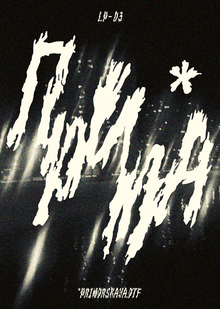
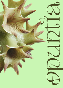
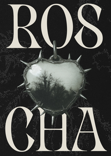
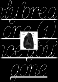
Original size 1464x2066
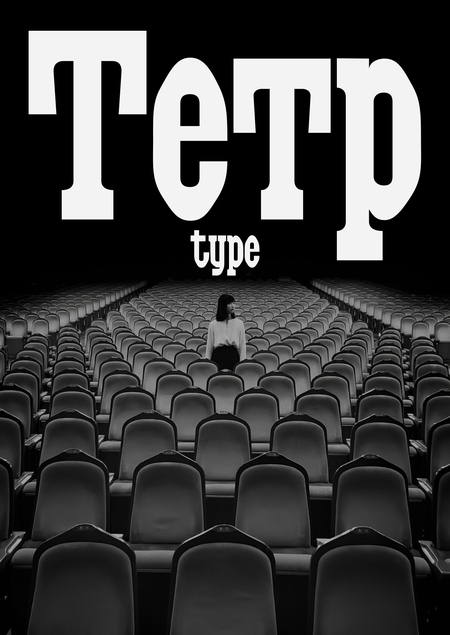
TETR
Longread translated automatically
Original size 1920x1080
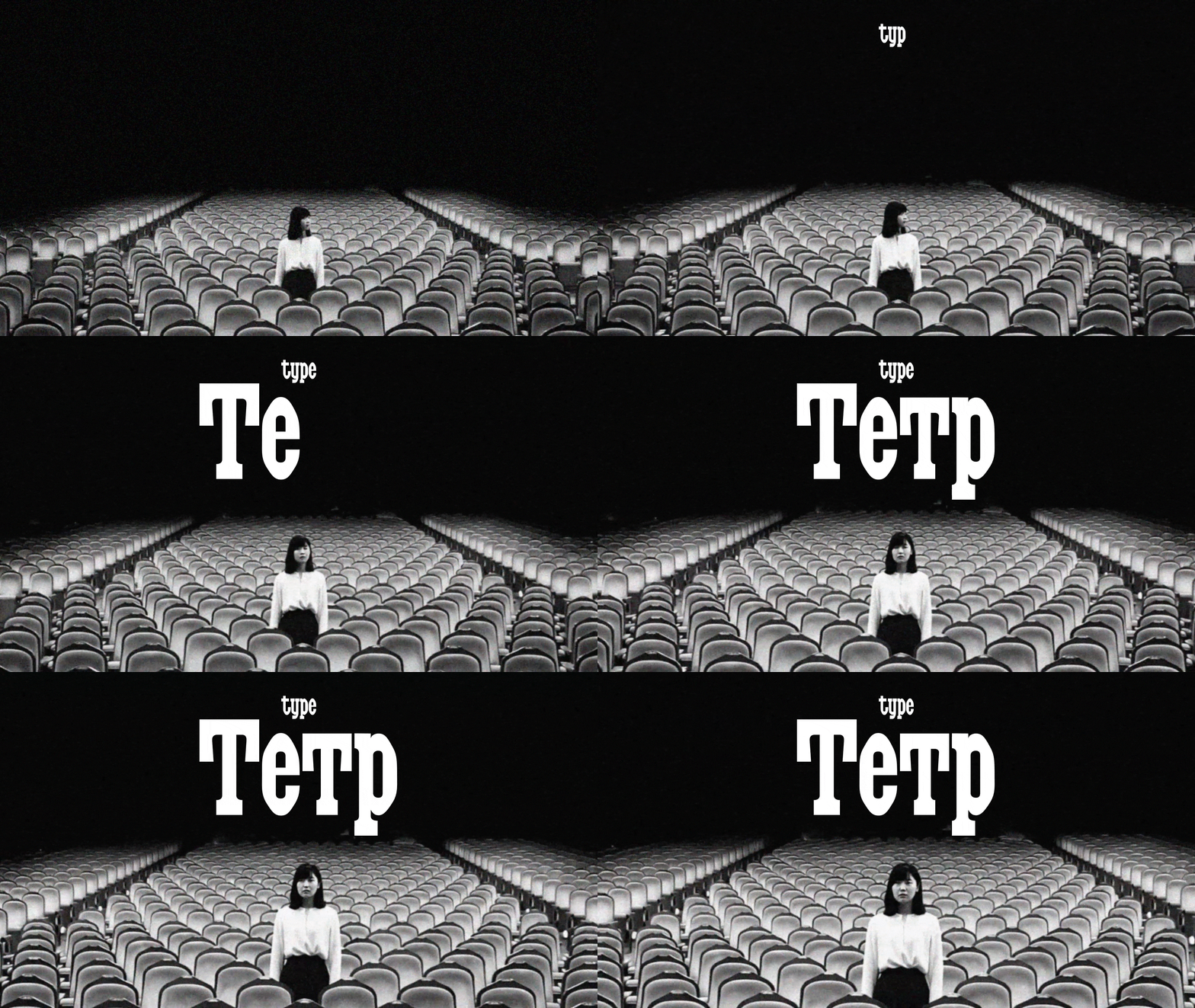
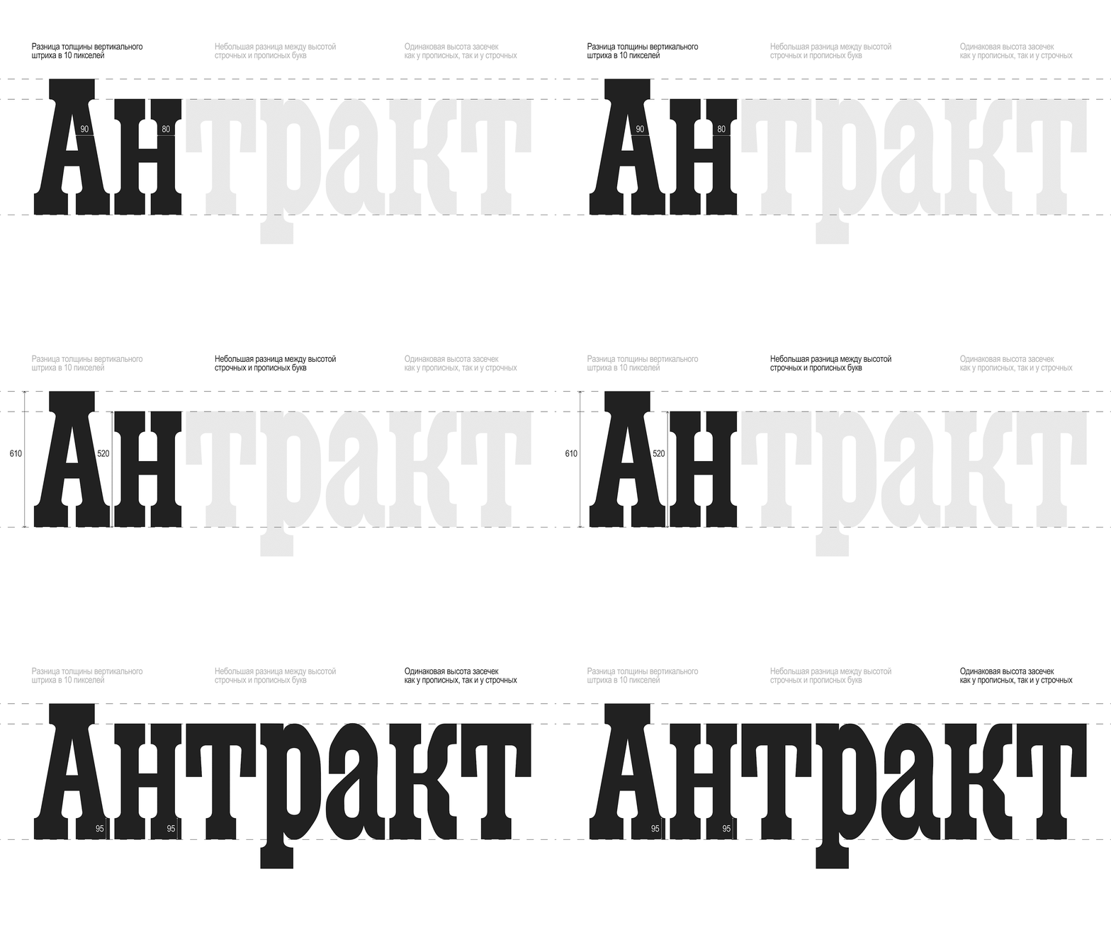
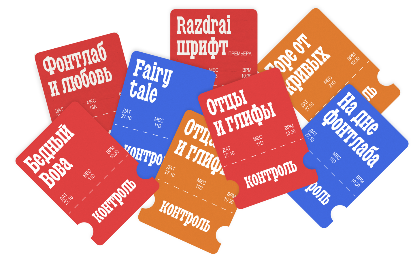
The project’s key objective, inspired by Maxim Zhukov’s work, was to take a new look at the script, keeping the Soviet aesthetics and the emphasis on powerful hits.
Original size 1920x1080
Original size 4156x2707
Original size 4156x2338
The font chip is «circular scraping» in oval signs.
Original size 4156x2338
Original size 1920x1080
Original size 4156x2338
Original size 4156x2338
Original size 4156x2338
Original size 1920x1080
Original size 4156x2338
Original size 4156x2338
Also as part of the discipline, a «smart version» of the typeface was created, simulating the «Teter» subterraneans.
Original size 4156x2338
Original size 1920x1080
Original size 4156x2338
I thank Vova Anosov and my friends for helping me with the project!
More projects in font
We use cookies to improve the operation of the HSE website and to enhance its usability. More detailed information on the use of cookies can be fou...
Show more
