ABOUT
Research. Concept.
Visual direction.
I’m Fedor Kuznetsov, a communication design student at HSE University.
I connect research, brand strategy, and graphic design to build coherent visual systems.
I’m seeking an art direction internship at a branding studio, where I can develop concepts and learn from an experienced team.
APPROACH
Structure makes room for creativity.
Structure connects the brief, the idea, and the final design. I start with the audience, define a concept, and then set rules for typography, color, and imagery.
Three projects demonstrate this approach—a student film event, a bakery brand, and a cultural initiative.
RESEARCH → CONCEPT → SYSTEM → EXECUTION
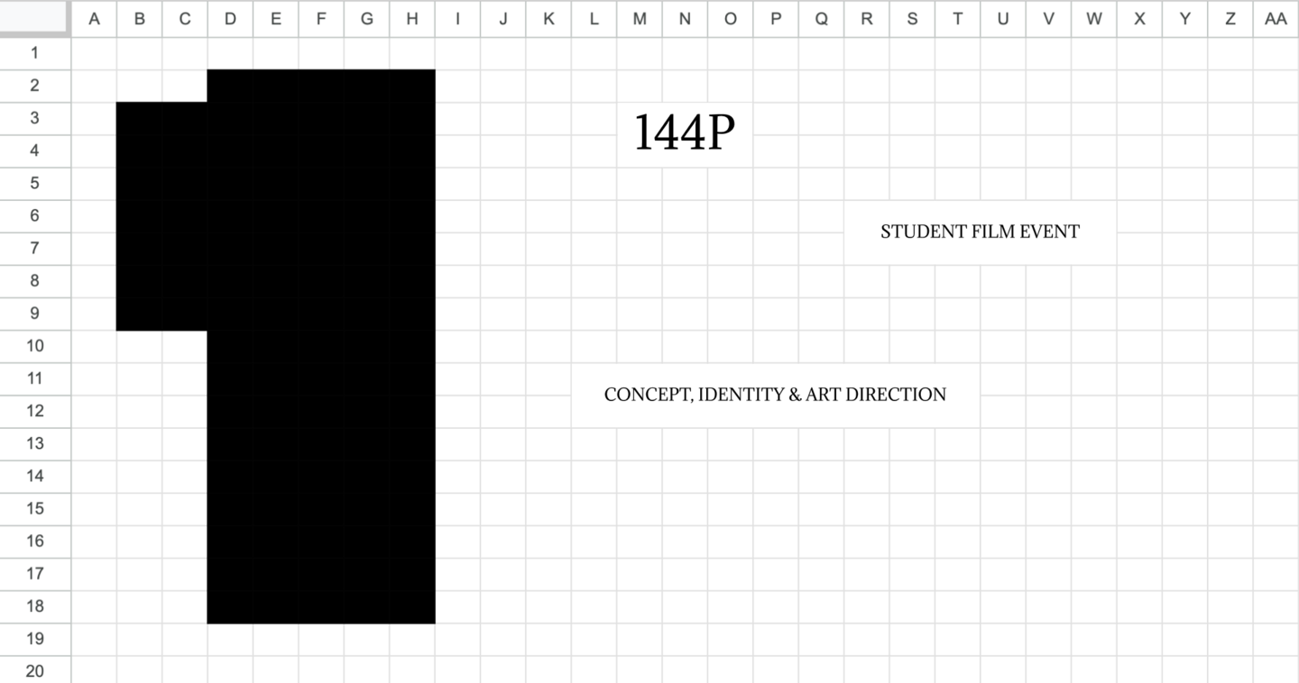
Two weeks to give a film event its own identity.
The brief: create a visual identity for a student film screening at HSE Art and Design School in Nizhny Novgorod.
The challenge: develop a recognizable visual language across print and digital communication, delivered in two weeks.
One event. Many perspectives.
Cameras, lenses, and varied perspectives form the visual concept. The name 144P captures the imperfect, direct energy of student films.
Repeated viewing angles became a graphic device that holds the identity together across formats.
From a Visual Idea to an Event for 65 People.
I developed the concept and logo, art-directed the team, and helped prepare the event’s print and digital materials.
From tickets and a program to posters and social media, the identity brought a coherent visual language to an event for 65 people.
A bakery built around
shared rituals.
Happiness Is is an academic branding project for a bakery chain in Nizhny Novgorod, spanning research, naming, positioning, and identity.
I built the brand around family warmth and the time shared around the table.
Make generosity visible.
The original Russian name, Schastye Est, plays on two meanings of est: exists and to eat. It connects happiness with food and shared moments.
Imagery of abundant bread makes generosity visible. Blue and expressive typography distinguish the brand from familiar beige-and-brown bakery identities.
One direction across the whole brand.
I conducted the research and developed the positioning, name, slogan, and identity.
In a single month, I designed packaging, posters, social content, and merchandise, and created printed packaging prototypes.
The result: a coherent brand system that translates strategy into visual decisions.
Revealing a city’s hidden layers.
Tochka 190 is a cultural initiative in Pushchino, a Russian science town. It connects science, culture, nature, events, and local communities.
The task: to organize these activities into a recognizable system and help people rediscover the city.
A scientific process
becomes a visual metaphor.
The core idea: Tochka 190 reveals the city. Chromatography separates components and makes them visible—a metaphor for the city’s different layers.
I translated this principle into color, fluid graphic forms, and typography.