I’m Zlata Tevs, a visual systems designer.
I build identities as systems: modules, rules, and patterns that remain consistent across a fence, a coffee can, or a phone screen—so the team doesn’t have to redraw every poster from scratch.
I work across graphic design, interfaces, and 3D, choosing the right tool for each task.
A 4th-year Communication Design student at HSE Art and Design School. Looking for a team at a branding studio.
★ Projects 1st place — identity design for the Botanical Orangeries (currently in implementation) Museum of Moscow — poster for the Typography DAFES exhibition 2nd place + 5 shortlists — DAFES competitionSkills Figma · Illustrator · InDesign · Photoshop · Illustrator · After Effects · Blender · Tilda · Processing
Here’s how one of these systems grew from five small shapes.
Botanical Orangeries
Arkhangelskoye Museum-Estate · Brand identity · 2026
1st place in the identity competition
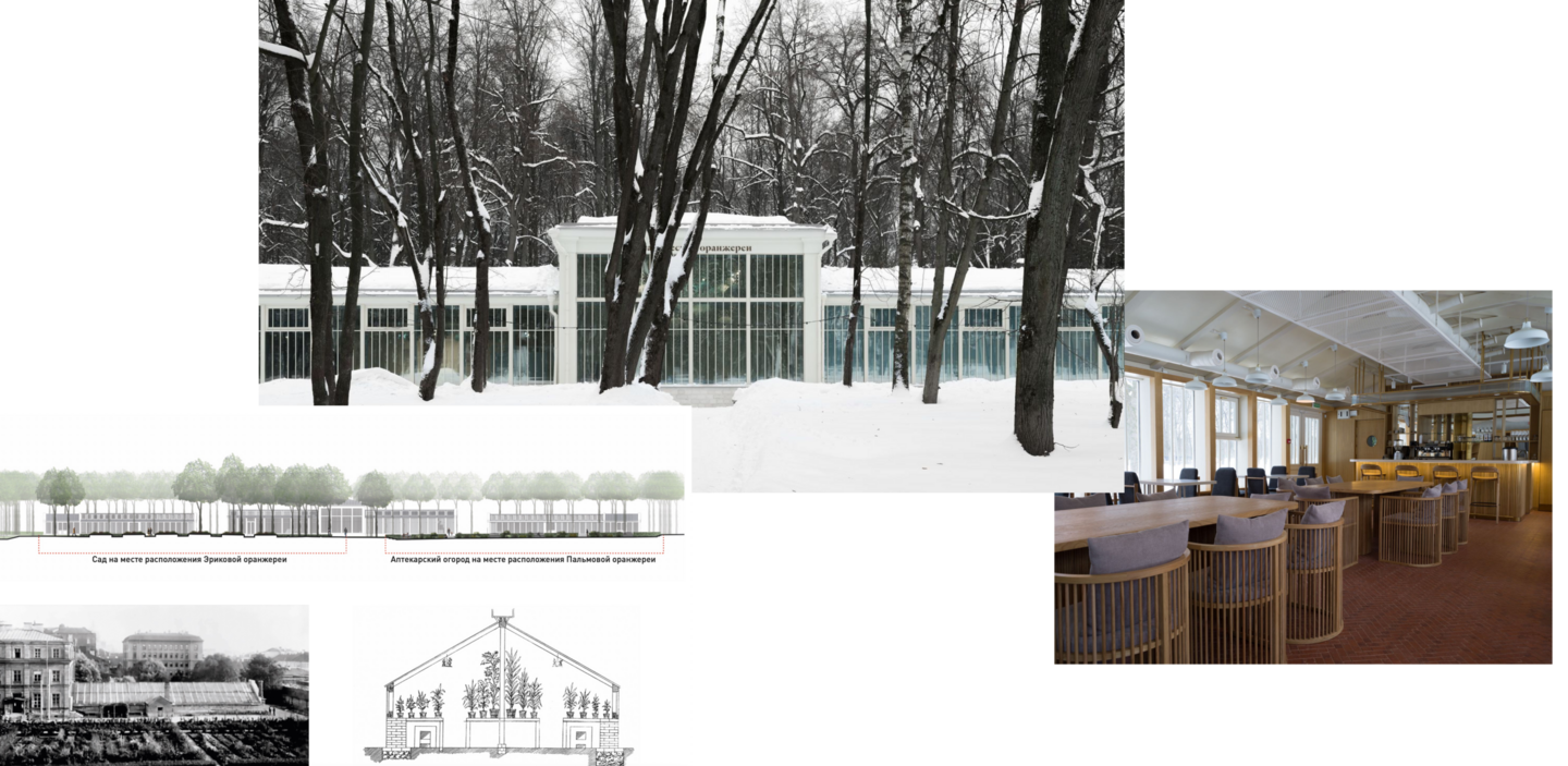
The historic orangeries of Arkhangelskoye are transforming into a cultural center hosting exhibitions, films, lectures, and kids' programs. Few people know it exists. The task: to develop a single visual language that unites heritage and new formats. The catch: no literal depictions of plants.
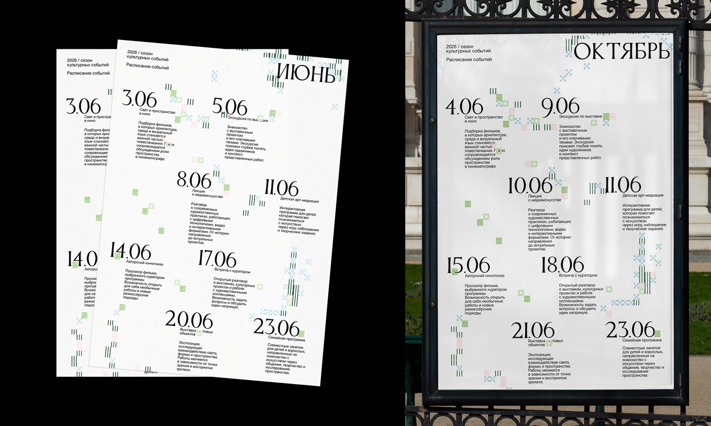

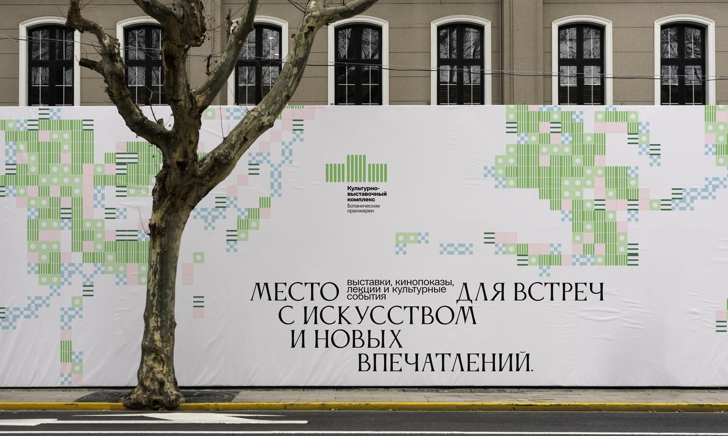
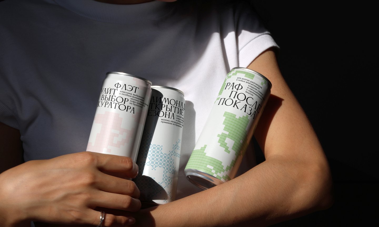
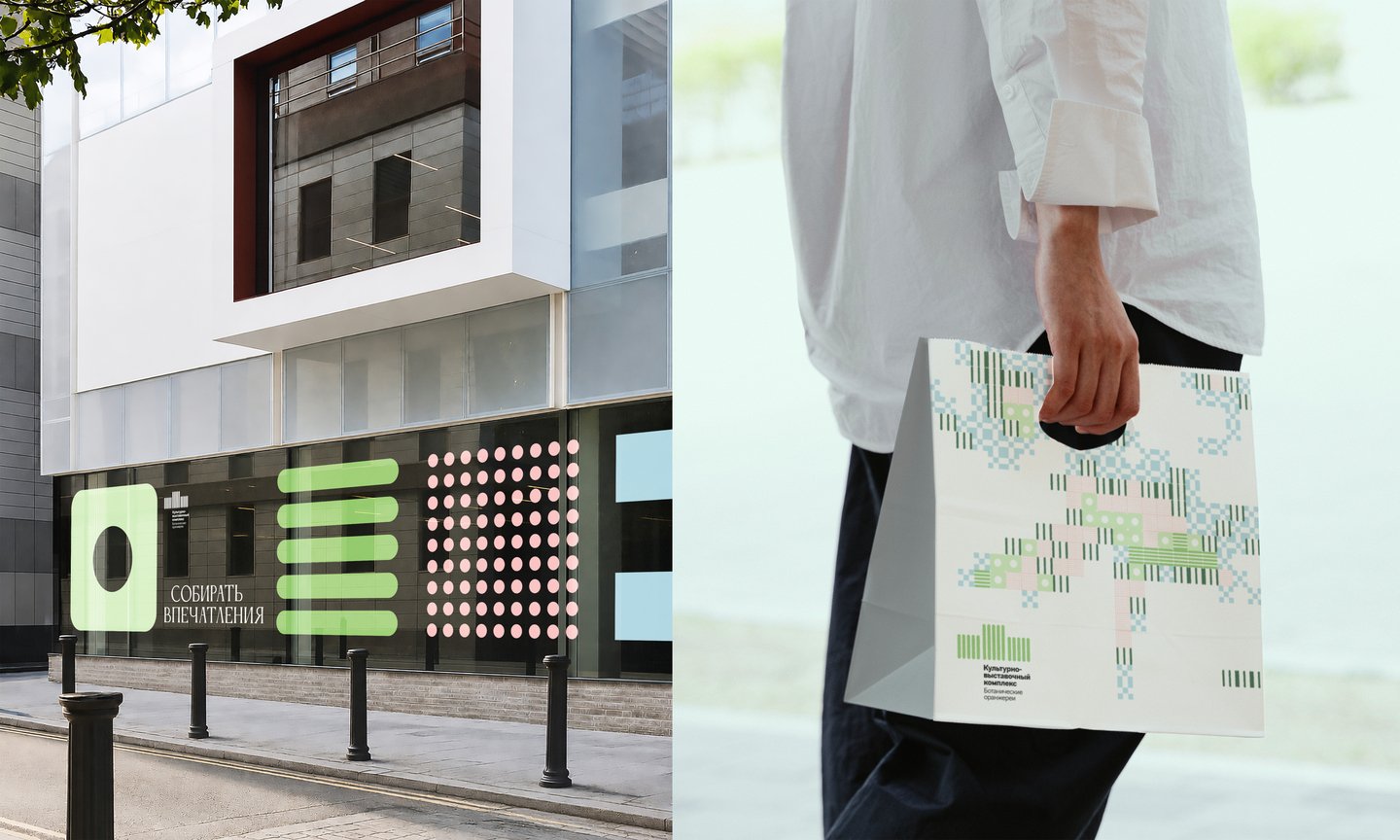
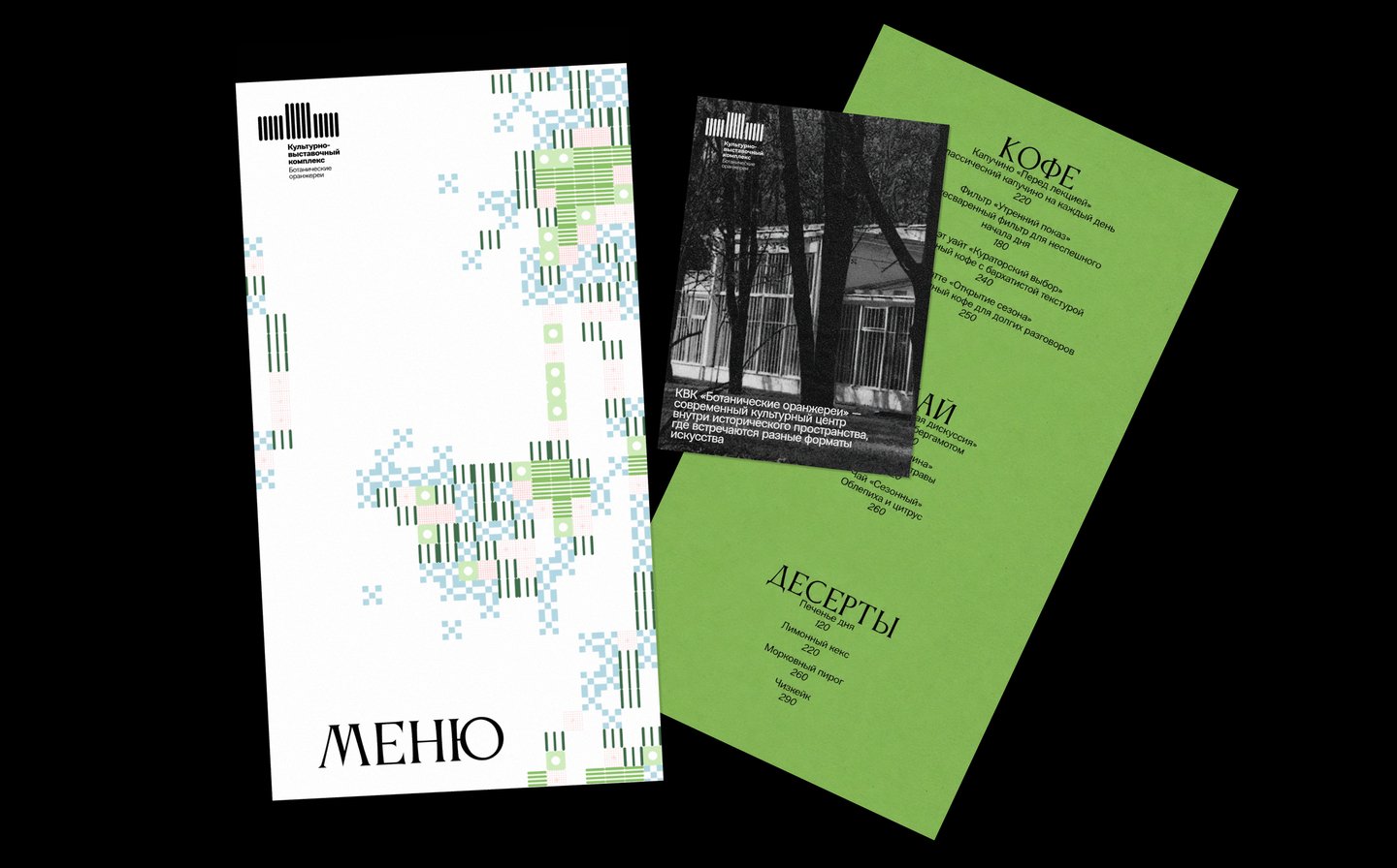
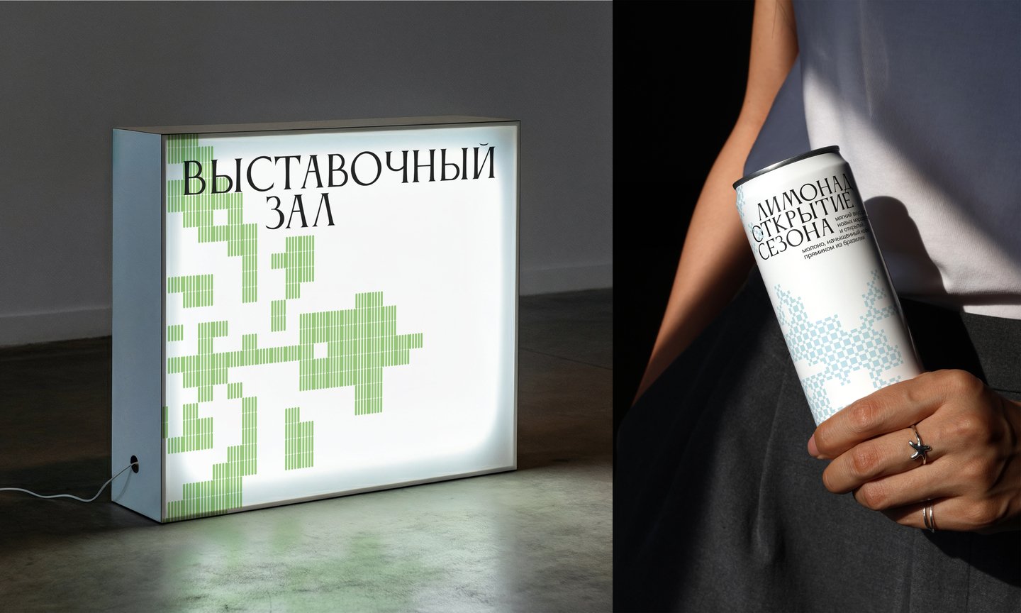
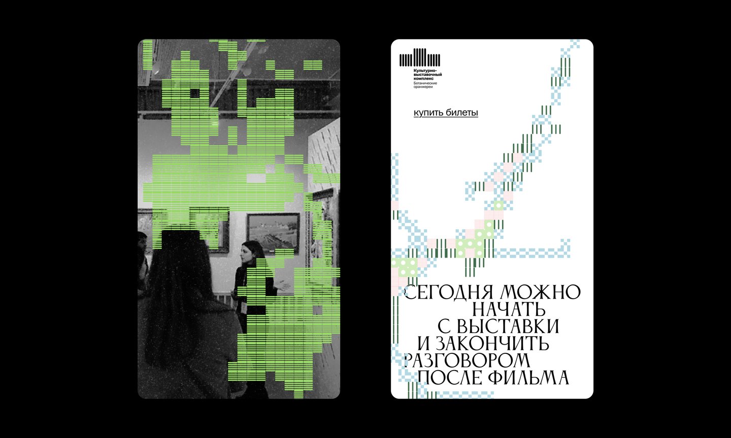
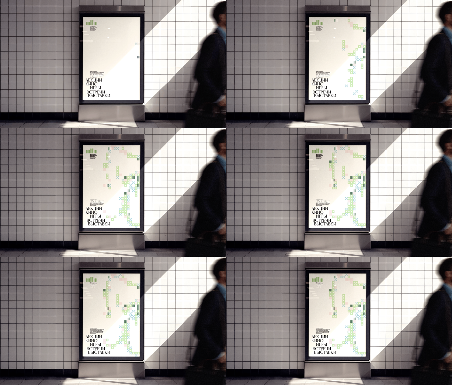
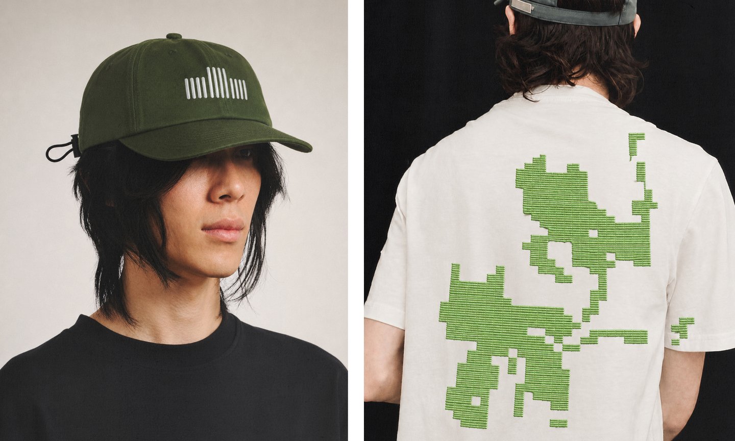
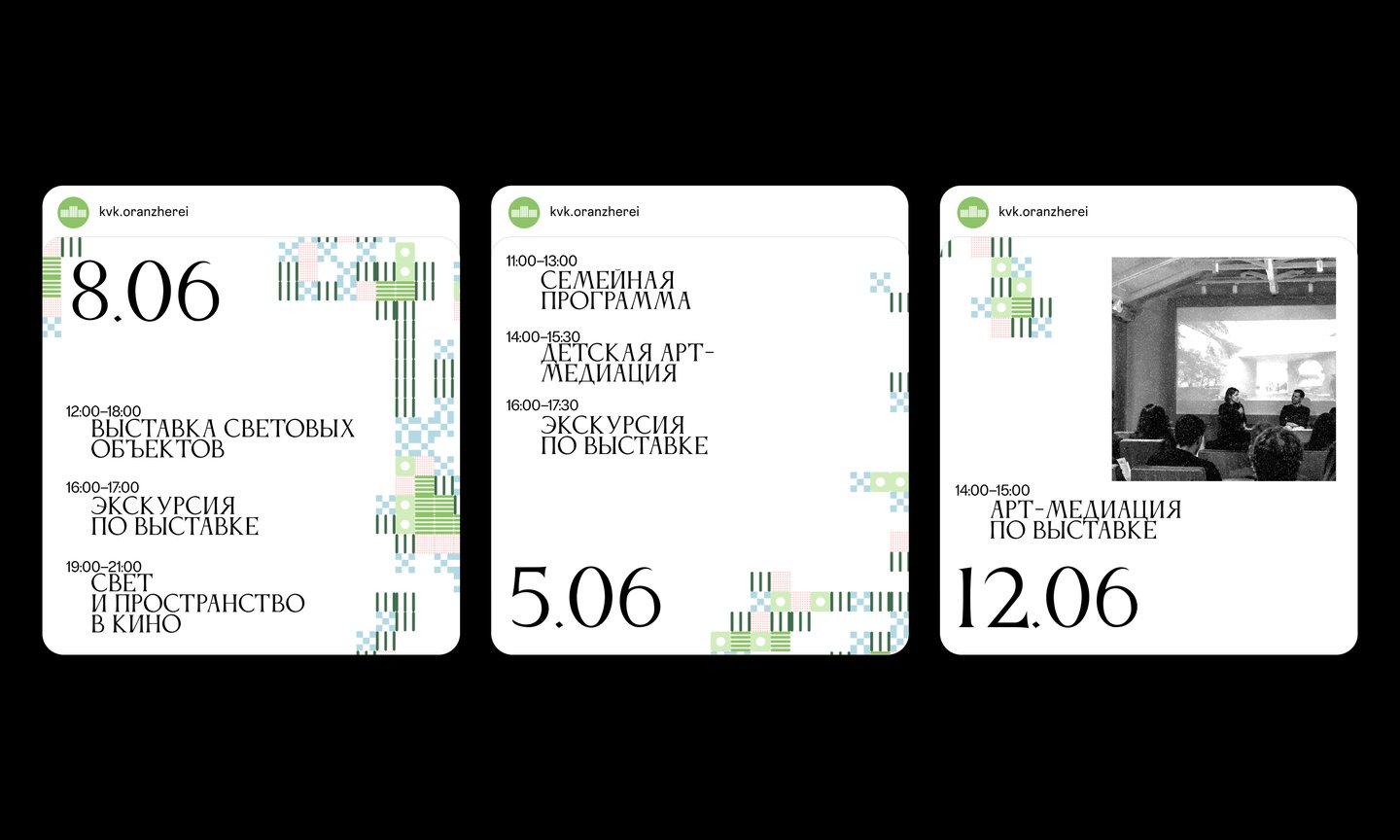
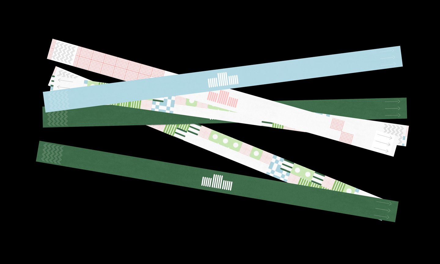
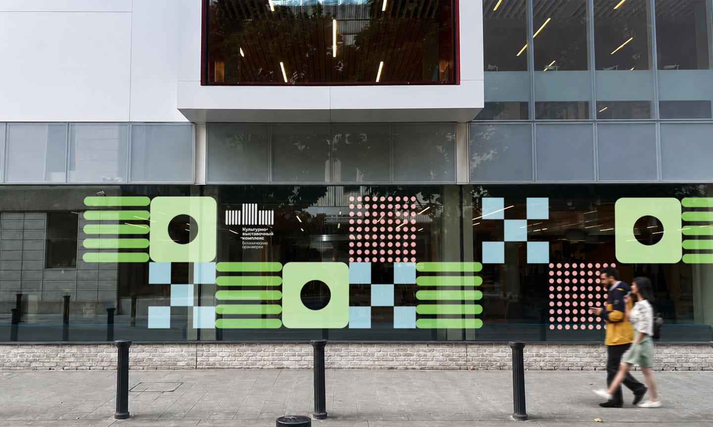
Every event is a sprout. Five modules represent five ways to spend time here: watch, listen, observe, interact, and explore.
A Processing script transforms black-and-white images into patterns: dense modules fill the dark areas, and lighter modules fill the bright ones. New brand graphics in minutes, always within a unified logic.
1st Place in the identity competition. The identity is now being implemented.
TRUESHKOWSKI
Identity for a jewelry brand · 2026
Competition brief with a real client
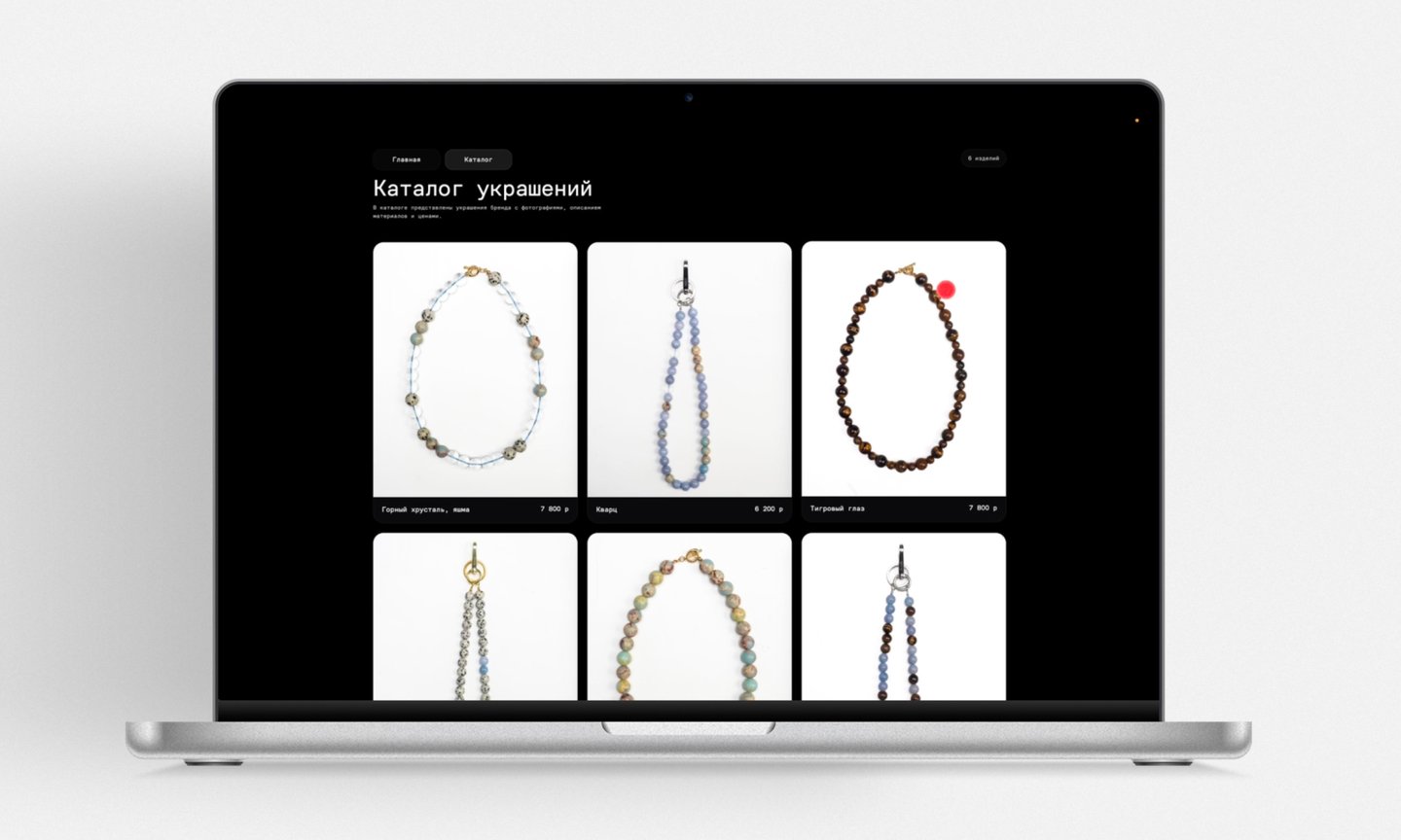
Natural stone jewelry with irony and a touch of mischief. Insight: adults feel they lack permission to be unserious. The catch: playful, but never childish.
A person is the thread; jewelry is the beads. Identity is strung together like a necklace—never twice the same.
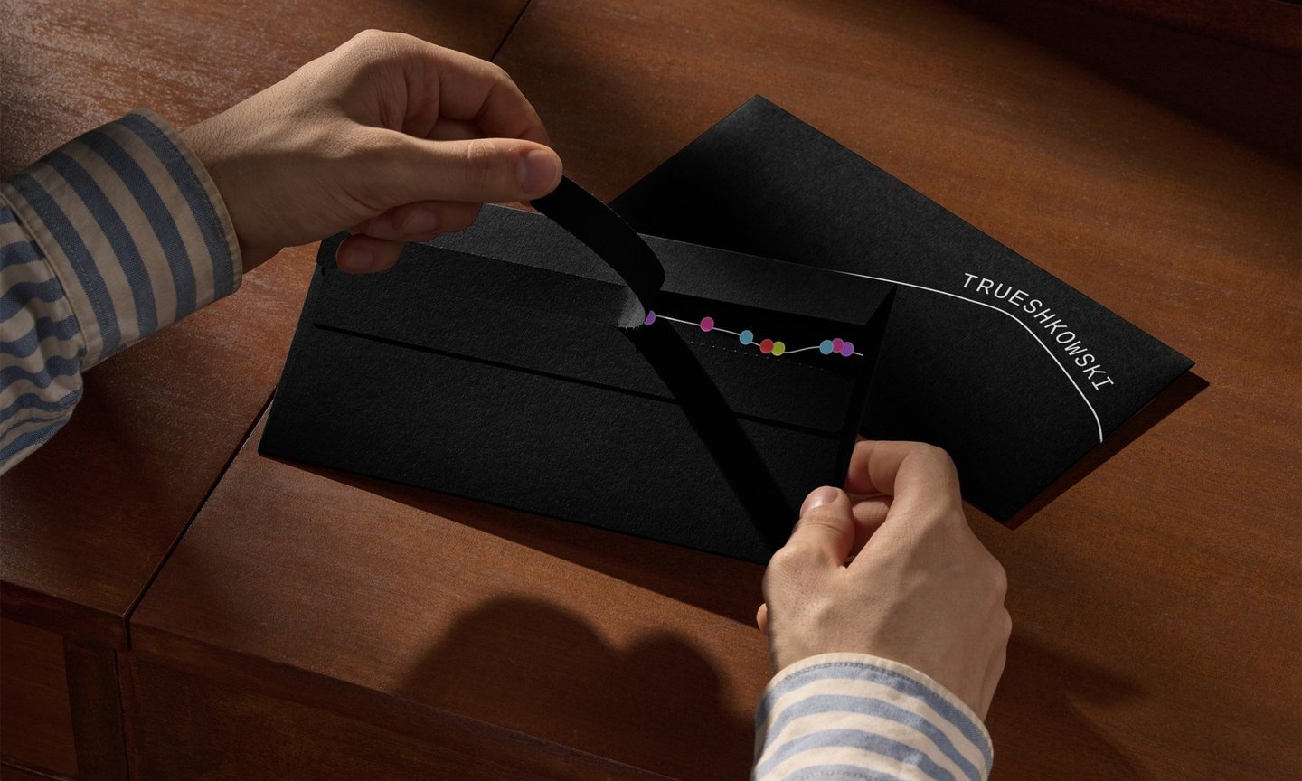
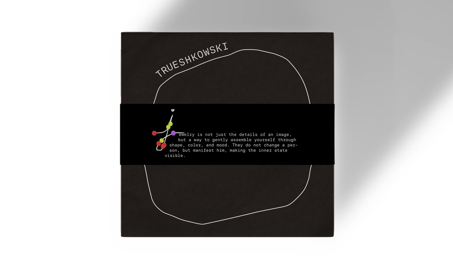
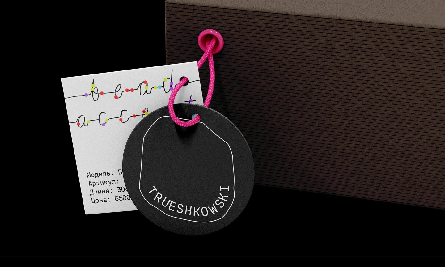
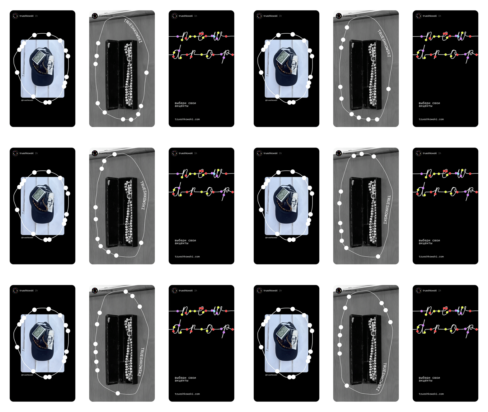
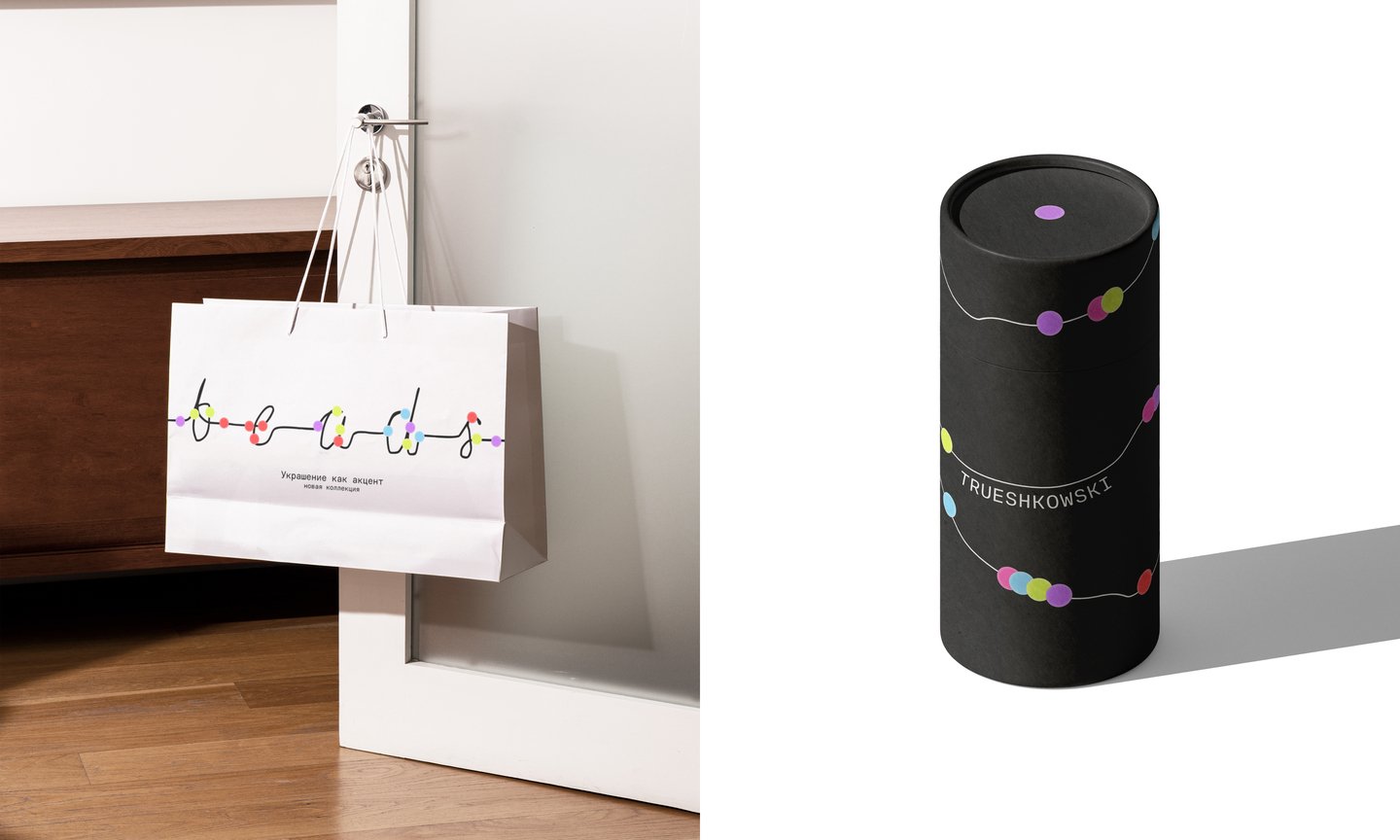
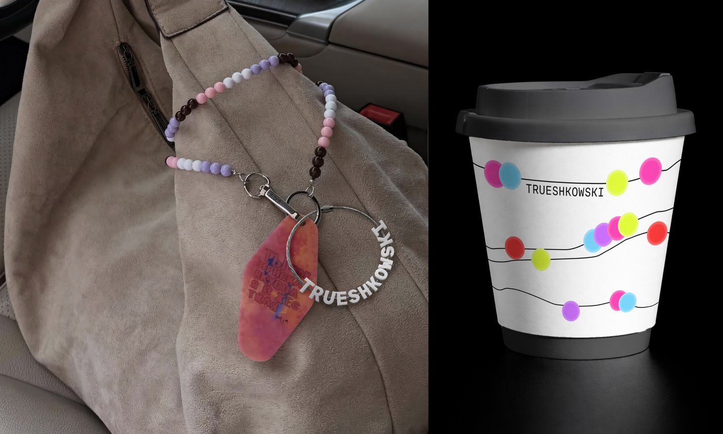
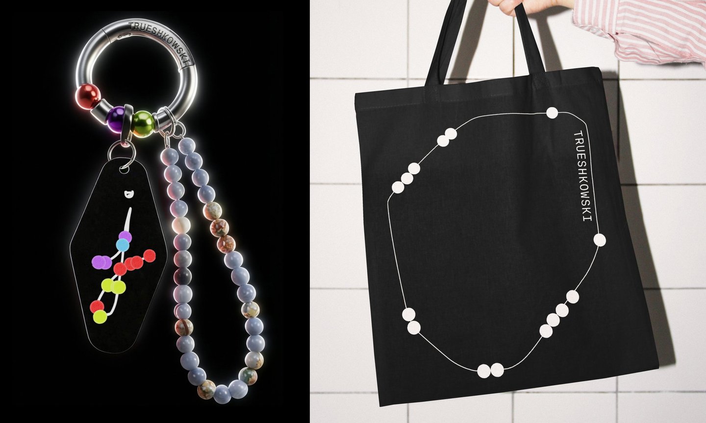
Each letter is one continuous line with beads strung along it.An online editor allows the brand team to draw a thread, type with a chosen font, and string their own beads—creating new graphics in seconds.
Developed for the brand identity competition, involving direct client consultation.
[PROJECT] item
Identity for a seasonal fashion pop-up · Nizhny Novgorod · 2026
A pop-up featuring curated local fashion brands, with a new venue and a refreshed lineup every season. Insight: people don’t want to search; they want to choose from a curated selection. Idea: the identity is a receipt. Every brand is a line, and every season prints a new catalog.
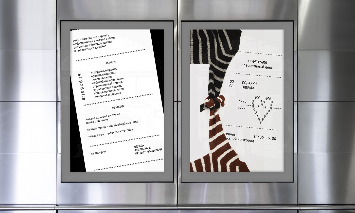
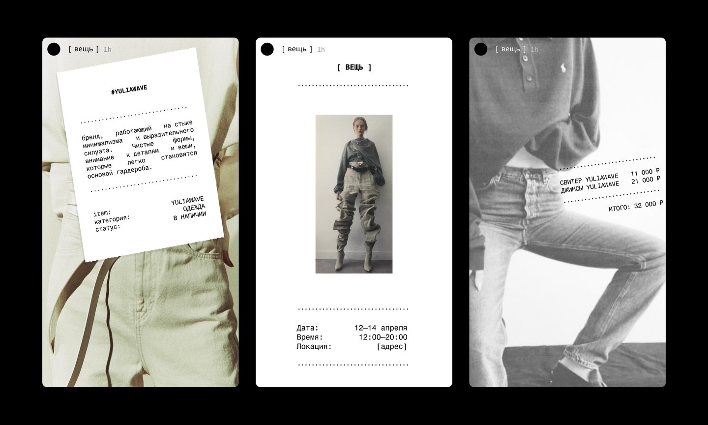
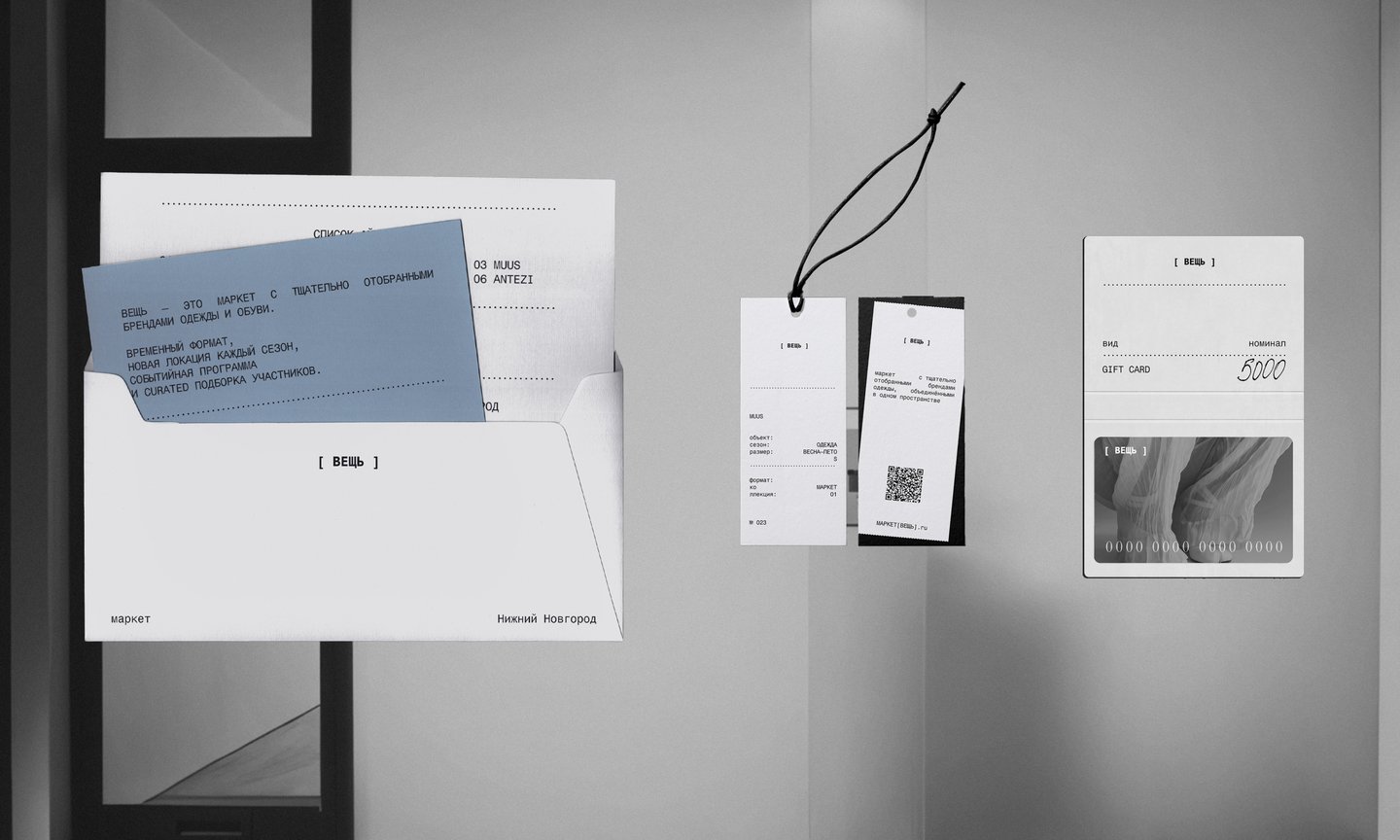
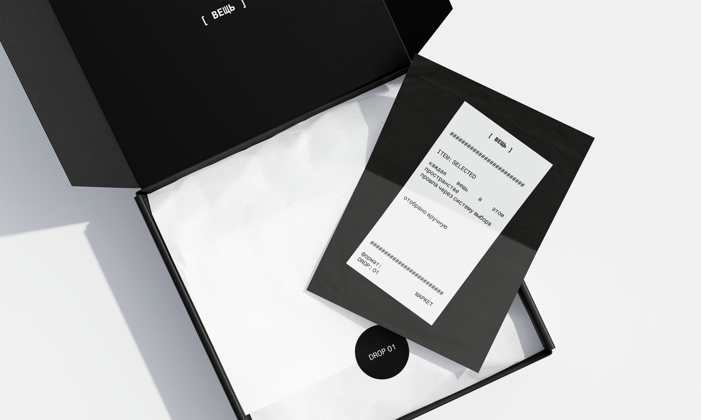
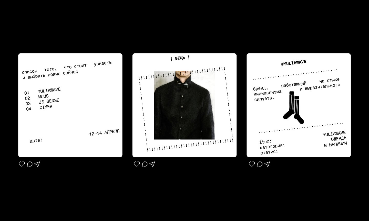
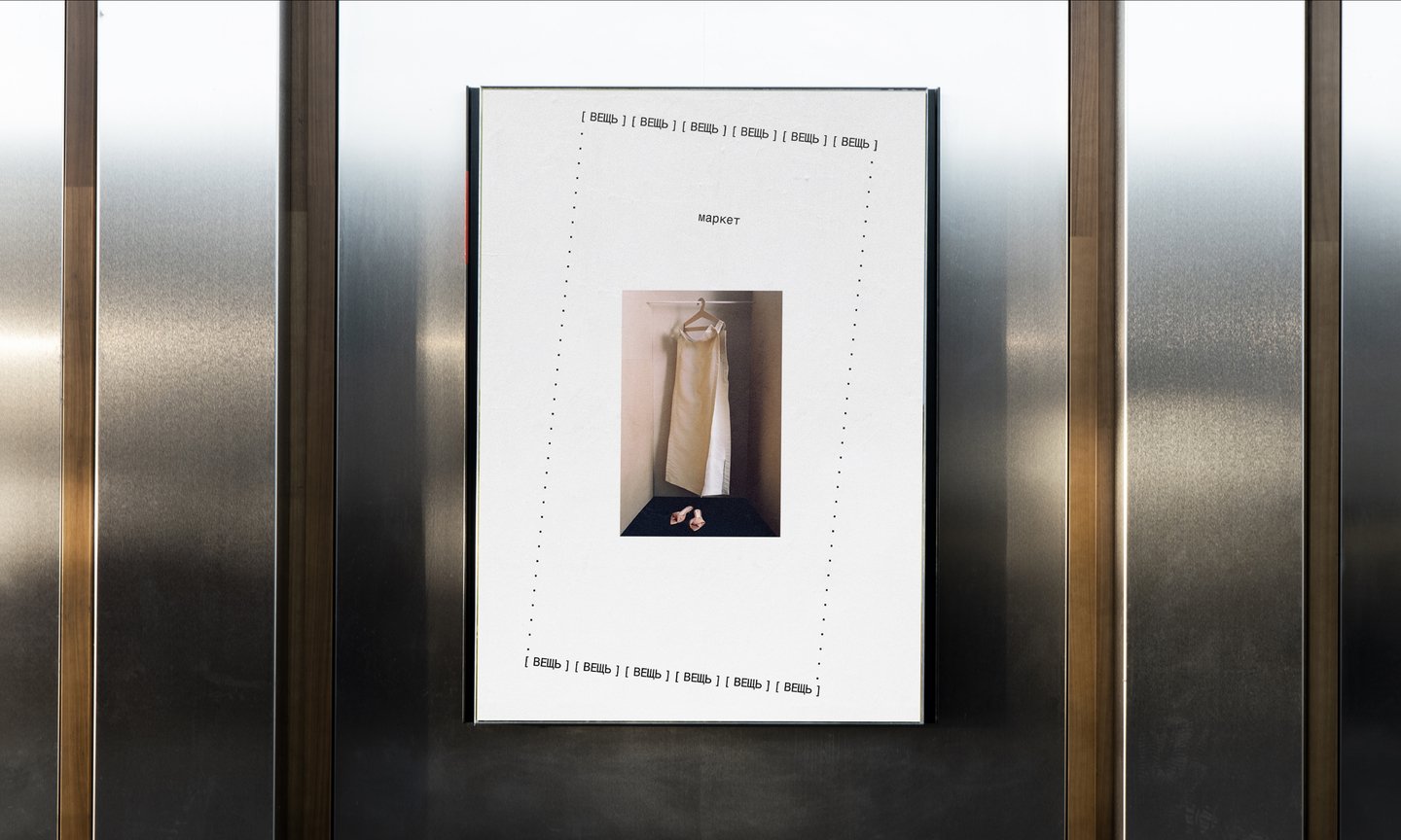
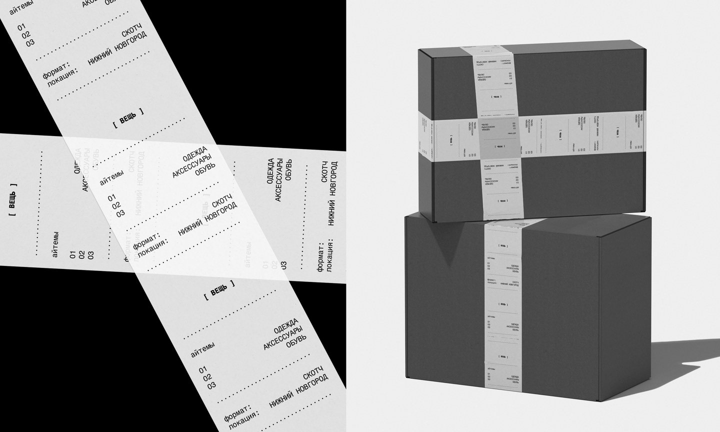
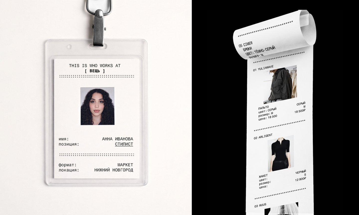
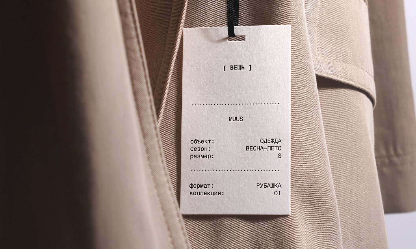
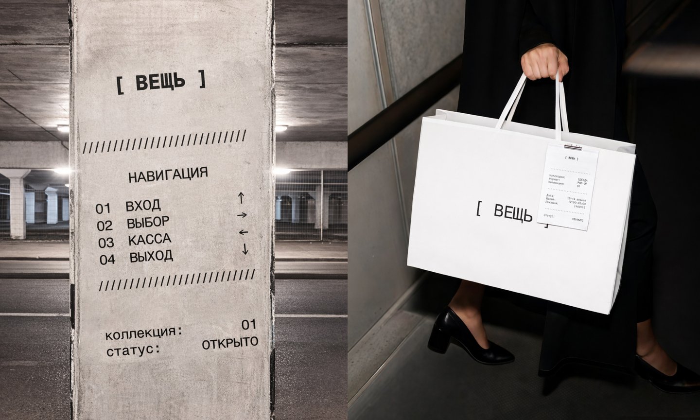
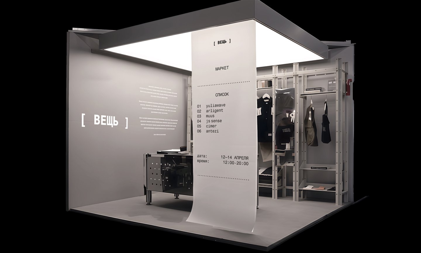
Developed for the brand identity competition, involving direct client contact.
Sip AI
Mobile app and brand identity · 2025
UX research, identity, UI
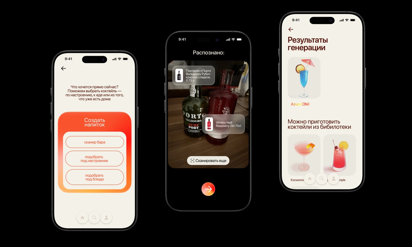
People want to make cocktails at home but get stuck: what to make, what pairs well with dinner, or what to do with random bottles. Research: 87% want recipes based on what they already own, and 75% find existing recipes too complicated. Current apps provide recipes but fail to account for mood, accompanying food, or the user’s home bar inventory.
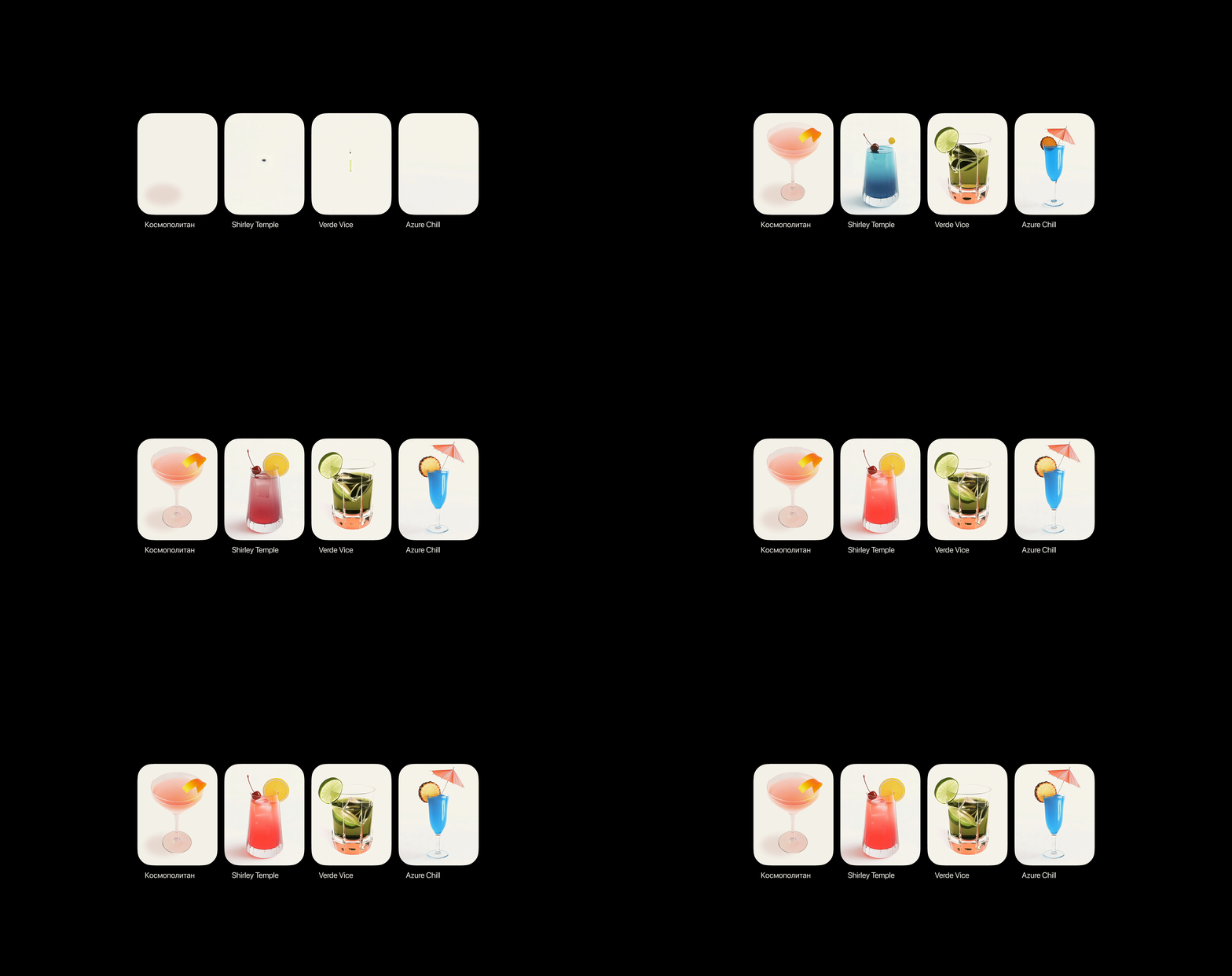
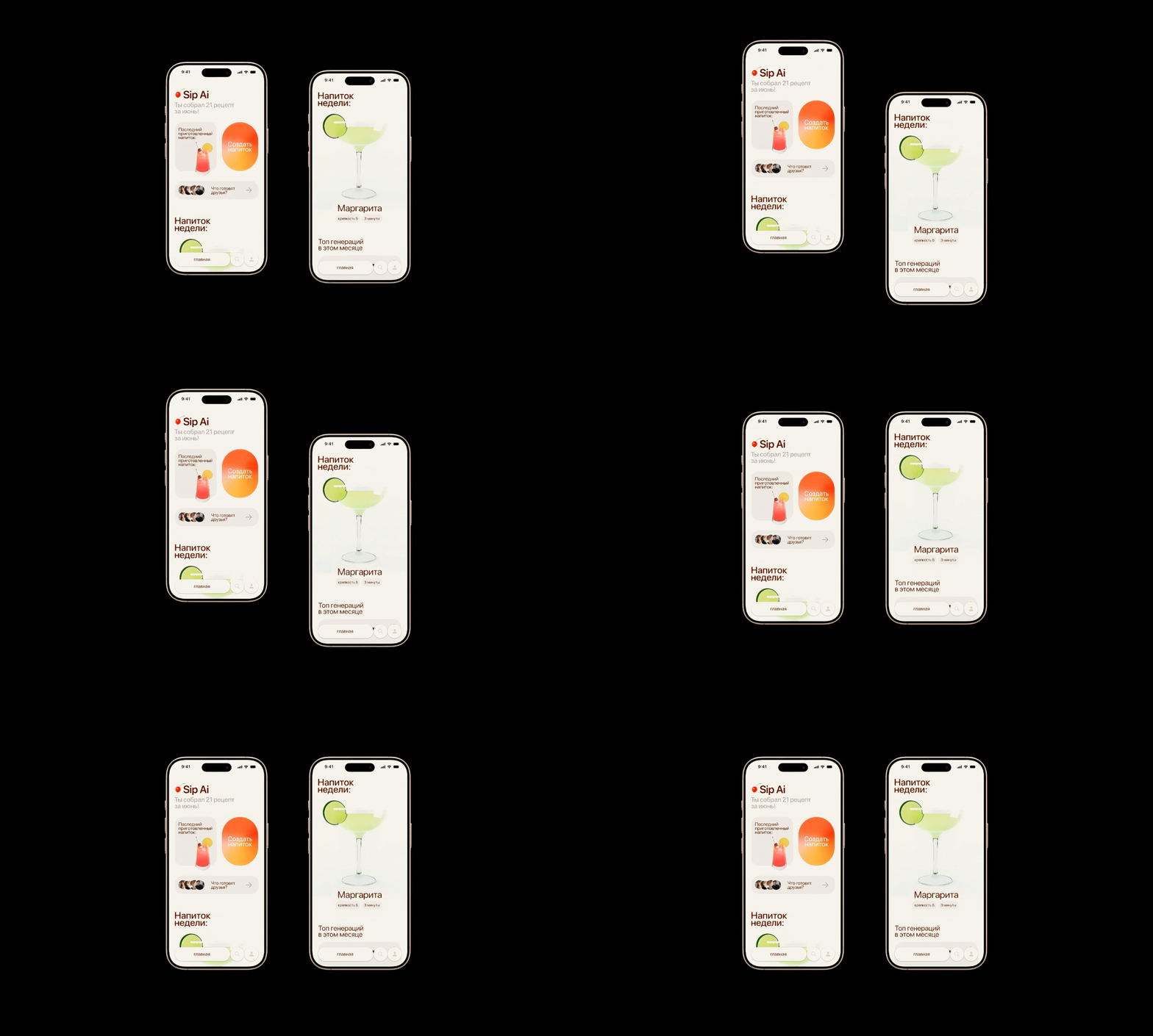
An AI Bartender: scan your bar, pick a mood or a dish, get a drink made for the moment.
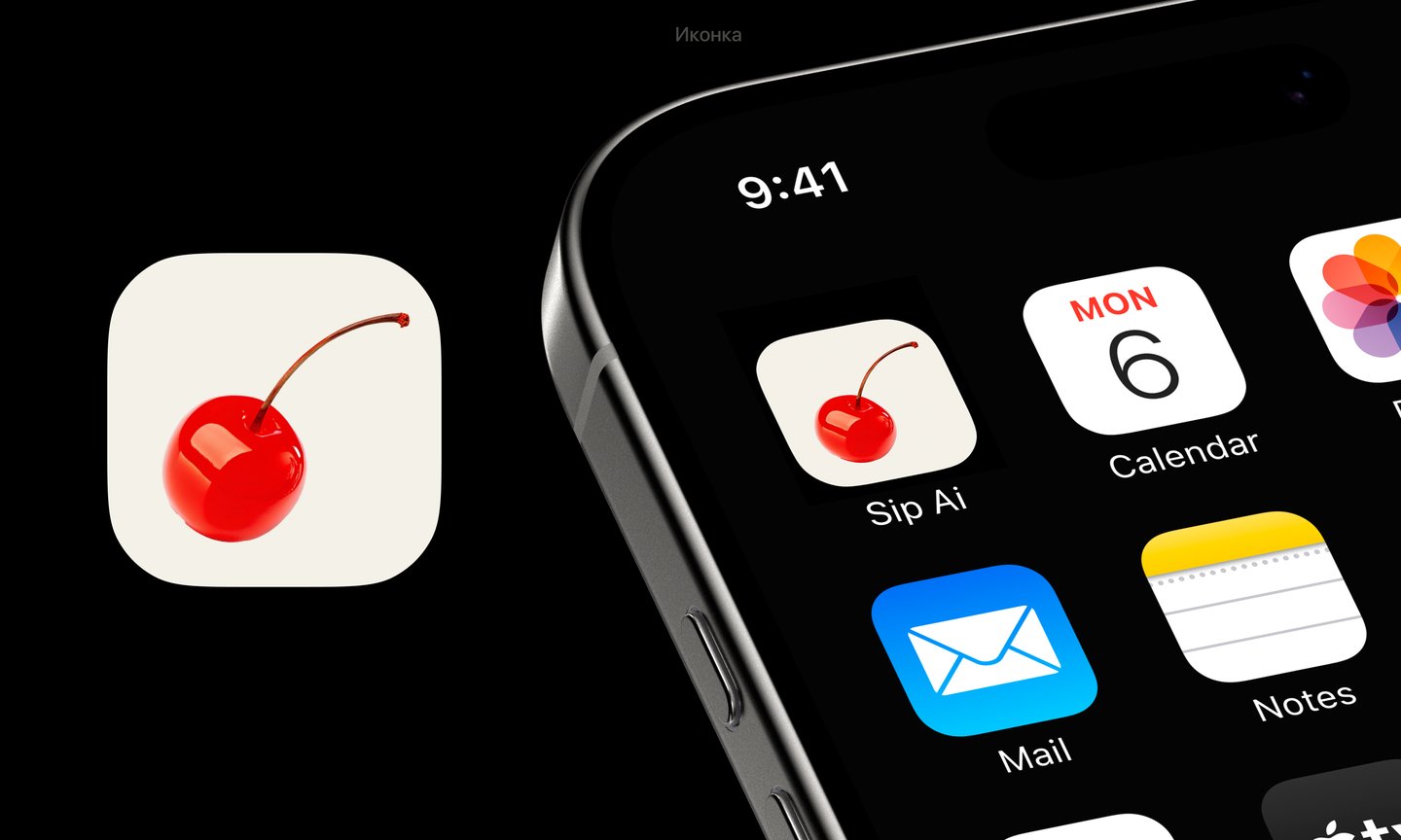
The logo is a cocktail cherry—one bright accent on a warm cream base, much like a garnish on a drink. Gradients feel liquid.
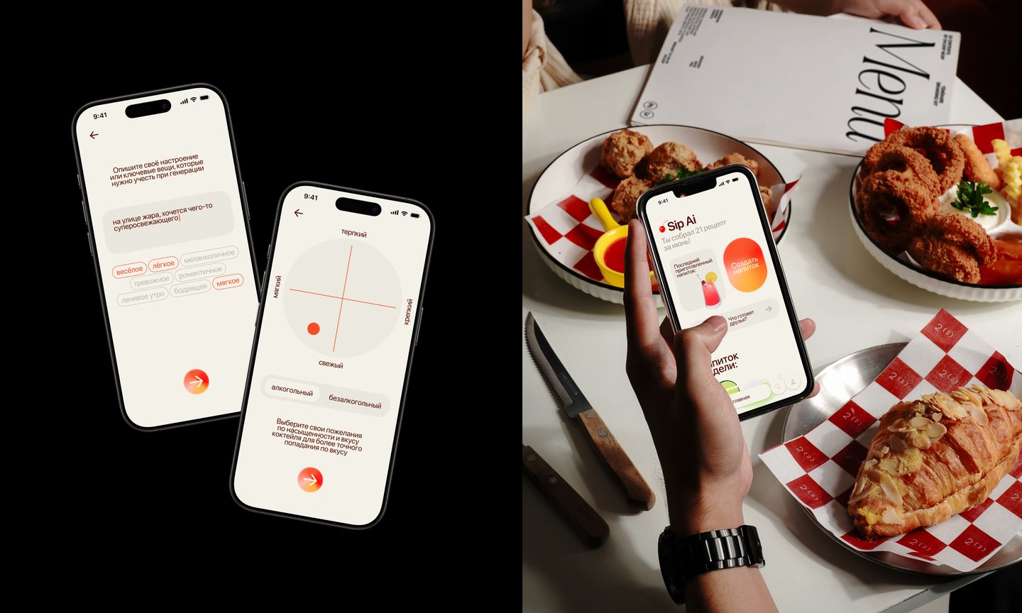
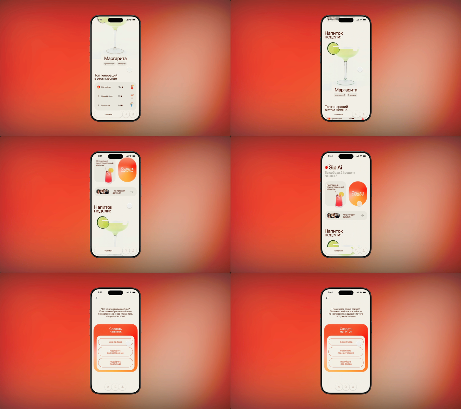
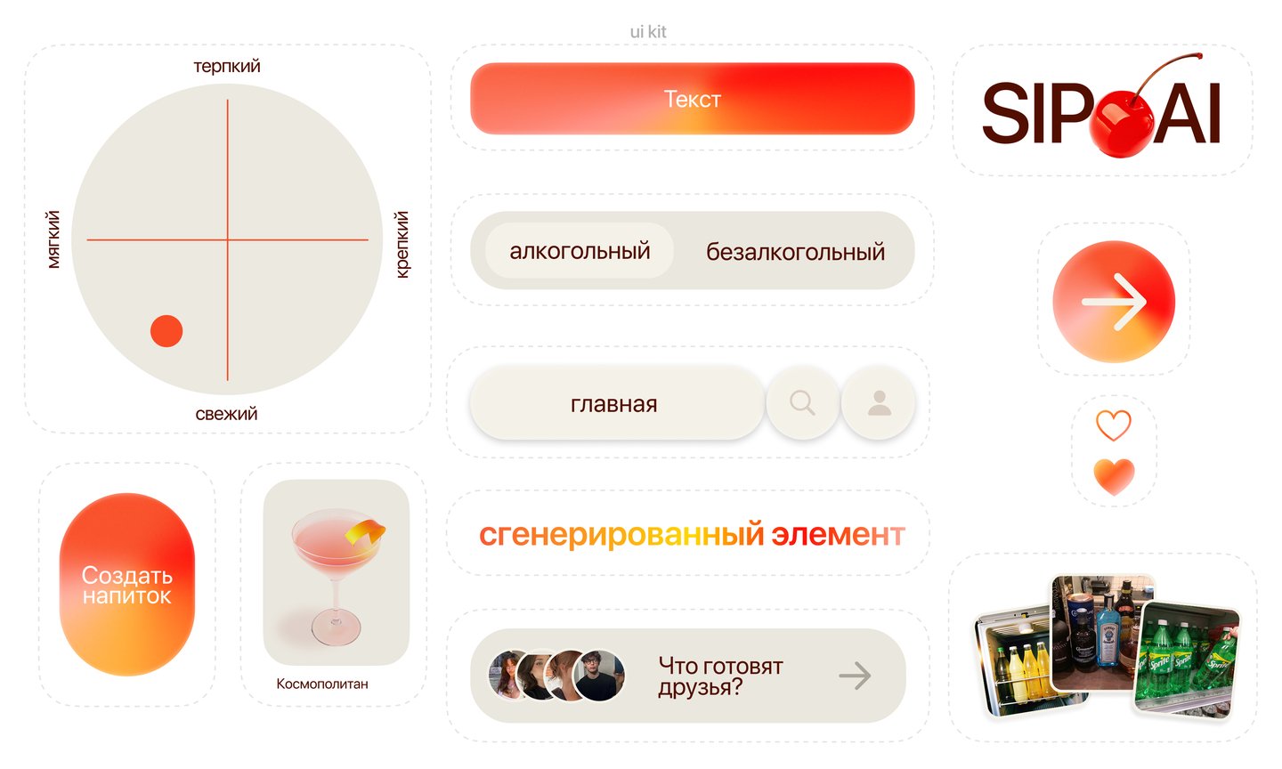
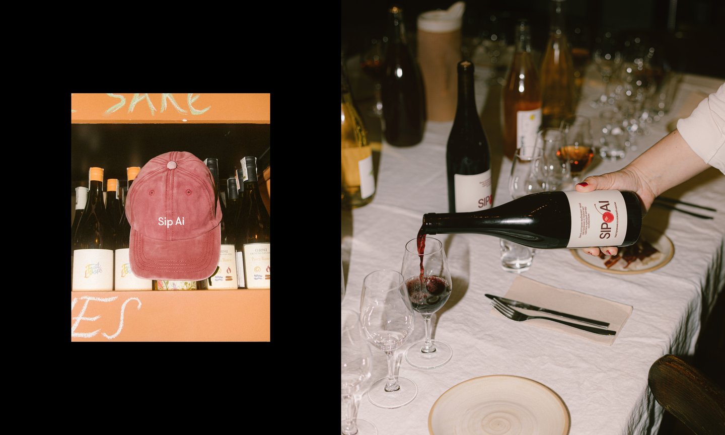
The cherry leaves the screen: coasters, labels, a bottle in ice. Clickable prototype with a screencast.