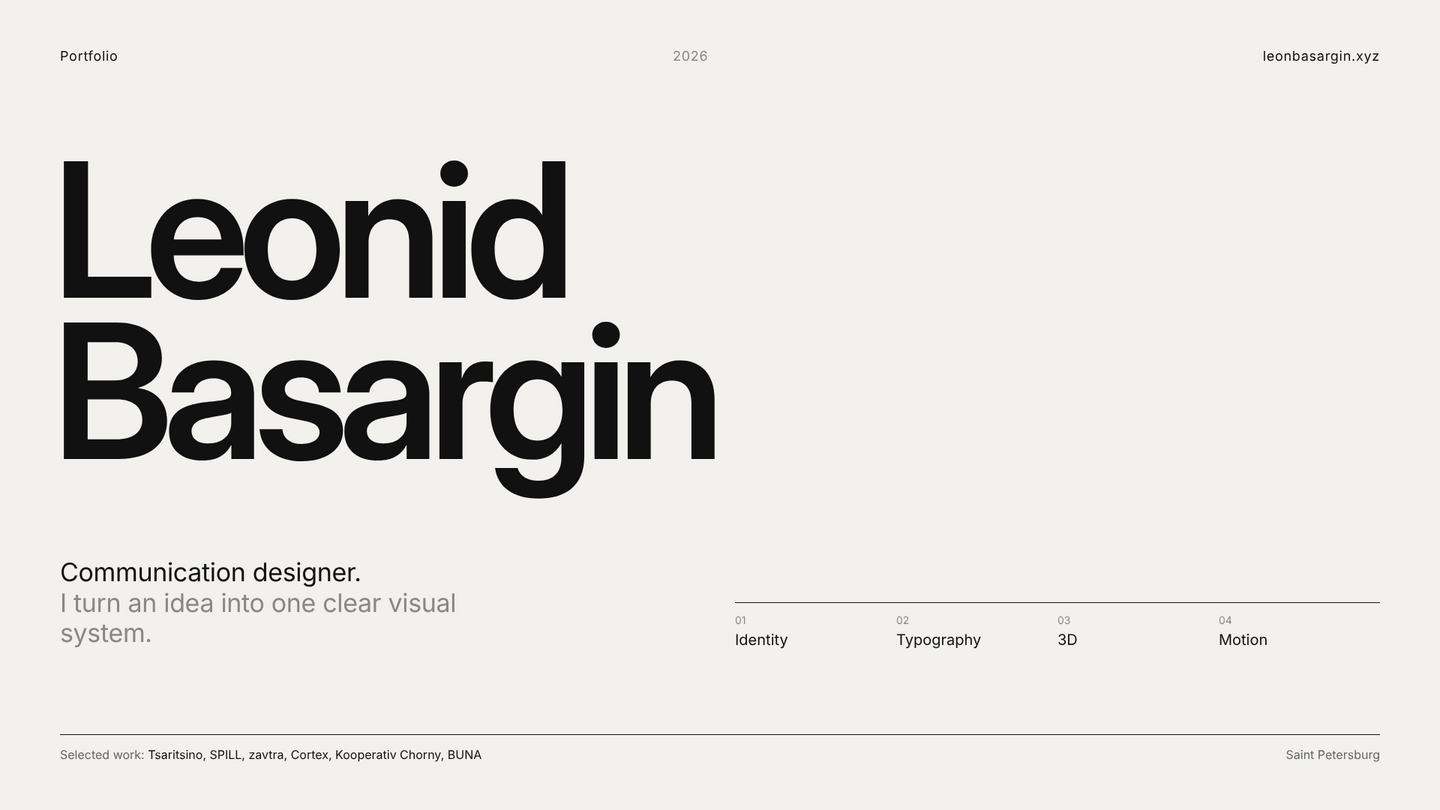
LEONID BASARGIN
COMMUNICATION DESIGNER
I work across identity, packaging, editorial design, and 3D. I enjoy transforming a product or an idea into a single, cohesive visual system and maintaining it across every touchpoint—from a business card to an entire retail space.
01 TSARITSINO GARDEN FESTIVAL
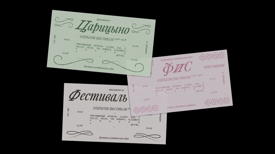

Identity for a festival of historical gardens at the Tsaritsino museum estate. The challenge was to make a centuries-old park feel vibrant and contemporary while honoring its history. The concept: the garden itself becomes the alphabet. Plant shapes, paths, and parterres transform into a modular graphic system and an animated logo that grows like foliage. This system scales across posters, wayfinding signage, merchandise, and motion graphics for social media.
02 SPILL BREW BAR
Brand identity for SPILL, an alternative brew bar and cafe where every guest can personalize their drink. The objective was to demonstrate that alternative brewing is playful, not pretentious. The concept emerged from the name itself: a spill, a drop, a stain of coffee becomes the core visual element. Liquid forms, a bold wordmark, and a vibrant palette translate across cups, menus, signage, and animated content.
03 ZAVTRA CAFE
Branding for Zavtra, a specialty café in Kolomna that opened on the site of a cult coffee shop. The task was to preserve the warmth people remembered while giving the space a new, confident voice. As the name means «tomorrow,» the identity is built around mornings and anticipation: a calm wordmark, soft daylight colors, and subtle animated moments for packaging, menus, and social media.
04 CORTEX
CORTEX is a speculative neural exchange where users can trade experiences and skills. The task was to make an abstract, slightly unsettling technology feel tangible. The idea: visualize the signal itself. This involved a series of posters built from distorted type and neural noise, alongside a brand manual that transforms the system’s rules into an editorial object.
05 KOOPERATIV CHORNY CALENDAR