I know you’re looking for someone who can generate creative ideas, art-direct them, and bring them to life. So, hi, my name is IRINA!
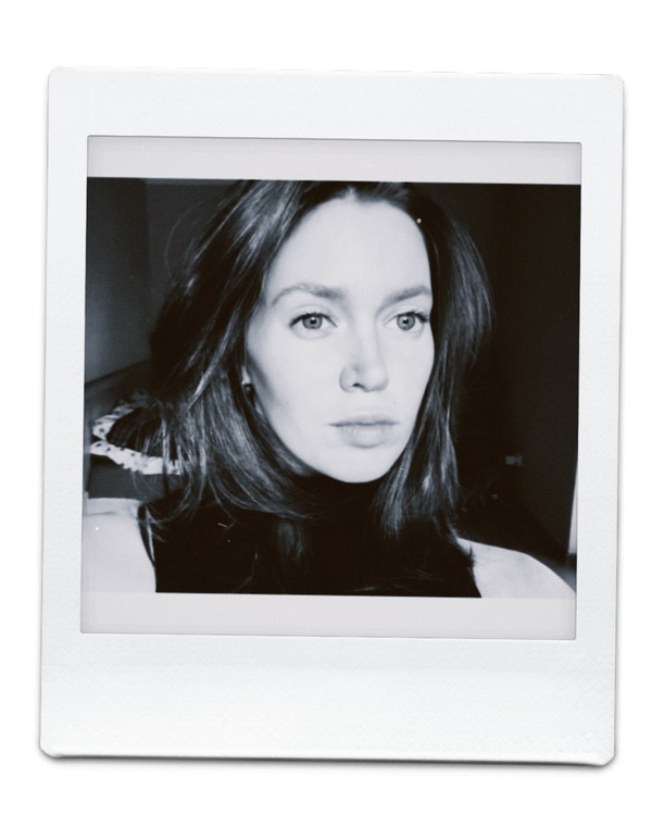
I work at the intersection of design, strategy, and art direction—from concept development and brand positioning to visual communication and physical products.I am particularly interested in cultural institutions, special projects, and creative solutions for brands. I want to grow as part of a creative team where we can experiment, develop ideas, and bring them to life together.Here is some proof↓
GROWTH CALENDAR
print publication / startup / family product
This project captures not only a child’s physical growth but also how their thoughts, interests, and perspectives change over time.
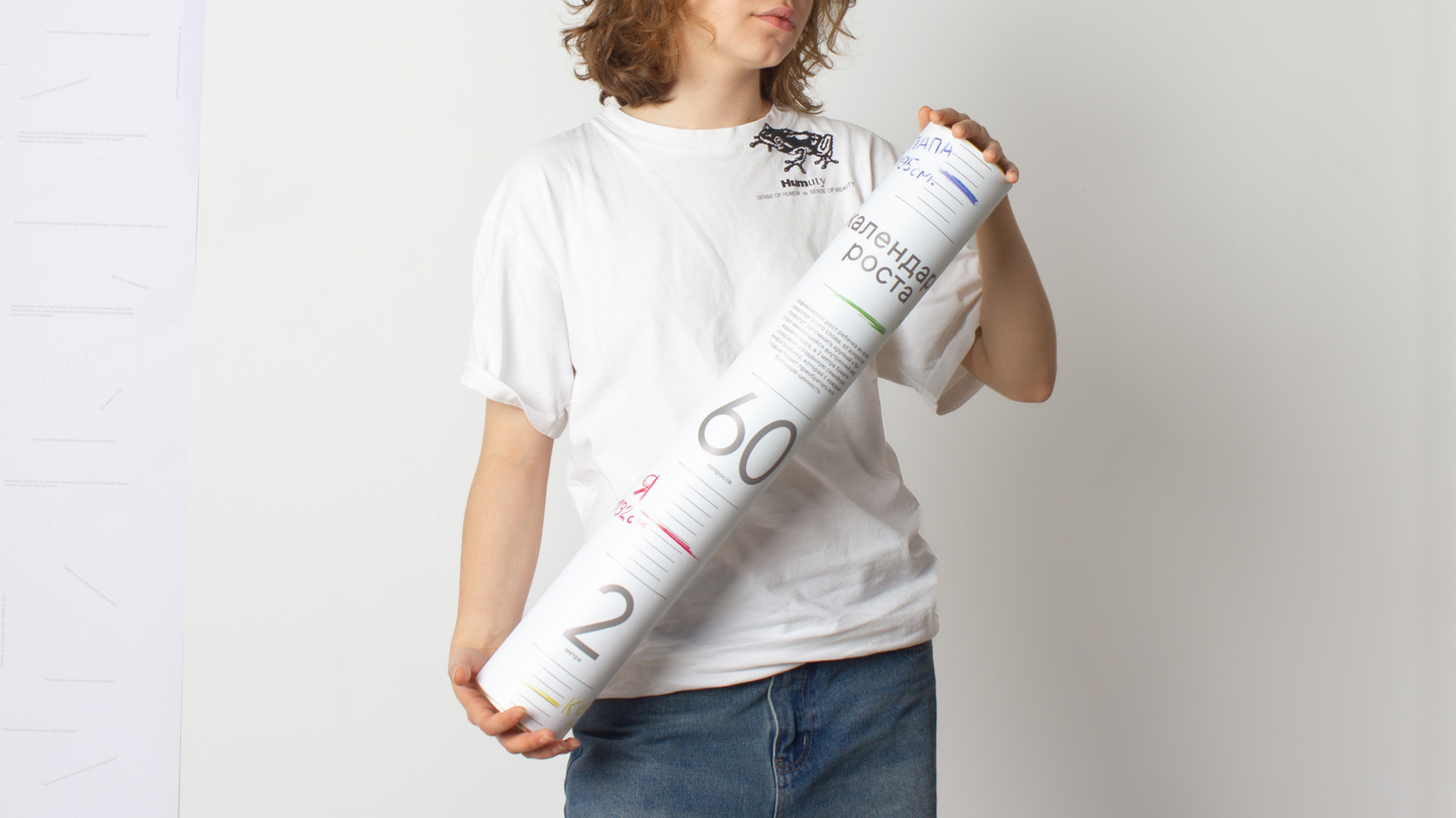
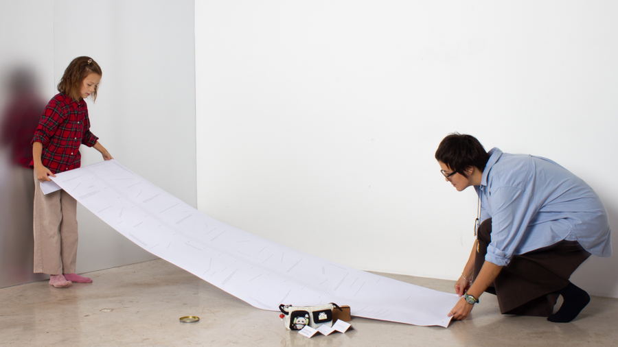
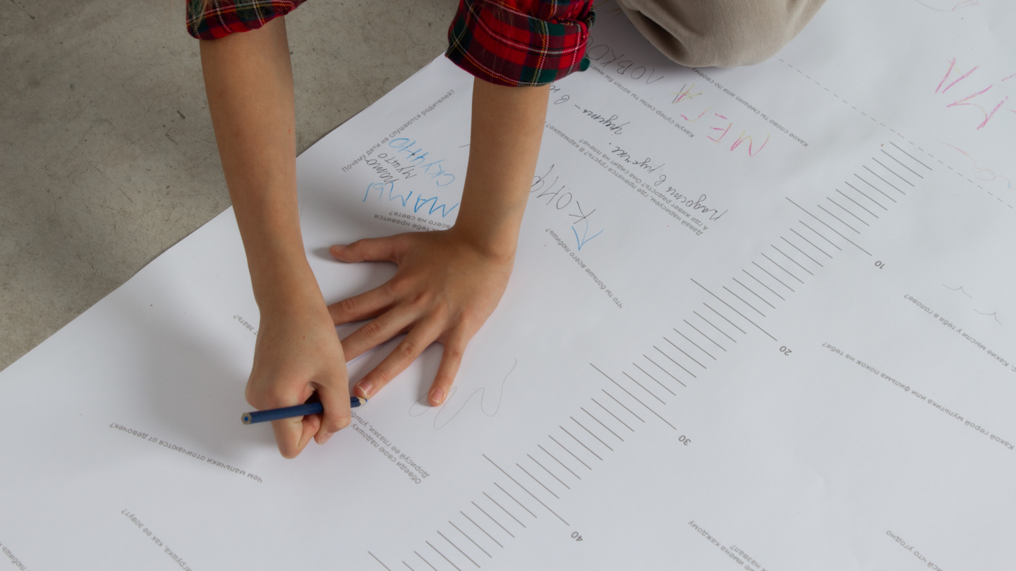
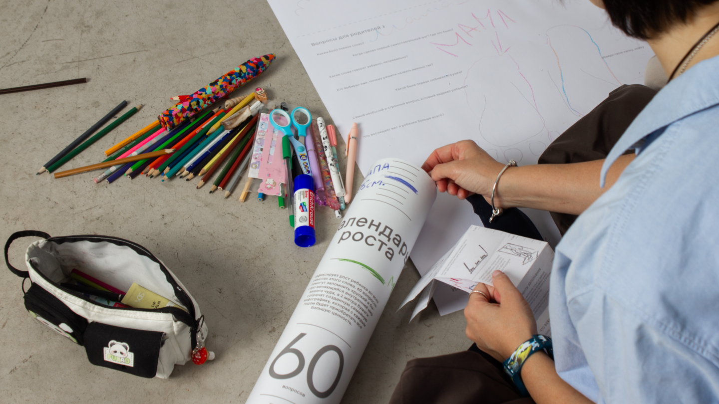
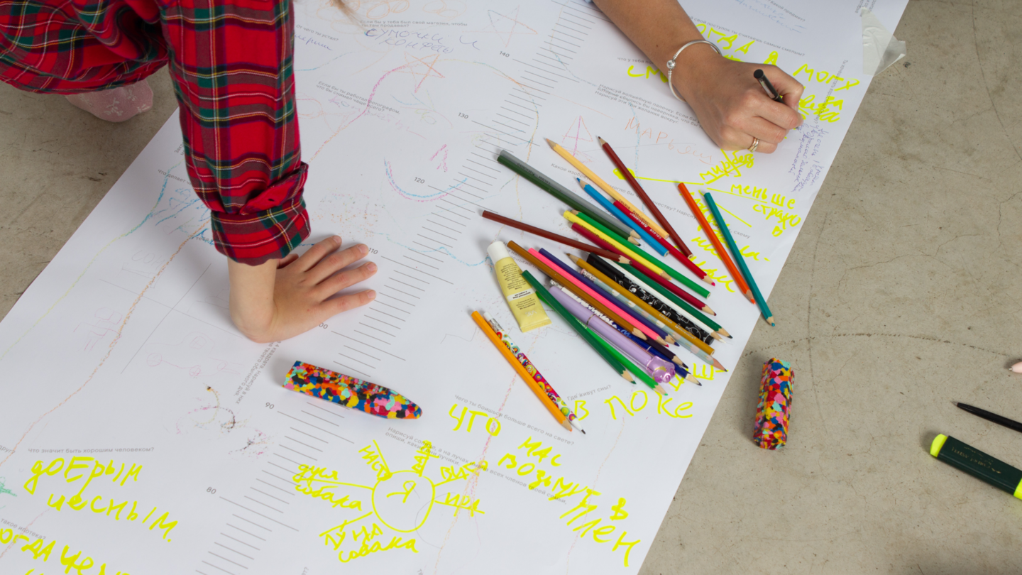
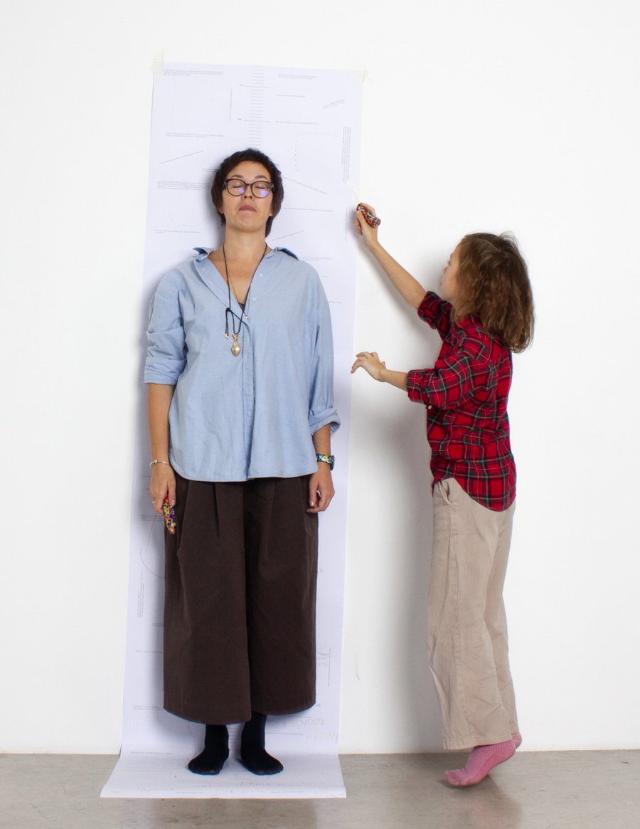
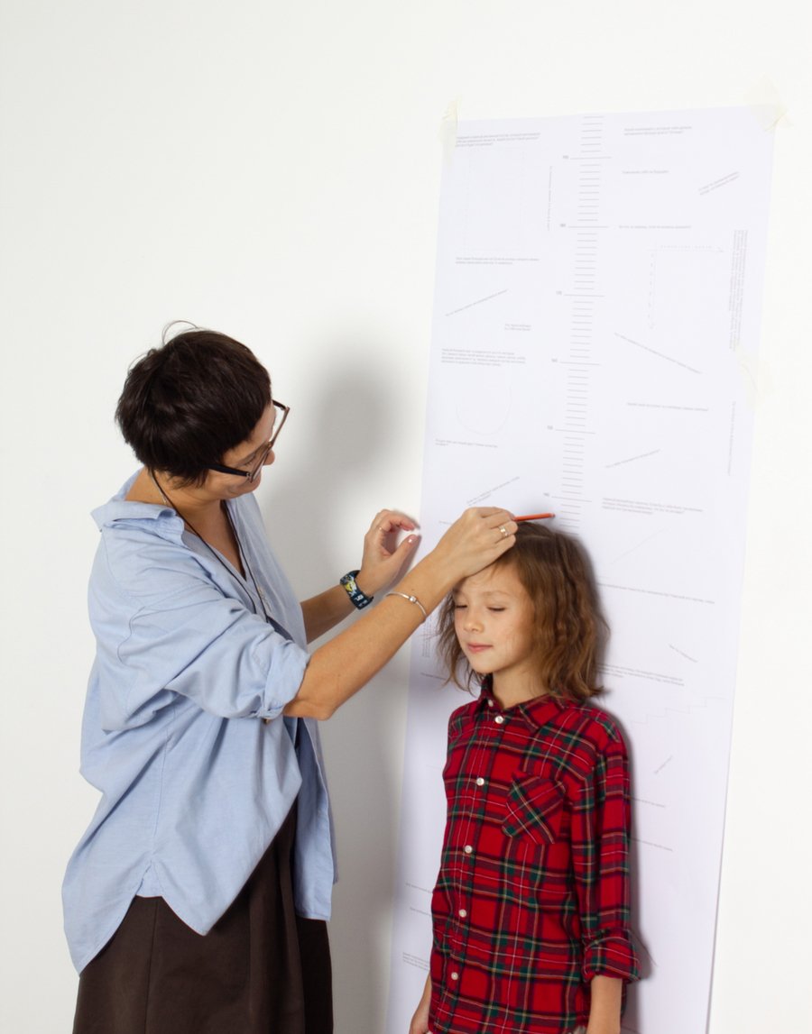
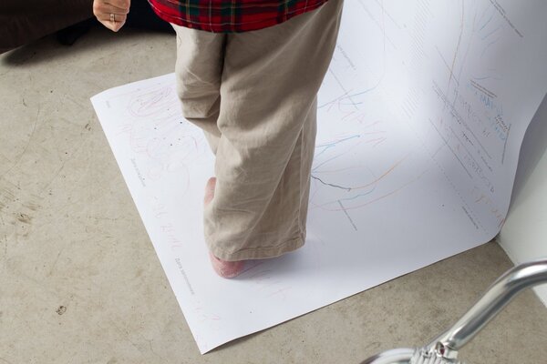
A 2-meter-long paper chart features 60 questions for kids to answer with their parents. Over time, the calendar becomes a personal story of growing up.
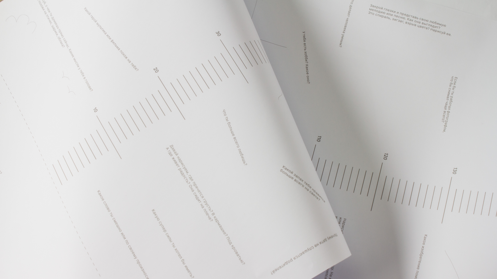
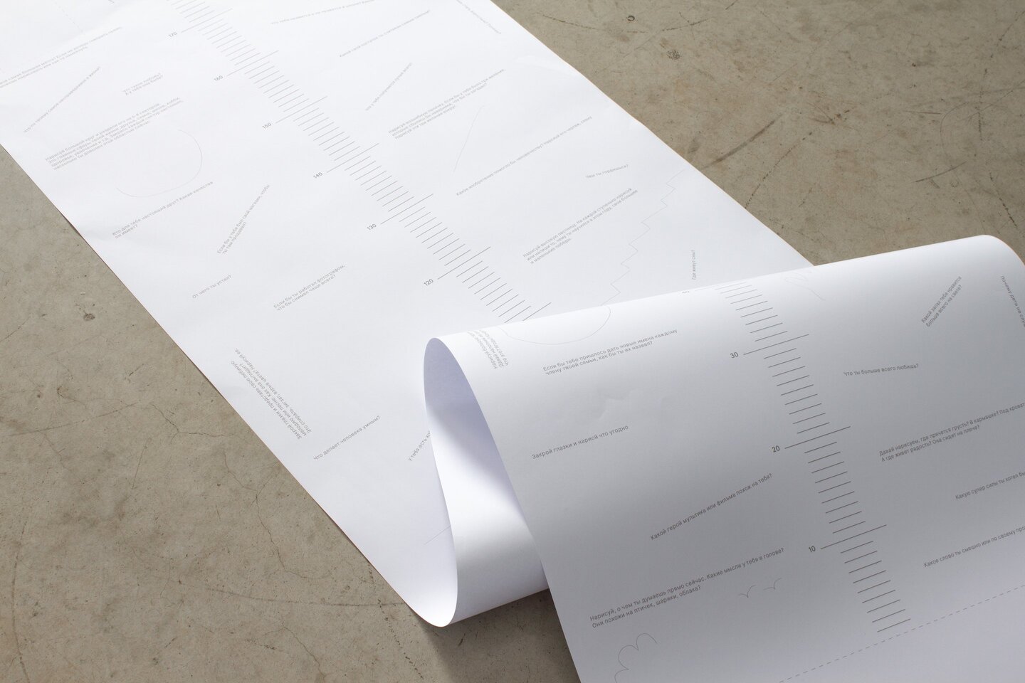
The multicolored wax crayon is designed to remain functional even if it breaks—each piece can still be used for drawing.
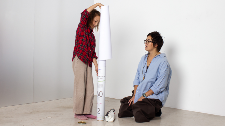
I developed the entire product: from its mechanics and packaging design to organizing a photoshoot with a mother and daughter to demonstrate how it works in real life.
— Honey, what is a mortgage?
— It’s when someone has the hiccups.
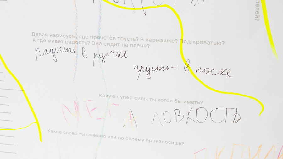
— What are you best at?
— Laughing and eating.
The test batch is currently available for purchase at the «Podpisnye Izdaniya» bookstore in St. Petersburg.
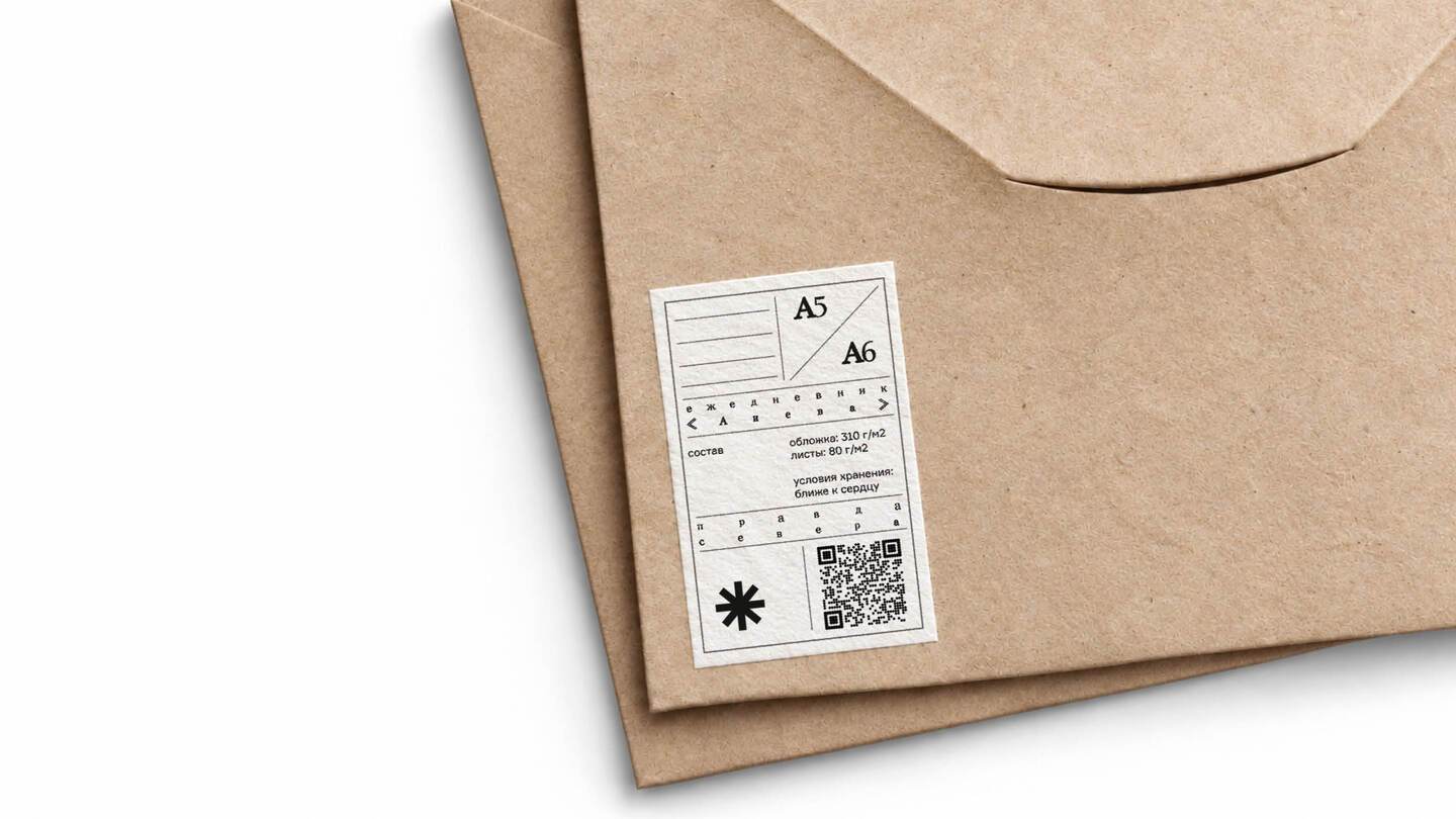
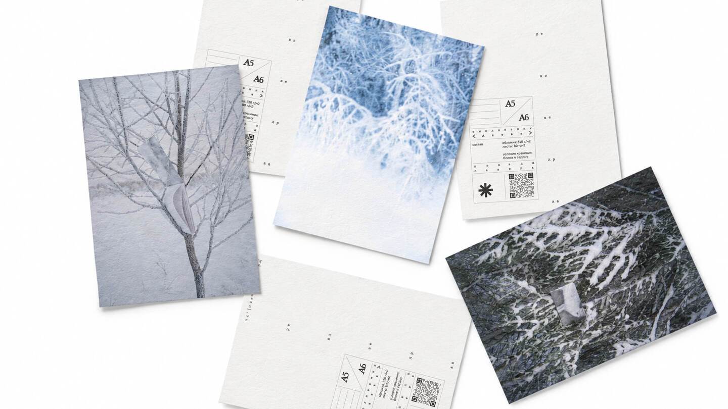
PRAVDA SEVERA
marketing strategy / identity / positioning
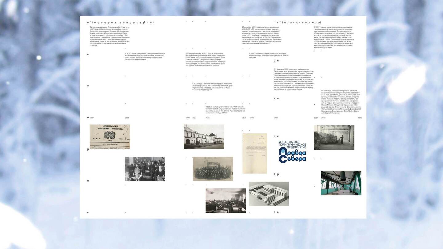
Typography studio from Arkhangelsk with a 200-year history, having survived every twilight and dawn of Imperial Russia and the USSR. Today, it is a project dedicated to simplicity and asceticism, crafting distinctive stationery that embodies the character of the northern region.


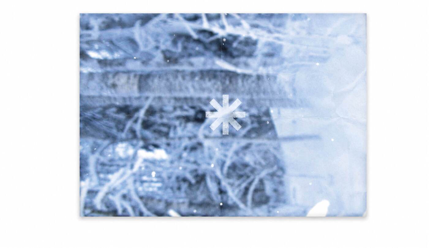
An adapted logo inspired by the asterisk (from the Greek asteriskos, meaning «little star»), serving as a universal symbol of the North—a snowflake, the sun, and a typographic character.
I developed the brand’s marketing strategy and positioning, highlighting the printing house’s history, and refined its key communication assets, including the logo and social media presence.
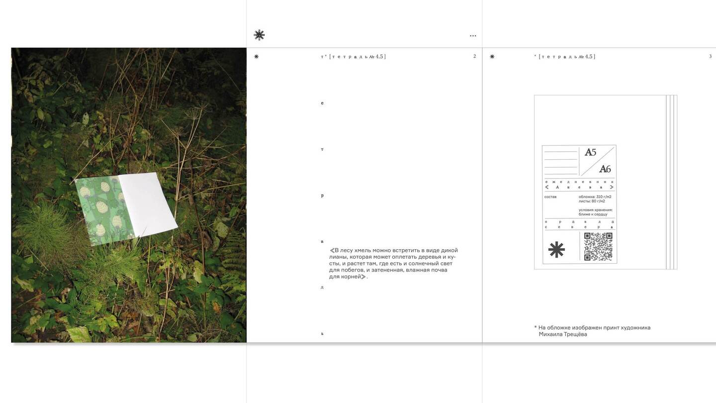
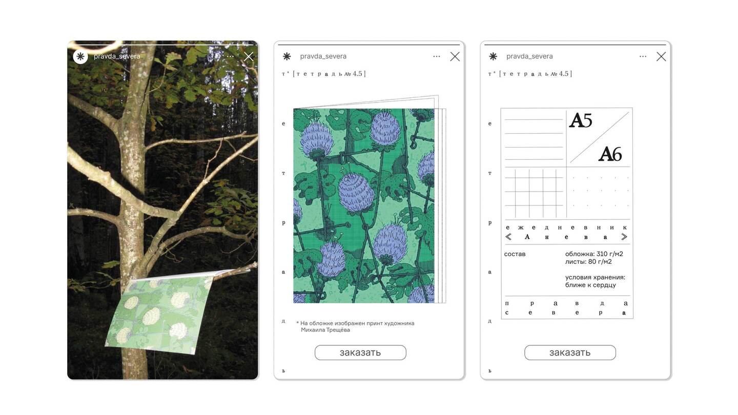
I paid particular attention to creating local physical brand touchpoints, including posters, postcards, labels, and rulers, designed to engage customers directly and increase brand recognition.
DIRECT CONTACT
brand identity / advertising campaign / work with open-air
City walk festival, an art platform that engages with modern art outside institutional walls and aims to rethink the daily urban experience of Basman District in Moscow.