Every idea has a visual language
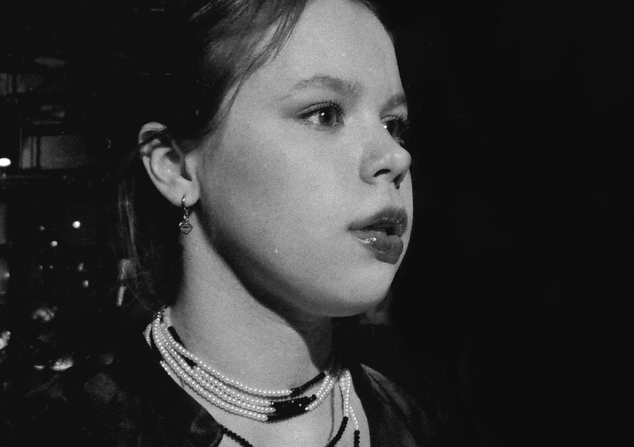

Kristina Pavliuchenko | Communication & Brand DesignerI am a communication designer with experience gained through internships and freelance projects. My practice centers on branding and visual identity, media projects, poster design, and other forms of visual communication.I enjoy exploring diverse visual approaches to develop distinctive concepts and forge meaningful connections between ideas, brands, and audiences.
BRANDING & VISUAL IDENTITY
Identity for the «Architecture of Morocco» Exhibition
CHALLENGEHow can a visual identity communicate the tactile beauty of Moroccan architecture and the deep connection between buildings, materials, and landscape?The challenge was to translate Morocco’s architectural heritage into a cohesive visual language for an exhibition featuring 3D models of its iconic structures.
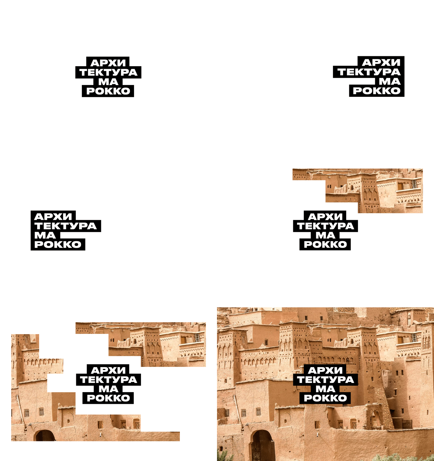
CONCEPTArchitecture shaped by the earthThe concept stems from the dialogue between people and the landscape. Raw earth, adobe, and rammed-earth construction have defined the distinct character of Moroccan architecture.Inspired by the organic textures and sculptural forms of kasbahs, the project explores how the essence of this material heritage can be articulated through a contemporary visual identity.
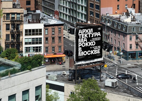
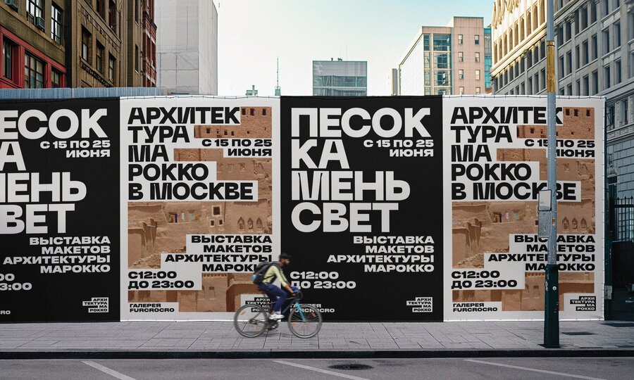
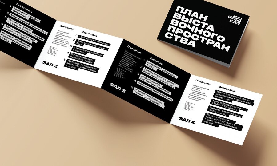
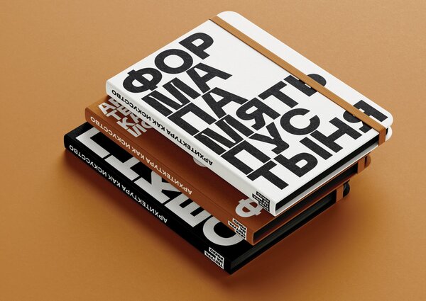
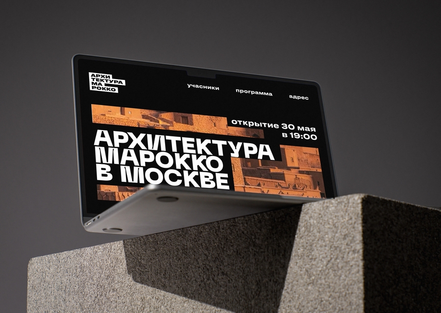
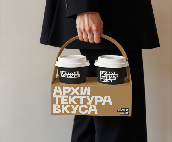
THE RESULTA cohesive visual identity that reflects the character of Moroccan architecture and brings the exhibition concept to life.
Gaps in the Symbolic Structure
CHALLENGE
How can exhibition design communicate the tension between contemporary art and the institutions that shape its interpretation?
The project explores the relationship between institutional frameworks and artistic expression through an exhibition space divided into two contrasting environments: a bright upper level and a dark underground space.
CONCEPT
The visual identity is built around the image of an opening connecting two contrasting spaces. Inspired by the exhibition’s architecture, the logo represents the transition between the bright upper level and the dark basement.
The typography spanning both zones expresses their connection, while the artworks emerge from darkness, illuminated by the light of the opening.
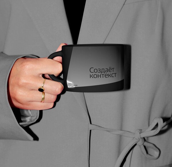
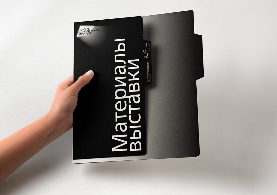
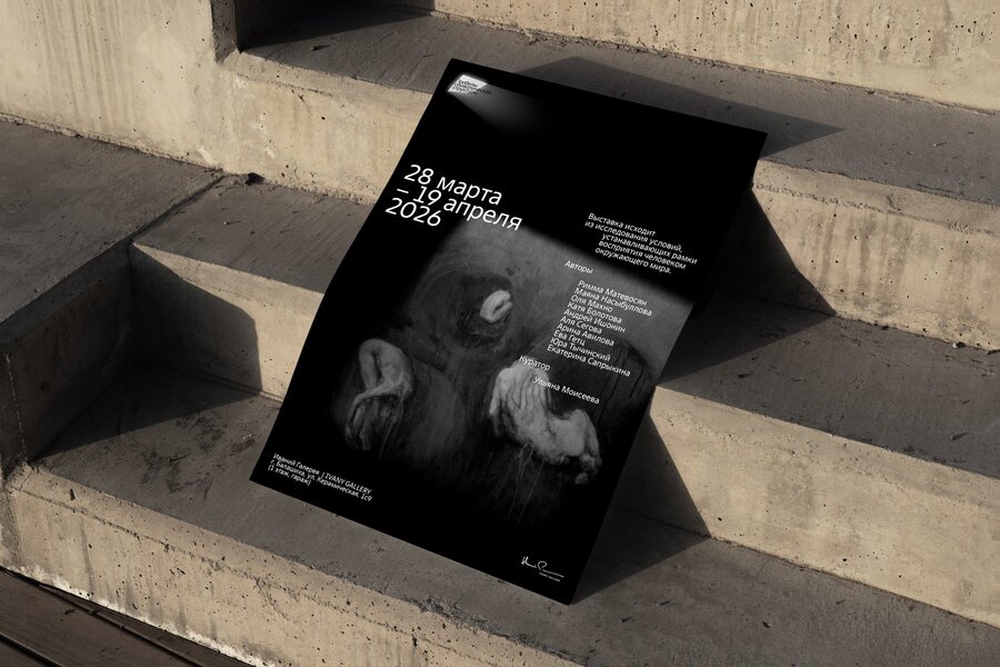
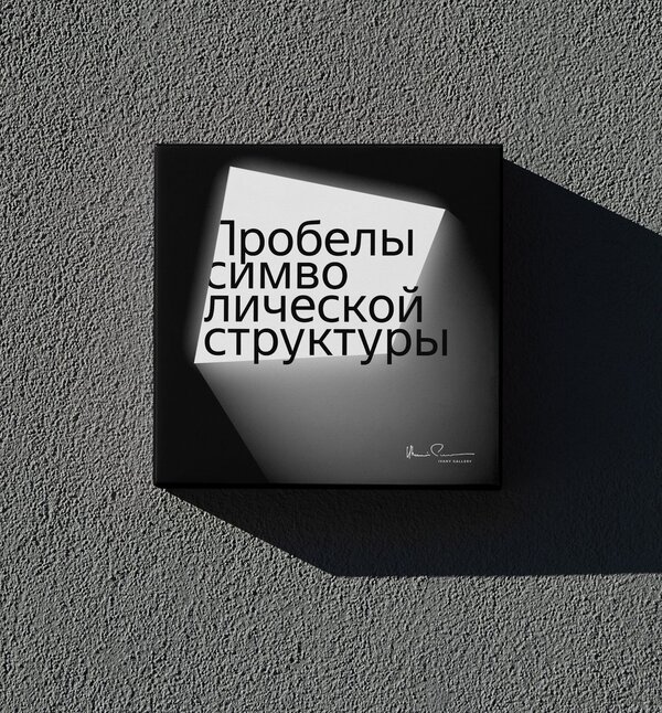
THE RESULT
A visual identity that translates the exhibition’s spatial concept into a unified graphic language, connecting contrasting environments through light, darkness, and typography.
MEDIA PROJECT