Project Concept
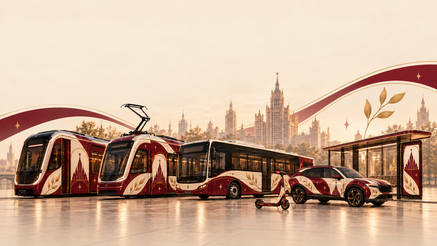
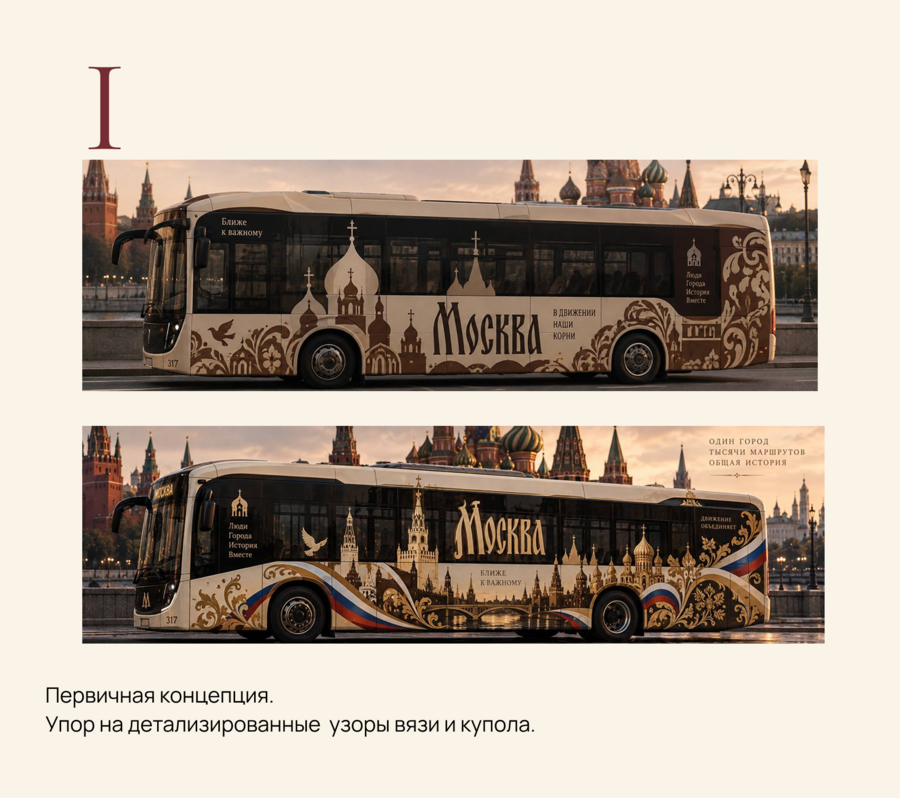
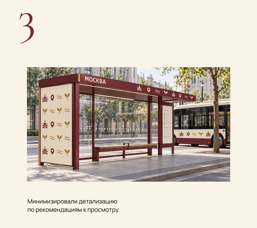
In this project, we aimed to convey the idea of Moscow’s unified transportation system by consolidating the diversity of its visual solutions into a single, recognizable style. Our concept was to preserve the unique character of each mode of transport while simultaneously creating a cohesive image of Moscow’s transit network.
Today, Moscow’s various transport services possess their own visual languages: Yandex, Moscow Transport, bus stops, and scooter rental services are all designed differently. We propose unifying this diversity under common design principles so that the urban environment is perceived as cohesive, and navigation is intuitive and convenient. A unified style will help users find the information they need faster, make transfers easier, and perceive different modes of transportation as part of a single transit system.
Palette and Typography
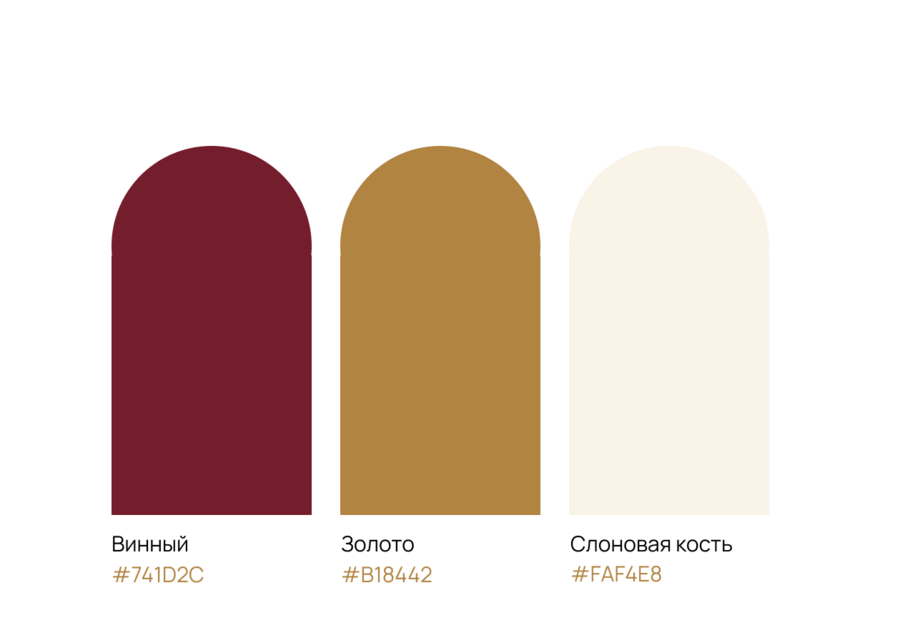
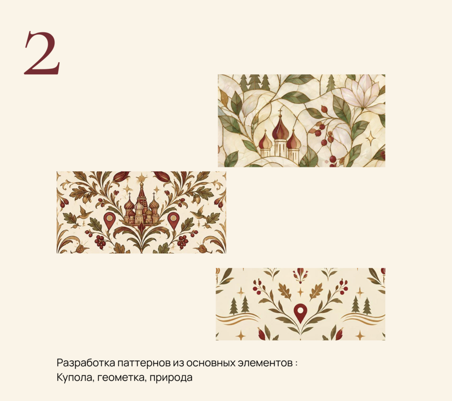
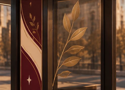
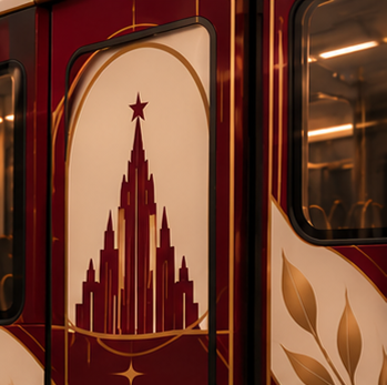
Wine Color — anchor zones and primary signifiers. Saturation and recognition.Gold Color — Lines, leaves, and stars. A warm connecting accent.Ivory — Primary background and negative space. Reduces visual density.
Brand Style Alphabet
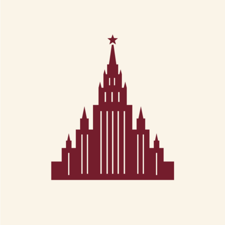
Stalin’s Skyscraper
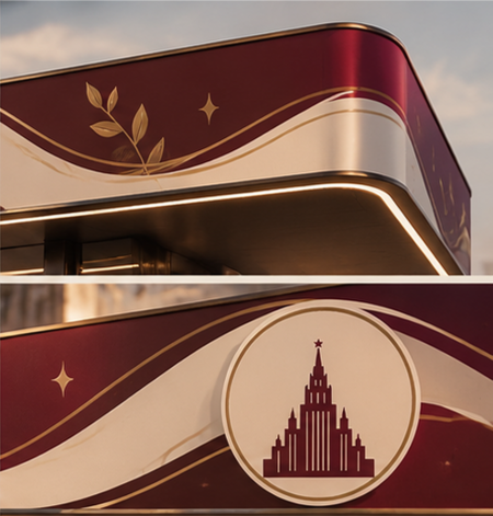
Location. The silhouette of a Stalin skyscraper is the city’s signature feature. The city is recognized by its architecture.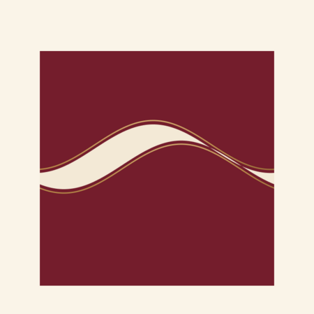
Wave
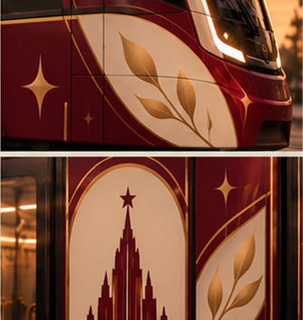
Movement. The ribbon runs along the hull and rises toward the stern—this is the route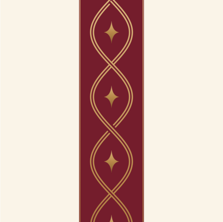
Weave
Memory. A double thread of Russian ornamentation connects the parts of the system.
Leaf
The living city. A sprig of three leaves—boulevards, parks, a warm character.

Star
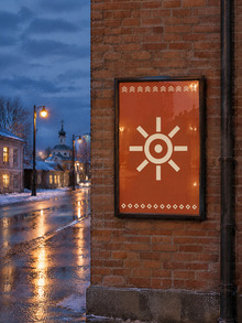
Focal Point. Four rays—a waypoint and an accent in open space.References
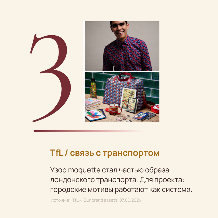
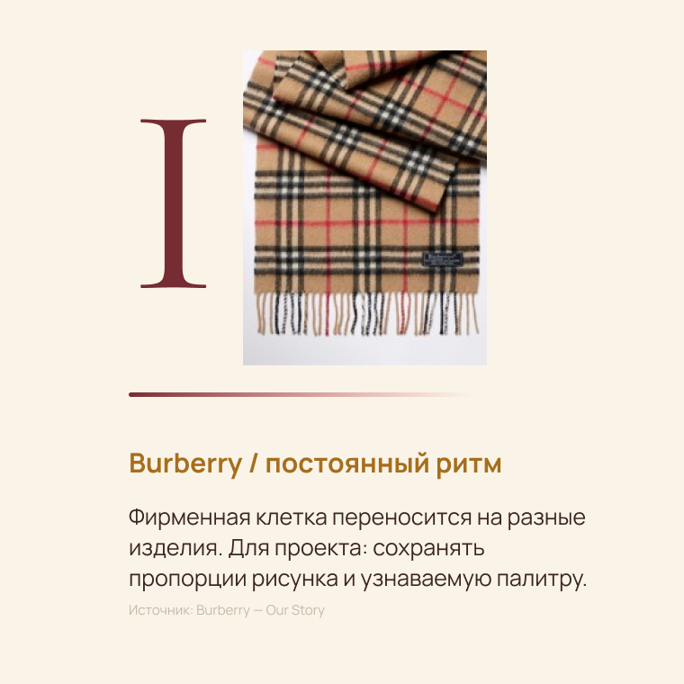
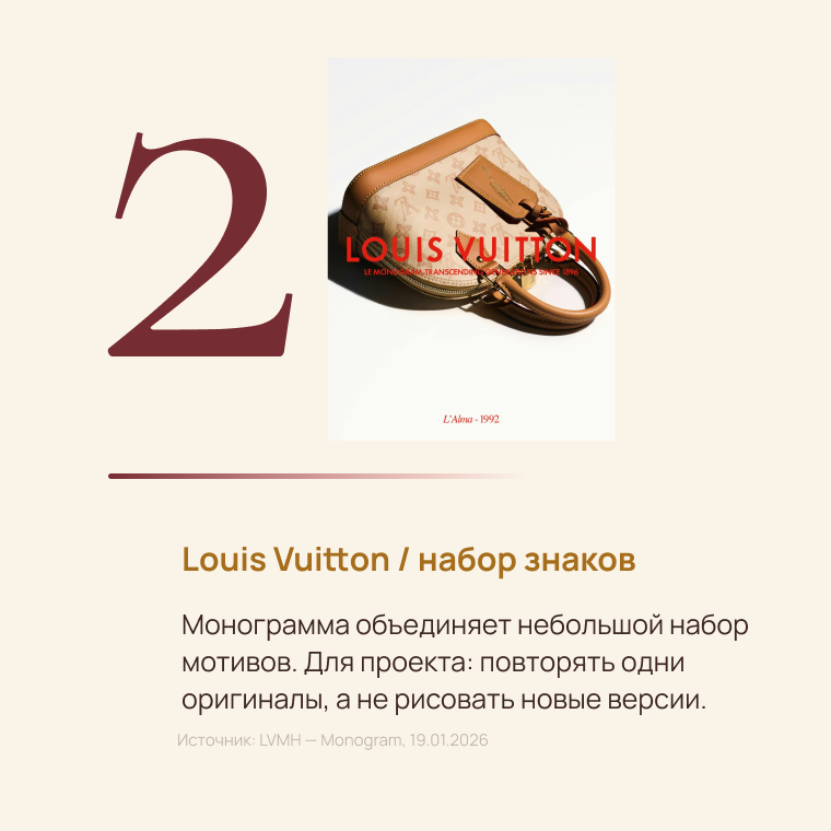
What we were moving toward
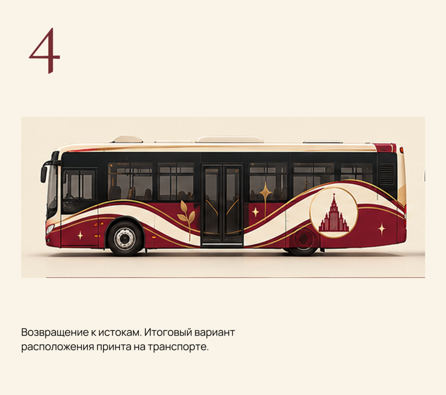
Bus
Public ground transportation stop
Scooter
Train
Underground
Overhead