
MOU | Brand Communication Strategy
Reflection
In this project, we focus on communication theory specifically within the field of branding.
Branding is a particularly sensitive area of design communication because it operates not only through visual form, but through the construction of meanings, values, and expectations. Communication theory provides a framework for understanding how these meanings are produced, interpreted, and negotiated between brands and their audiences.
Communication theory helps explain how meaning functions in design and why visual messages are not universally understood.
Design operates through signs that require interpretation, especially in branding, where meaning depends on the audience’s cultural background, expectations, and context rather than on visual form alone. As Stuart Hall argues, «communication is not the transmission of a message, but the production of meaning, ” emphasizing that interpretation is central to any communicative process.
A key concept is the encoding/decoding process: designers encode values and ideas into visual systems, but audiences actively interpret them rather than receive them passively. This explains why the same branding can be read differently by different groups and why aesthetic clarity alone does not guarantee shared understanding.
From a semiotic perspective, brands function as systems of signs rather than isolated elements. Typography, color, imagery, and materials gain meaning through consistency and repetition across touchpoints. Fragmented or inconsistent systems weaken communication, while coherent systems support recognition and trust.
Communication theory also emphasizes context and channels.
Meaning changes depending on where and how a message is encountered. In branding, ignoring the conditions of perception can lead to loss of nuance or misinterpretation, especially across digital and physical environments.
Finally, communication theory distinguishes between clarity, persuasion, and trust: a message may be clear without being credible, and trust in branding emerges through consistency over time and alignment between message and behavior rather than through symbolism alone. This perspective shifts design from subjective expression toward strategic meaning-making based on how communication actually works.
Presentation of the brand
Brand presentation for a general audience
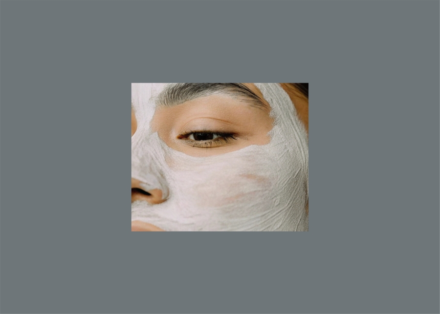
MOU is a brand about slowing down and reconnecting. In a world that feels noisy and rushed, we offer a moment of calm — a simple ritual that brings you closer to nature and to yourself. Our products are inspired by natural materials and landscapes, not to impress, but to make you feel grounded and present.
We believe that care is not only about results, but about experience. Using MOU is a way to pause, breathe, and feel your body again. The textures, scents, and visuals are designed to remind you of earth, stone, water, and skin — things that feel real and familiar. We don’t promise transformation or perfection. Instead, we offer balance, comfort, and a sense of harmony.
The target audience of the MOU brand consists of people who value calm, balance, and conscious self-care.
They are interested in wellness, beauty, and a mindful lifestyle rather than quick results or aggressive marketing. This audience seeks products that feel natural, honest, and emotionally meaningful, and they are drawn to brands that support slow rituals, connection with nature, and a sense of inner grounding. MOU speaks to individuals who see skincare not only as a function, but as a personal and sensory experience.
MOU sells an experience of connection with nature. Even in everyday routines, the brand brings a feeling of being outside, of touching something natural and honest. There is no pressure, no rush, and no loud messages. Everything is designed to feel soft, calm, and reassuring.
The brand is built around the idea that communication is not about telling people what to think, but about creating experiences that people can feel and share. This is why the brand focuses on calm, nature, and grounding rather than loud messages or promises.
By staying consistent in how it looks and feels, MOU becomes something you can trust over time.
It is not about convincing you, but about being there — quietly, steadily, and naturally. MOU is a reminder that care can be gentle, and that feeling grounded is already enough.
MOU is a reminder that care can be gentle, and that feeling grounded is already enough.
The way the brand communicates is based on the understanding that people create meaning themselves through experience.
Visuals, textures, materials, and atmosphere are designed to help you feel connected to nature and to your body, not to convince you through words. You are free to interpret the experience in your own way.
The brand’s physical spaces — including retail environments and experiential locations — are addressed primarily to the general audience, as they operate on an experiential rather than analytical level.
These spaces are designed to translate the brand’s values into an embodied experience through biophilic design, natural light, simple architectural forms, and minimal intervention. Materials, spatial rhythm, and atmosphere are used to create a sense of calm, grounding, and presence.


MOU is not only about skincare products, but about a shared way of living and feeling.
We create a brand that brings people together around calm, balance, and connection with nature. Through MOU, we imagine a community where self-care goes beyond the bathroom routine and becomes a shared experience. This can take the form of retreats in nature, yoga and wellness practices, slow beauty rituals, and moments of collective pause away from everyday noise.
By participating in these activities, people do not just use the product — they become part of a community that values grounding, presence, and care for both the body and the environment. MOU offers a space where you can reconnect with nature, with others, and with yourself, at your own pace.
Presentation for a professional audience
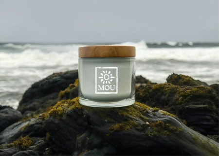
For a professional design audience, MOU functions as a carefully constructed branding system rooted in materiality, atmosphere, and restraint. The visual identity is built around a minimal yet expressive language that prioritizes tactility over decoration.
The logo references hand-made print techniques such as linocut and block printing.
This choice introduces controlled imperfection and physical presence, positioning the brand away from digital smoothness and industrial polish. The abstract sun symbol operates as a non-literal sign, allowing for open interpretation rather than fixed meaning.
The color palette is intentionally muted and nature-based, relying on greys, earthy greens, and soft neutrals.
These colors were selected to support calm perception and visual continuity across different media. Graphic elements are sparse, giving space to imagery and texture rather than competing with them.
Imagery plays a central role in the system.
Photography avoids idealized beauty and high contrast, focusing instead on skin texture, natural light, and interaction with organic materials. This reinforces the idea of honesty and presence. All visual decisions — from product mockups to spatial concepts — are aligned to create a consistent semiotic field that communicates the brand’s values without explicit verbal explanation.
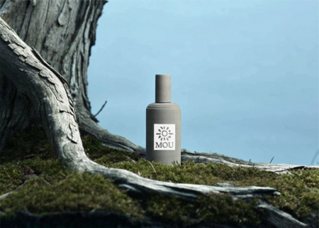
These materials evoke authenticity, tactility, and a sense of primordial simplicity, positioning the product closer to natural objects than to conventional cosmetic packaging. Packaging thus functions not as decoration, but as an extension of the brand’s semiotic system, where material choice communicates values of honesty, grounding, and connection to nature without the need for explicit messaging.
In product packaging, the brand deliberately avoids additional graphic elements and relies solely on the logo as the primary visual marker.
This decision reinforces restraint and reduces visual noise, allowing materiality to carry the main communicative load. Jars and tubes are designed using materials that reference nature and raw matter — such as concrete-like surfaces, stone textures, glass, and wooden lids.


These spaces also carry meaning for a professional audience, as they demonstrate how spatial design can function as part of a coherent communication system. In this way, MOU’s environments act both as places of interaction for users and as case studies of how brand values can be consistently translated across physical contexts.
Explanation
The communication strategy of MOU is grounded in several key theories studied in the course, which guided both conceptual and practical decisions.
First, the project relies on encoding/decoding theory.
We treat branding not as a direct transmission of messages, but as a process where meaning is actively constructed by the audience. Visuals, materials, and atmospheres are encoded with cues related to nature, calm, and grounding, while interpretation is left open. This approach is particularly suitable for branding experiences and emotions, which cannot be communicated through fixed statements.
Second, we draw on semiotic theory, understanding the brand as a system of signs rather than a collection of isolated elements.
Meaning emerges through repetition and consistency across touchpoints — logo, imagery, materials, and space. This explains why coherence is prioritized over visual variety, and why subtle elements such as texture and light play a central role.
Third, the campaign incorporates principles of group communication.
The brand is designed not only for individual consumption, but for shared experiences. Events such as retreats, nature-based activities, or wellness practices extend communication beyond media into social interaction. Through these collective experiences, the brand helps form a community around shared values of care, balance, and connection with nature.
At the same time, we consciously avoid linear transmission and purely persuasive communication models, which assume a passive audience and focus on control, clarity, and calls to action.
Such models are less effective for building trust and emotional engagement in long-term branding. Instead, MOU aligns with theories that emphasize experience, interpretation, and relational communication.
By connecting these theoretical frameworks with concrete design and campaign decisions, the project demonstrates how communication theory can be translated into branding practice — not as abstract knowledge, but as a foundation for meaningful and sustainable brand communication.
Literature
В проекте из которого взяты изображения использованы эти инструменты:
ChatGPT — генерация идей и промтов (chatgpt.com) Adobe Color — цветовая палитра (сolor.adobe.com) Qwen Chat — генерация изображений (chat.qwen.ai) Recraft — генерация изображений (www.recraft.ai) Illustrator — трассировка логотипа Photoshop — обработка изображений (добавление шума, блюр, нанесение логотипов на мокапы)
Communication Theory: Bridging Academia and Practice. Smart LMS URL: https://edu.hse.ru/course/view.php?id=133853 (дата обращения: 13.12.2025)
https://hsedesign.ru/project/11335630fe974460b4e4ec80792f4d56 (дата обращения: 13.12.2025).
https://www.pinterest.ru/ (дата обращения: 13.12.2025).


