Julia Usacheva
graphic designer · portfolio
ABOUT ME

My name is Julia Usacheva, and I am a student at the HSE Art and Design School.I specialize in typography, carefully structuring and designing books from cover to cover. I believe a book should be not only functional but also beautiful. Its visual language must support the content, emphasize the most important elements, and convey ideas and moods across its pages—after all, in typography, form is an integral part of content.I also work in illustration. For me, storytelling and concept are central to every image. I hold a minor in content production for fantasy and science fiction franchises and possess a strong understanding of narrative and visual storytelling.
WHAT I OFFER
· Book & Editorial Design
Developing visual systems for books and multi-page publications—from structuring and designing the content to preparing the final files for print.
· Illustration
Creating visual artwork for a wide range of projects, from book covers and fully illustrated publications to social media avatars.
· Visual Identity Systems
Designing poster series and event posters to create clear, engaging, and memorable communication with audiences.
· 3D Visualization
Creating detailed, three-dimensional representations of product and display models.
Software Adobe InDesign · Adobe Photoshop · Adobe Illustrator · Procreate · Blender
SELECTED WORKS
TYPOGRAPHY
THE LITTLE BAD HARE, OR THE RELATIONSHIP BETWEEN RELIGION AND THE ENVIRONMENT
Book Design
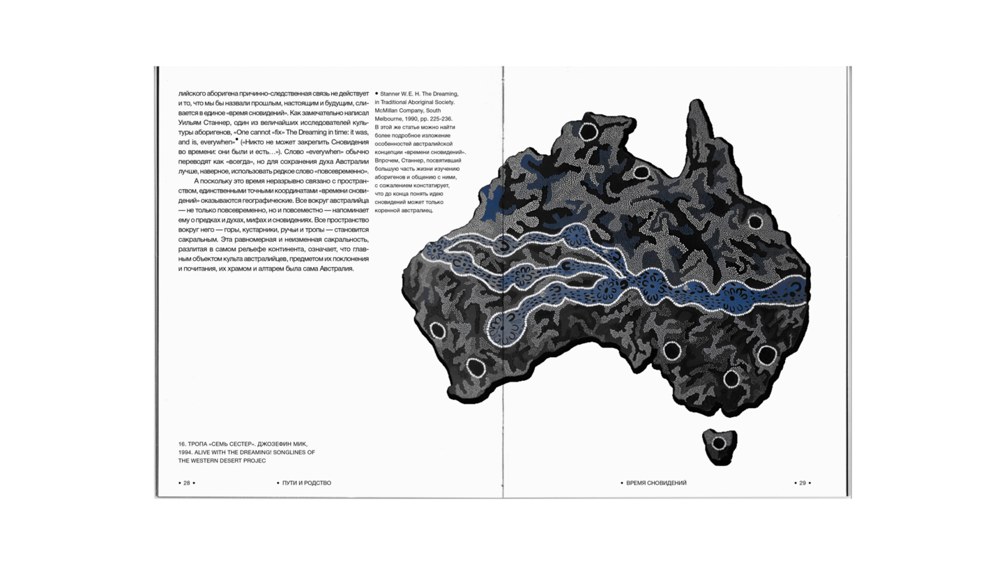
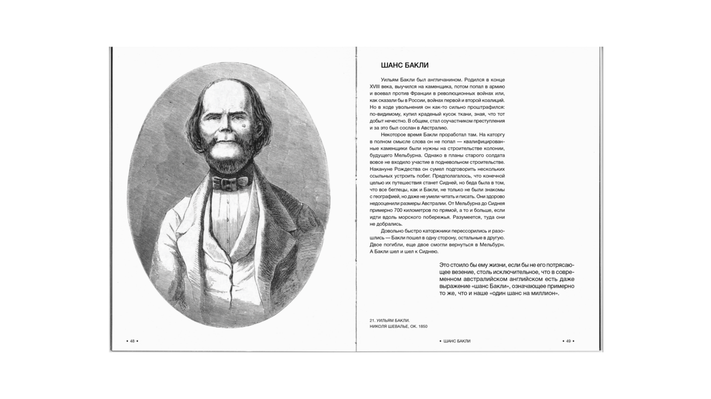
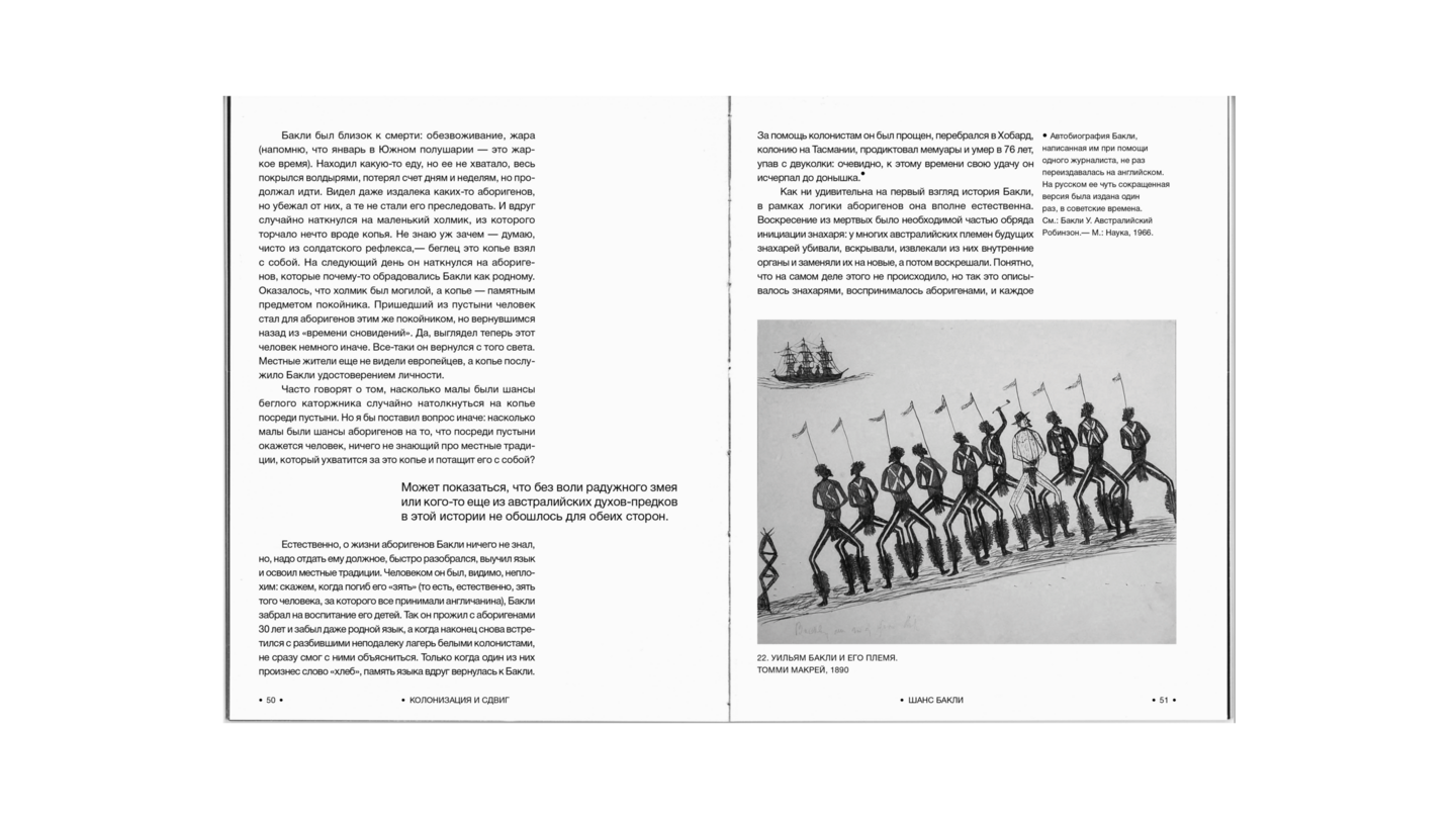
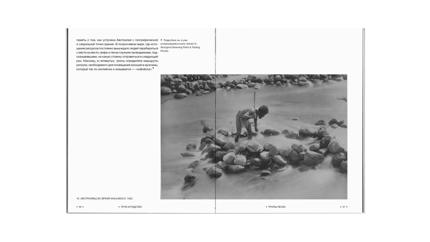
This project is a layout design for the first part of Konstantin Mikhailov’s book, *The Little Bad Hare, or the Relationship Between Religion and the Environment*, focusing on Australia. In this section, the author explores how the lack of plants and animals suitable for agriculture prevented the emergence of a conventional state and history, while simultaneously giving rise to a unique religious system.
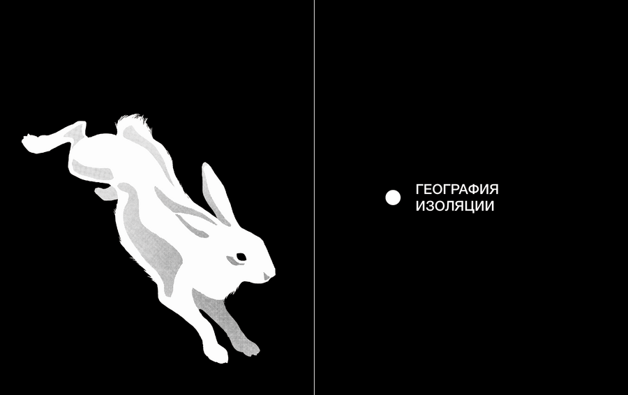
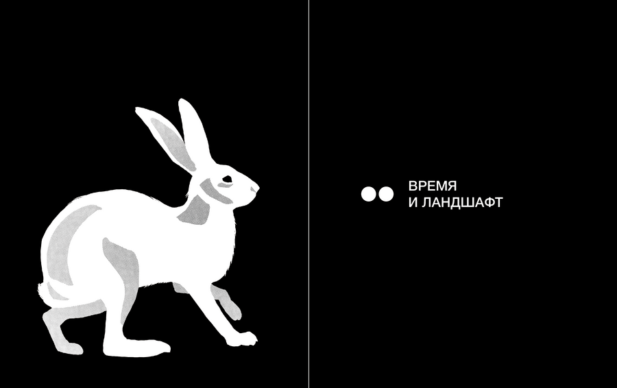
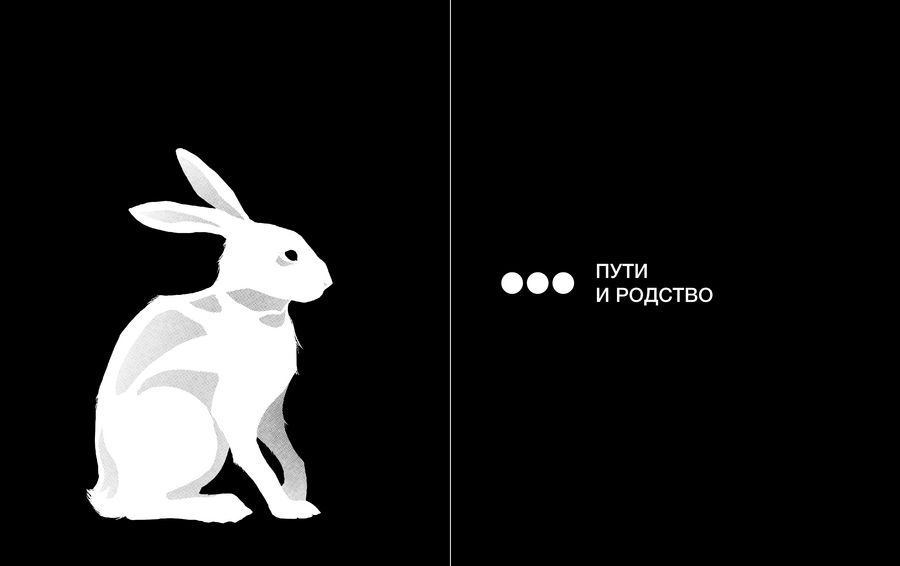
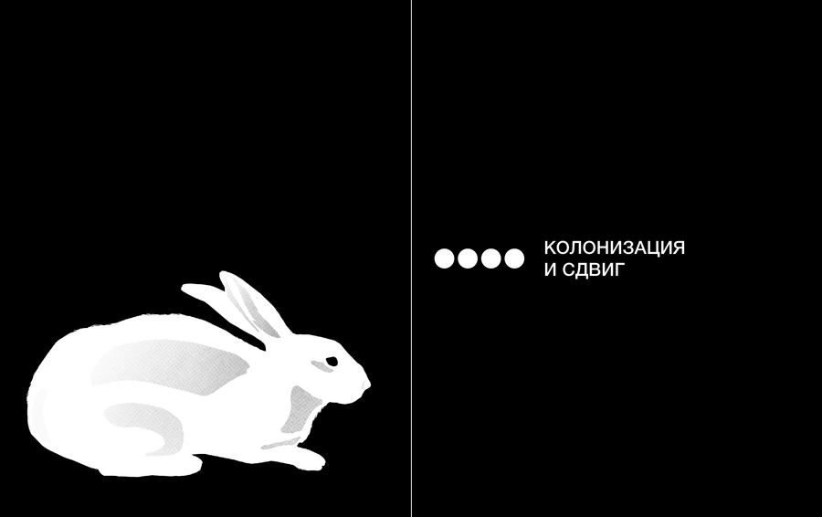
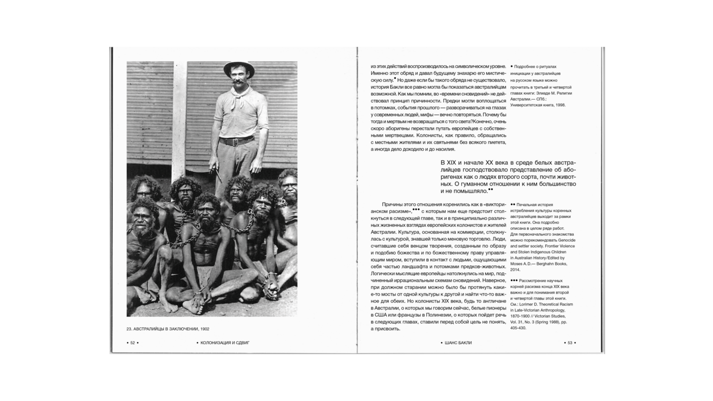
The goal was to develop a fully structured editorial design that retains references to traditional cultural aesthetics without sacrificing its contemporary feel. Designing a multi-page publication demands particular attention—the large volume of material presents a challenge in terms of organization and visual hierarchy.
The modular grid allows for the combination of text and images while incorporating generous negative space. Typographic techniques establish a clear hierarchy and visual rhythm, while distinct sections are clearly separated and complemented by illustrations that reinforce the book’s title and concept.
TYPOGRAPHY & ILLUSTRATION
12 ARCHETYPES
Calendar Design
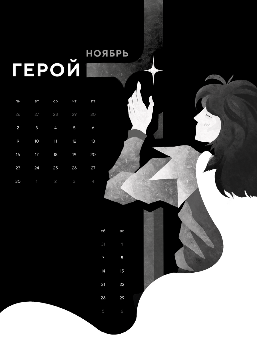
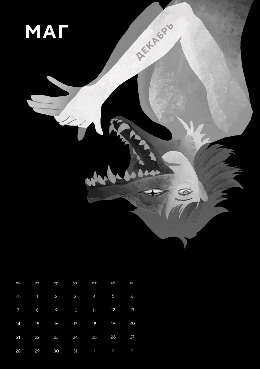
Anyone who has studied art is familiar with the concept of archetypes. They form the foundation of mythological structures and fairy tales, and are still widely used today—for example, in brand development.
The project is a twelve-page wall calendar, with each month representing one of the twelve archetypes in Carol Pearson’s classification.
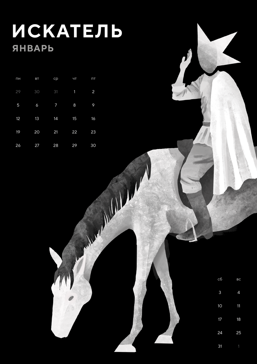
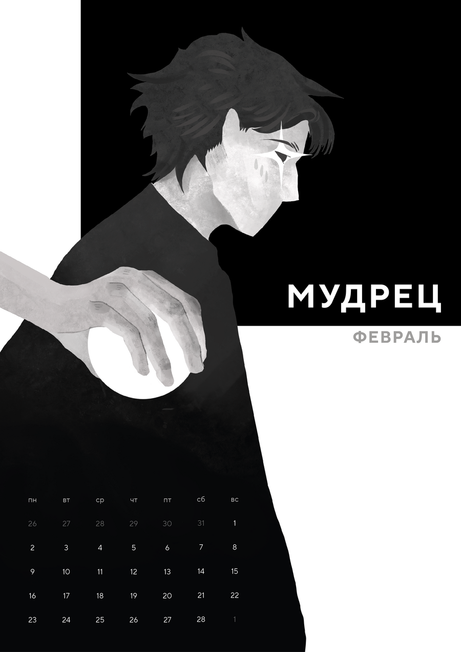
The challenge was to visualize each month through symbolic imagery. Some interpretations were fairly direct, while others were built upon a chain of associations. December, for instance, is a month of preparation for the New Year—a time of wonder when the Earth completes another orbit around the Sun. In this case, the image of the Magician is rooted in the idea of transformation, rather than the stereotypical image of a fantasy wizard.
ILLUSTRATION
MALE ARCHETYPES
Playing Card Deck Design
The deck is based on the system of male archetypes developed by Douglas Gillette and Robert Moore in their book King, Warrior, Magician, Lover. Each suit represents one of the four archetypes.