ABOUT ME
Hello! My name is Alice, and I create visual identities for both new and established brands.

I am a student at the HSE Art and Design School. My visual systems encompass every touchpoint where a brand connects with its audience: from storefront signage and wayfinding to print, packaging, and badges. The portfolio features three projects: an art space in Tbilisi, the newspaper «Bez Tseremoniy, ” and the hospital „RKIB.“ If you require a recognizable, consistent visual identity, let’s discuss a potential collaboration.
SPECIALIZATIONS:
Brand identity · Editorial layout · Packaging and print · Wayfinding and merchandise
Who will I be working with?
Companies needing design for a new product or a refresh of an existing brand.Often, these companies haven’t yet decided on a direction or on the best way to present their product. I help discover a visual solution that takes into account the product, the company’s goals, and its customers.B2B: I collaborate with the client company as an independent designer. The outcome of each stage is agreed upon with the client’s representative.
My Projects
01 Fabrika Tbilisi
(the identity of an art space and its festival)
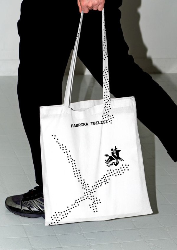
ABOUT An art space within a former Soviet factory, reimagined as a cultural hub for artists, creators, and travelers—featuring a hostel, studios, workshops, bars, shops, and an event courtyard.TASK A rebrand that emphasizes relevance, cultural value, and creative character, strengthening the space as a contemporary urban hub.IDEA The festival is intrinsically linked to its venue, a former bunker. It shifts focus from digital screens to live interaction, with the bunker acting as a transmitter—a signal that gathers the creative community. For the graphics, I reconstructed Georgian ornaments using pixels.
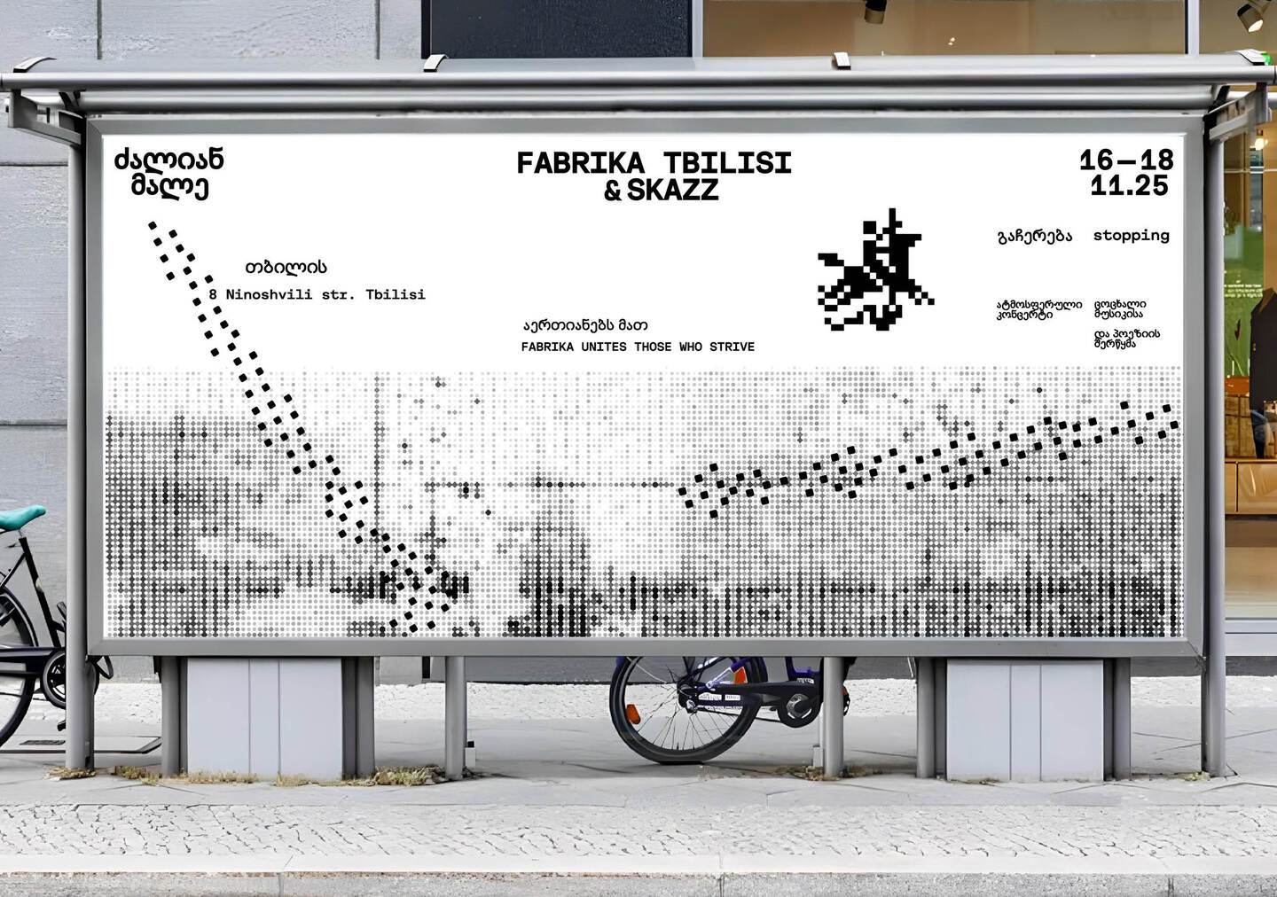
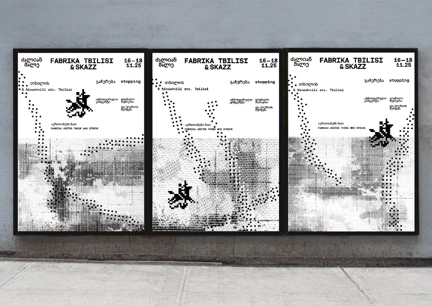
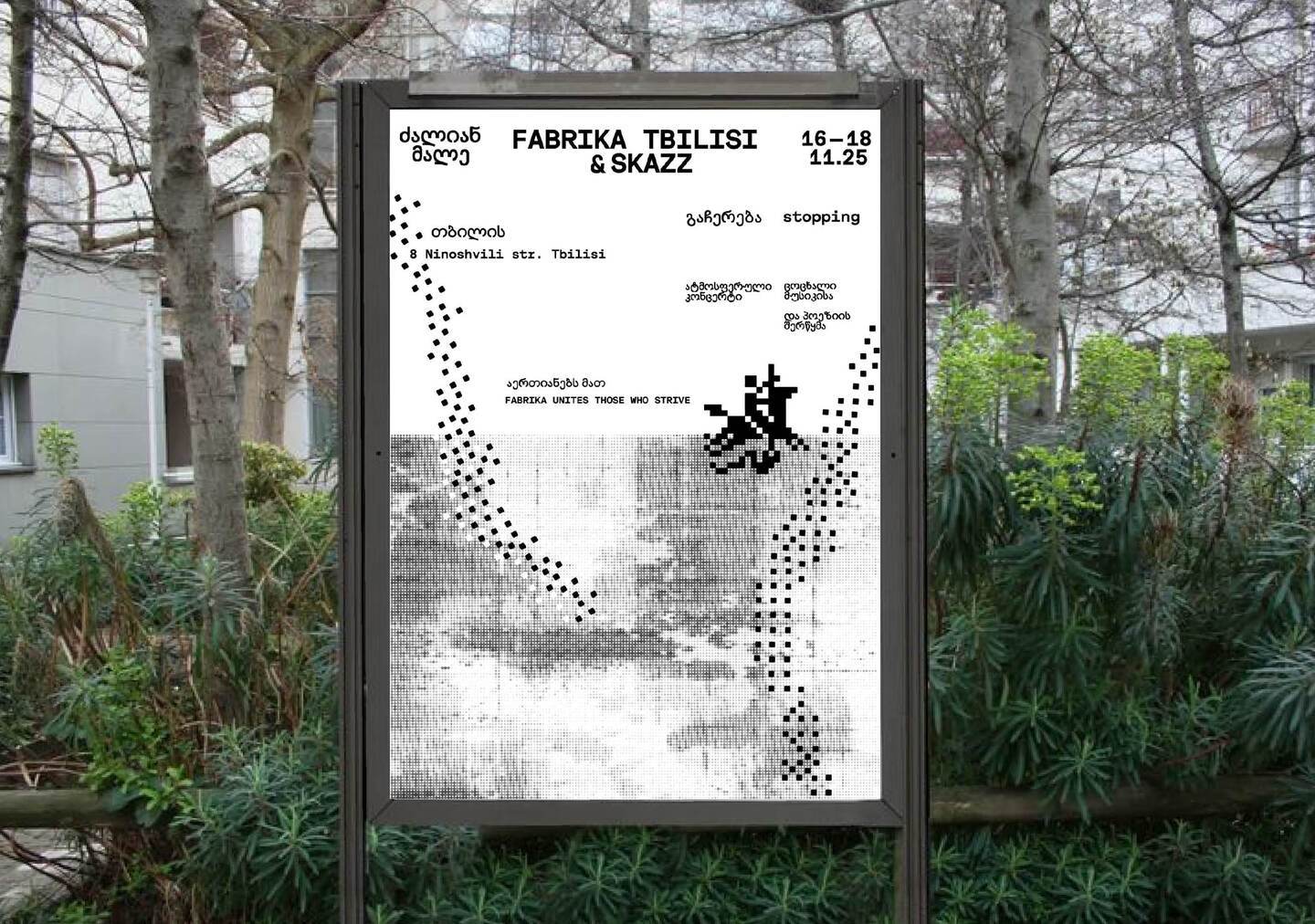
SYSTEM:
mark: pixel rider
pattern: Georgian ornaments built from pixels
type: plain monospace
color: black, white, signal orange
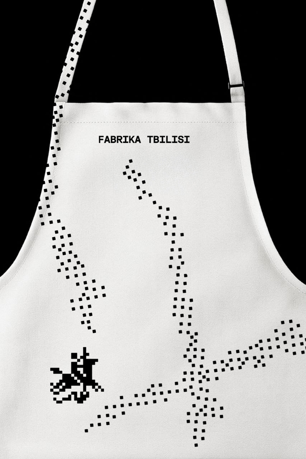
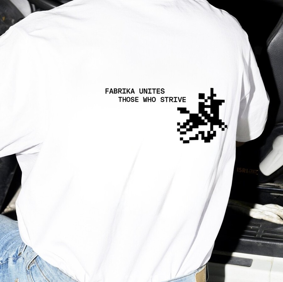
A single pixel language across every medium. On posters, pixels form a Georgian ornament. On aprons and T-shirts, the mark remains: the pixel rider. In wayfinding, the same pixels become pictograms, and the lettering utilizes the same monospace typeface. The ornament from the posters repeats on the signs, ensuring every element reads as part of a unified place.
02 «No Ceremony»
(newspaper of a new Nizhny Novgorod outlet)
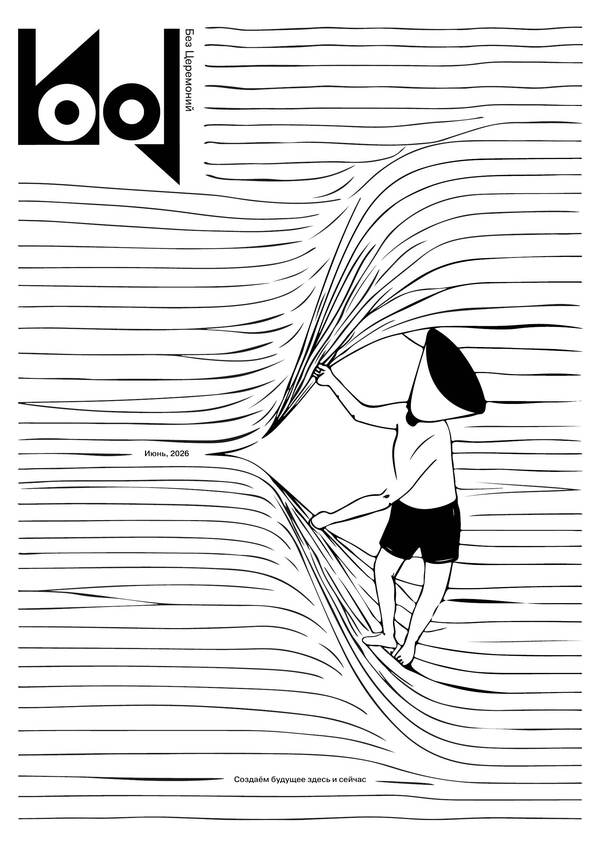
ABOUT A new Nizhny Novgorod outlet from the Sobaka.ru team. It covers business, culture, and industry: expert analysis, real-life case studies, and a conversation between newcomers and experienced professionals.TASK An analytical edition worth collecting: a convergence of business press, cultural media, and an author’s visual statement. It continues the spirit of open professional dialogue established at the 1896 All-Russian Industrial and Art Exhibition.IDEA The city as a space of interaction: a system of links between people, communities, and generations. Several columns represent distinct voices within one dialogue, while author illustrations transform complex processes into visual narratives, making dense text feel archival.
SYSTEM:
logo: separate elements forming one system
quotation marks: an element of the identity
type: chosen for composition and readability
grid: multi-column, black and white
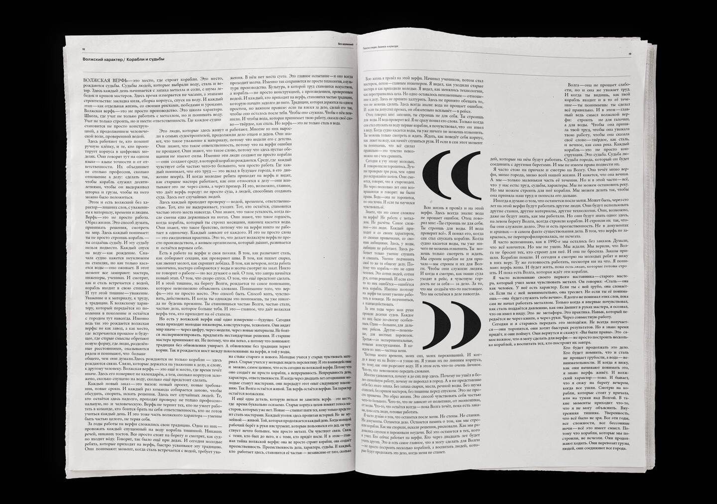
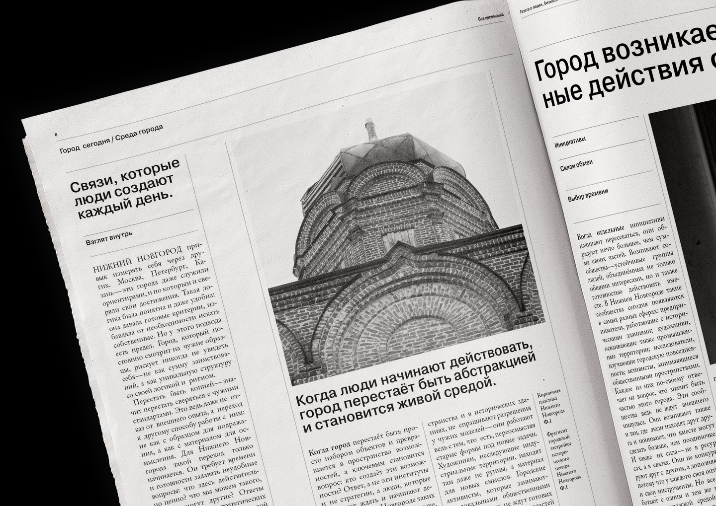
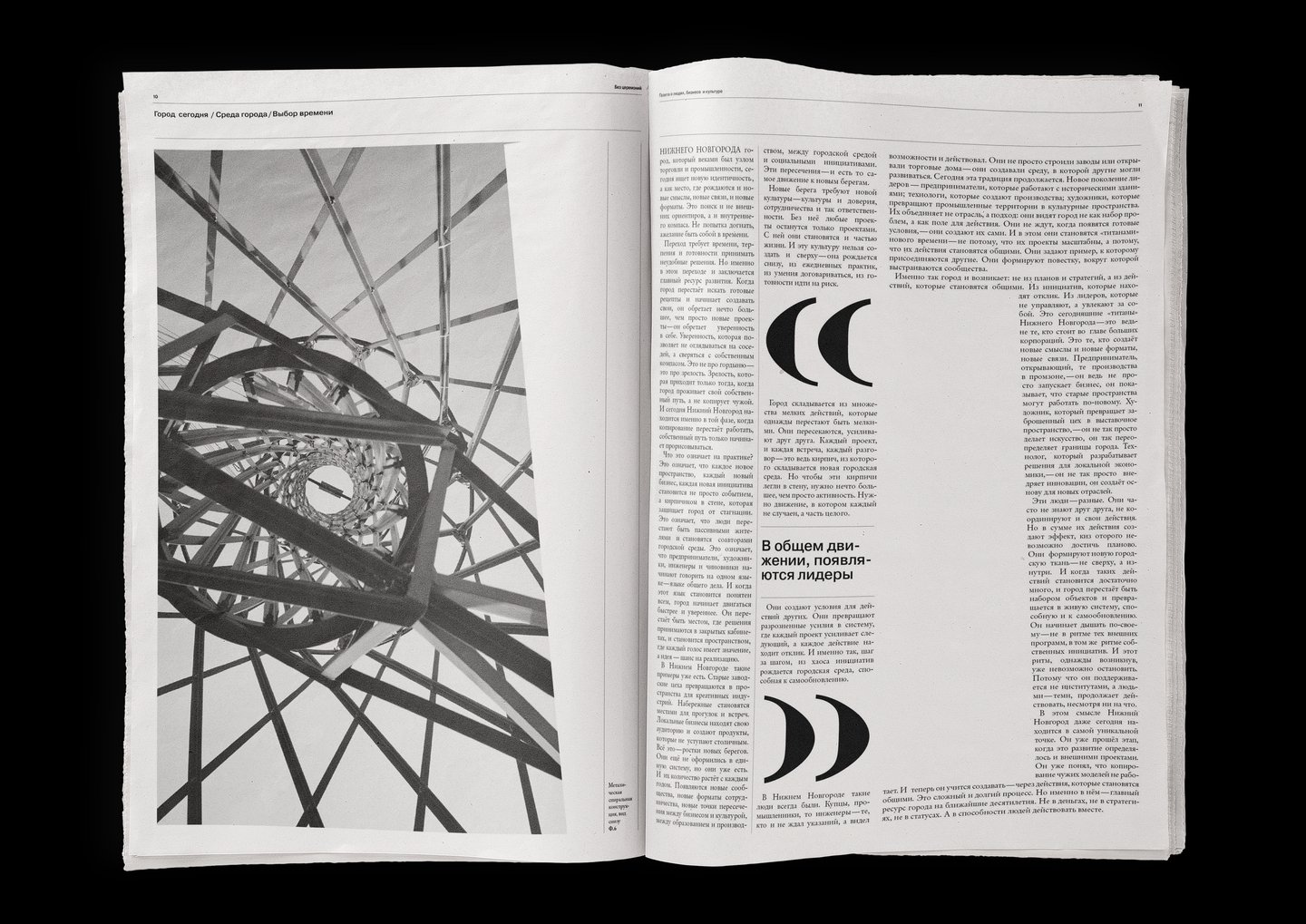
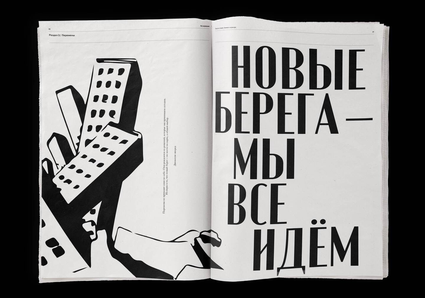
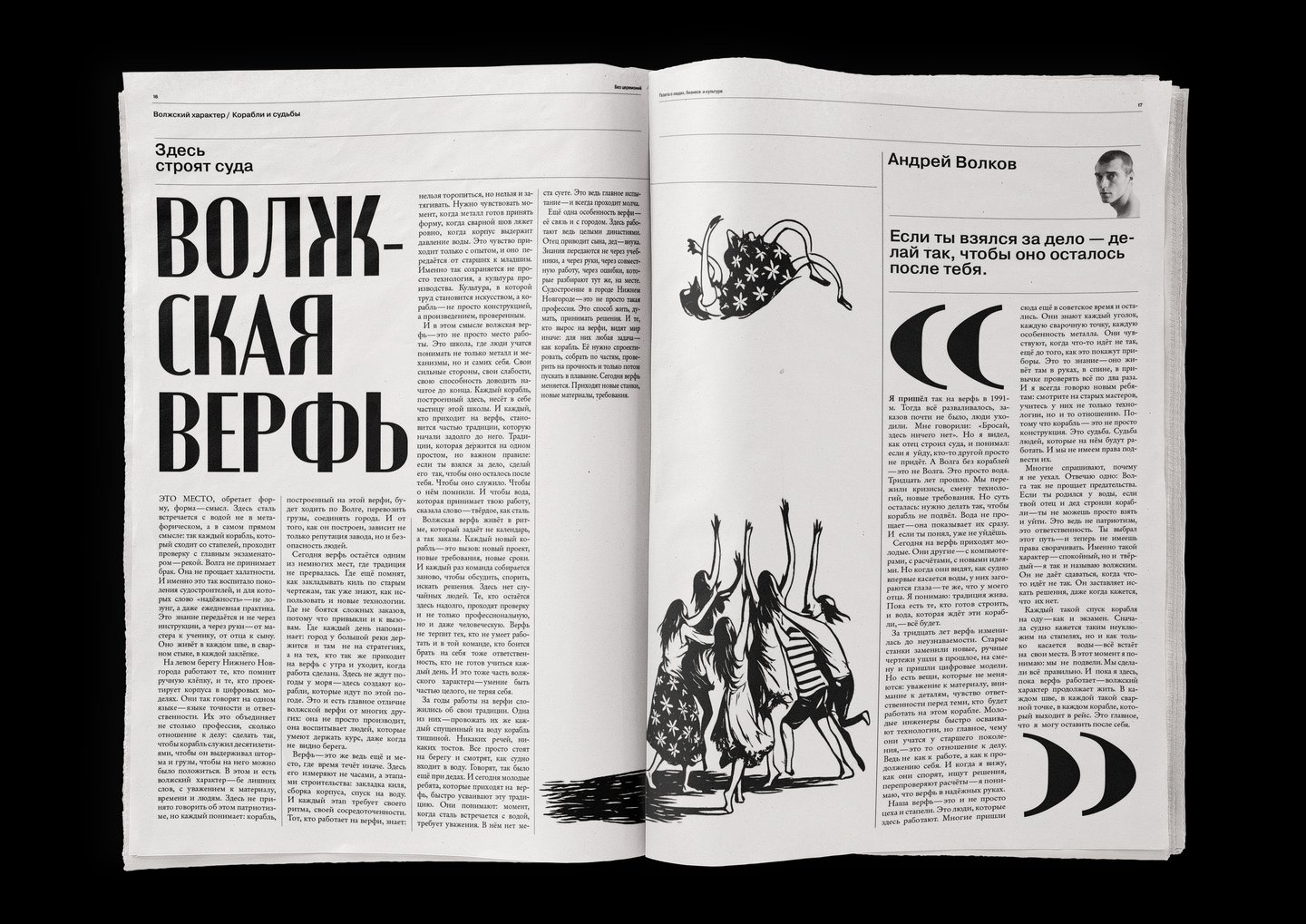
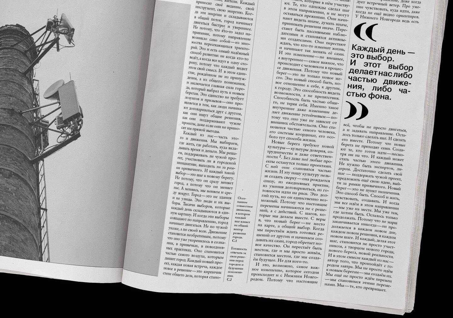
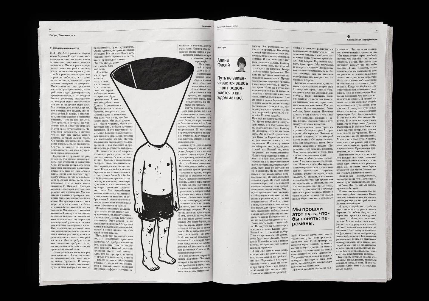
The paper explores economics, industry, and culture, presenting a city composed of its people and the connections between them. Consequently, the text is organized into columns that run parallel, mimicking a conversation among different voices. Author illustrations simplify complex topics visually, serving to link these columns together. The pages are dense—like an archive you can flip through and revisit—yet they remain easy to read.
02 «RKIB»
(rebrand of a science and practice center)
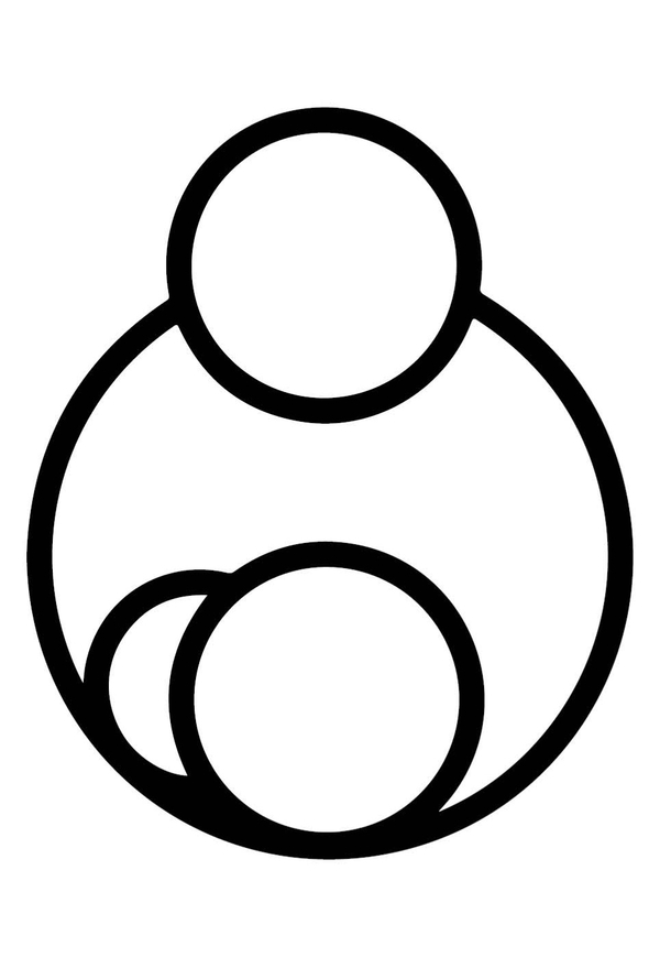
ABOUT Republican Clinical Infectious Diseases Hospital of the Russian Ministry of Health, a center for preventing and treating HIV in pregnant women and children.TASK A complete rebrand. The client requested retaining a recognizable, modern form of the baby, selecting two to three colors inspired by the original logo, and clearly conveying that the center treats HIV-positive children and women.IDEA The identity borrows the visual language of laboratory virus research: the graphics resemble fragments of an enlarged structure under a microscope, along with traces of recorded data. The «sticks» read as components of that structure.
SYSTEM:
mark: parent and baby depicted in simple circles
graphic: thick, rounded strokes—the «sticks»
type: rounded geometric sans-serif
color: red, coral, and the light blue from the old logo
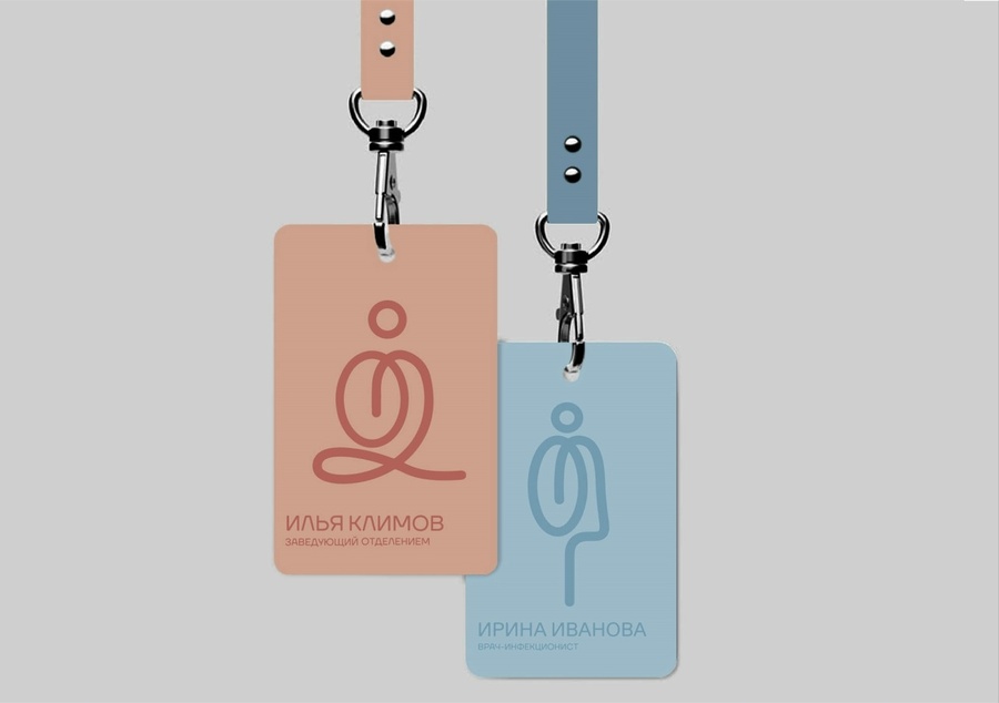
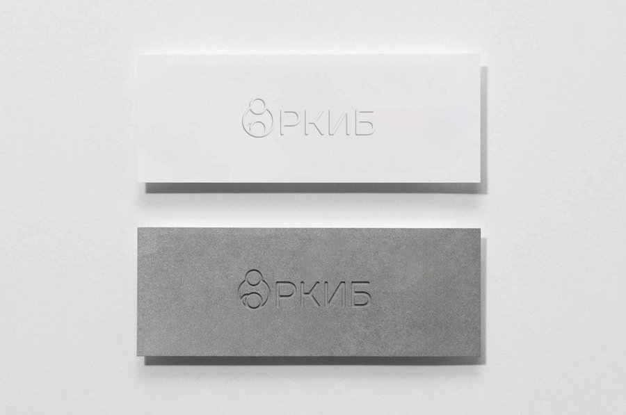
HIV in children and pregnant women is addressed with care; thus, the poster, badge, and business card contain no images of fear. They feature the logo, calm text, and «sticks”—fragments of an enlarged structure, as seen under a microscope. They demonstrate that the center is studying the disease and keeping it under control.
my approach
01 Brief
I study the product, the company’s goals, and its customers.
02 Concept
I seek one clear image to convey the idea.
03 Visual System
Type, color, and graphics that work in harmony.
04 Handover
I deliver the materials; every stage is agreed upon with the client.
Why me?