How communication theory works in the field of design or contemporary art
Communication theory plays a fundamental role in the development of a content strategy, promotional planning, and brand positioning. On a basic level, a designer must clearly understand who their audience is, which social or cultural group is being addressed, and how messages should be structured in order to reach this target group effectively. Without this understanding, visual language risks becoming unclear or disconnected from its intended recipient. In the field of contemporary art, including painting, sculpture, graphic art, and works presented at art fairs, communication operates on multiple levels. Artistic success is not determined solely by knowledge of market trends or the ability to follow current aesthetic movements. It also depends on a clear understanding of the viewer or collector and their expectations, cultural background, and emotional motivations. Communication theory helps explain how meaning is constructed between the artwork, the artist, and the audience, turning artistic production into a dialogue rather than a one-sided statement. From a market perspective, effective communication is essential for building long-term relationships between artists, art dealers, and collectors. Buyers tend to return to art dealers or galleries that are able to establish trust, maintain consistent communication, and provide a coherent narrative around the artwork. This includes not only verbal interaction, but also visual presentation, storytelling, and the framing of artworks within exhibitions and online platforms. In this sense, communication theory becomes a practical tool that shapes the entire chain of interaction — from first contact to sustained engagement. Ultimately, in both design and contemporary art, communication is not merely a method of transmitting information. It is a strategic process that defines how meaning, value, and identity are produced and perceived. Understanding communication theory allows creative professionals to position their work more consciously and to create stronger, more meaningful connections with their audiences.
Presentation of your brand for a general audience
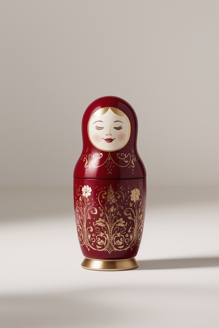
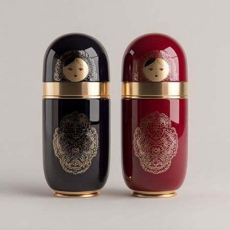
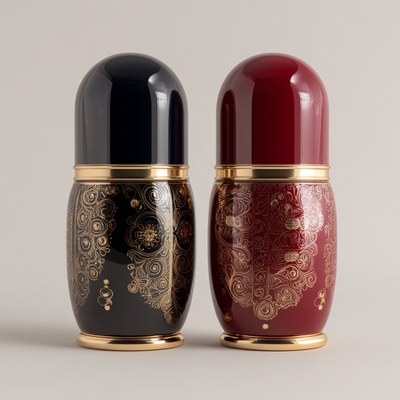
DOROGO\BOGATO reimagines lipstick cases as collectible design objects inspired by traditional Russian toys. Each piece transforms a familiar cultural symbol, such as the iconic matryoshka doll, into a refined, contemporary accessory for modern beauty rituals.
By combining cultural heritage with modern luxury design, we create lipstick cases that feel personal, expressive, and timeless. They are not just containers for beauty products, but objects of identity — meant to be displayed, carried, and cherished.
Our brand speaks to those who appreciate craftsmanship, storytelling, and beauty with meaning. It is where tradition meets modern luxury, and everyday makeup becomes an intimate, elevated experience.
Why Our Brand matters
DOROGO\BOGATO explores beauty through the lens of cultural memory, transforming everyday cosmetics into collectible objects inspired by traditional forms.
In a world of fast beauty and disposable packaging, our brand brings meaning back to everyday rituals. We believe beauty should feel personal, lasting, and emotionally resonant.
Our lipstick cases are inspired by cultural symbols that carry warmth, memory, and identity. By transforming traditional Russian toys into refined design objects, we create a connection between heritage and modern self-expression.
This brand matters because it offers more than a product, it offers a feeling. A sense of individuality in a mass market. A small luxury that stays with you, not something to be thrown away.
Our cases are made to be kept, reused, and cherished. They turn a simple beauty routine into a moment of pride, pleasure, and personal storytelling.
For our audience, this is beauty with soul designed to be meaningful, collectible, and unforgettable.
Brand Story
This brand was created from a personal need — to bring meaning back into beauty.
Many of us grew up surrounded by traditional Russian toys, objects filled with warmth, memory, and quiet symbolism. Over time, we noticed how modern beauty products had become fast, disposable, and emotionally empty. We wanted something different.
We created this brand to transform familiar cultural forms into modern objects of desire by reimagining iconic shapes to unite heritage with contemporary luxury.
Each piece is designed to feel personal and lasting, something you don’t throw away, but keep. This brand exists to remind us that beauty can carry memory, identity, and emotion.
Our products
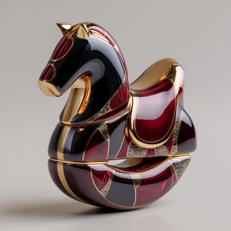
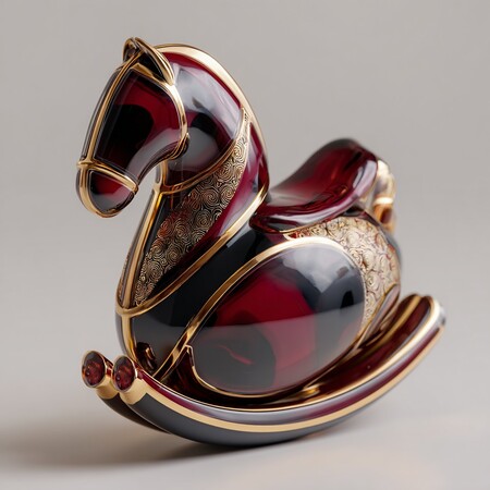
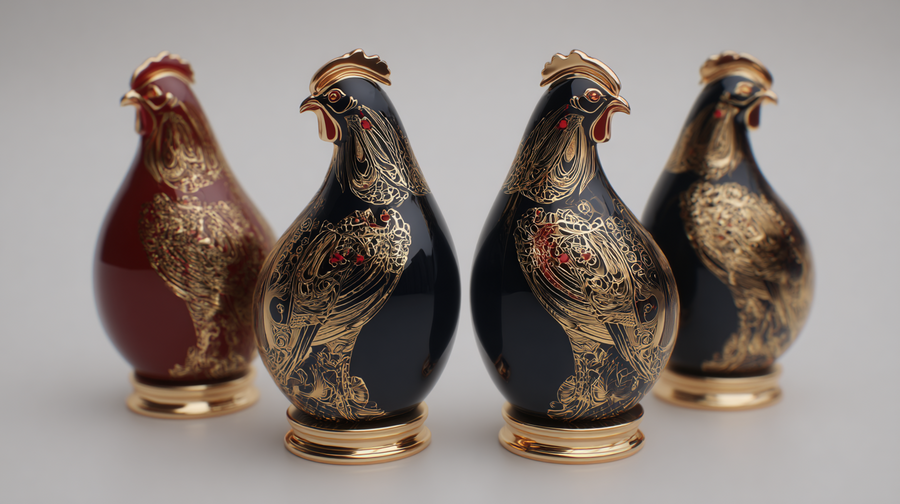
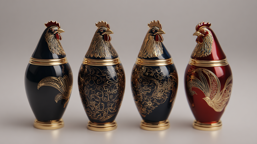
Each case features an elegant sculptural silhouette, premium materials, and a glossy lacquered finish. Rich colors, delicate detailing, and carefully balanced proportions give the product a sense of weight, permanence, and craftsmanship.
Unlike conventional cosmetic packaging, our lipstick cases are made to be kept and reused. They combine cultural storytelling with modern luxury design, standing out as emotionally meaningful objects rather than disposable beauty items.
Visual identity
Forms The brand language is built around clean, sculptural forms with clear geometry. Square and rectangular structures are combined with soft, rounded accents inspired by traditional silhouettes, reinterpreted in a modern and minimal way.
Color Palette The primary palette centers on deep red as a signature color, supported by black and warm gold accents. The colors are rich, confident, and emotionally expressive, creating a strong and recognizable brand presence.
Materials Premium materials define the brand experience. Glossy lacquered surfaces, matte finishes, and refined metallic details convey a sense of weight, durability, and luxury.
Brand values
Authenticity We stay true to our cultural roots, creating designs that feel honest, intentional, and meaningful.
Craft Every detail is carefully considered, from form to material, reflecting a high level of craftsmanship and quality.
Cultural Memory Our products carry stories and symbols that connect past and present, transforming heritage into modern design.
Sustainability We design objects to be reused and kept, promoting longevity over disposability.
Emotional Connection We create beauty objects that feel personal, memorable, and emotionally resonant.
Presentation for a professional audience
Positioning
The brand is positioned as a luxury art driven beauty brand. It sits at the intersection of high end cosmetics, collectible design, and cultural storytelling.
This is a niche brand created for a selective audience that values meaning, craftsmanship, and visual identity over mass trends. The product is not mass market cosmetics but a design object connected to beauty.
The brand can be presented in curated spaces such as concept stores, museum shops, art fairs, fashion boutiques, and selected luxury retail environments. It belongs in places where design, culture, and aesthetics are central.
Target audience
Color Palette
Primary Color Deep Red A rich, confident red that represents passion, strength, and cultural depth. It serves as the core visual anchor of the brand and creates instant recognition.
Secondary Colors Black A grounding color that adds sophistication, contrast, and modernity. It allows the product and red accents to stand out.
Warm Gold Used sparingly as an accent, gold adds a sense of luxury, refinement, and collectible value without overwhelming the design.
Neutral Tones Soft Black and Dark Charcoal Supporting shades used for balance, depth, and background elements.
Finish Direction Red appears primarily in matte or soft satin finishes. Black is used in both matte and glossy surfaces. Gold is applied as a subtle metallic accent.
Next Steps and Growth Strategy



