Соревновательная карточная игра про парфюмерию для 2-6 игроков. Их цель — смешивать имеющиеся ингредиенты, создавая новые ароматы. Составлять идеальные сочетания не получится, поэтому нужно находить комбинации, в которых лишние компоненты будут наименее заметны.
Карточки парфюмов
Карточки ингредиентов
Нейросеть
Карточки парфюмов
Общий промт: Design: digital painting, painterly brushstrokes, high-contrast cinematic lighting, dramatic chiaroscuro, minimalistic composition, single perfume bottle centered on a small reflective surface, strong directional spotlight with soft rim light, expressive textured background made of broad brush strokes, bold but limited color palette (one dominant hue + dark neutrals), subtle reflections on surface, slight painterly grain, hand-painted look, elegant editorial aesthetic, clean negative space, no extra props unless specified, maintain consistent visual weight across cards
Negative: no text, no logos, no signatures, no watermarks, no people, no faces, no hands, no full scenes or busy backgrounds, no extra objects/labels, no photorealistic 3D render, no anime, no cartoon, no low-quality, no pixelation, no JPG artifacts, no over-sharpening, no excessive gloss, no unrealistic lens flares, no typography, avoid photographic depth-of-field bokeh (keep painterly look), no duplicated bottles, do not include brand names
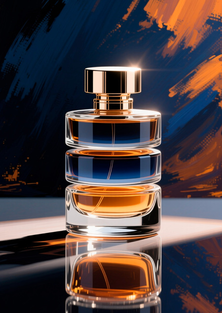
Под каждый флакон:
- Scene: A faceted crystal prism perfume bottle (tall rectangular prism with many beveled facets), filled with warm amber liquid, thick glass base, small square matte black cap, subtle soft shadow under bottle.
- Scene: A vintage glass atomizer with a round ribbed glass body and a soft fabric bulb pump, brass collar and fine engraved details, small puff hose loosely coiled beside base (minimal), faint perfume vapor suggestion.
- Scene: A spherical globe perfume bottle sitting on a low disc stand, deep emerald glass with inner glow, polished stone base creating clear reflection, rounded cap mirrored in surface.
- Scene: A stacked-disc bottle composed of three thin horizontal glass discs aligned vertically with visible liquid layers between discs, slim metal cap on top, architectural and geometric silhouette.
- Scene: An hourglass-shaped perfume bottle with narrow waist and rounded top and bottom, smoky translucent glass with coppery liquid inside, slim cylindrical cap, vintage modern hybrid silhouette.
Карточки ингредиентов
Общий промт: Design: digital painting, painterly brushstrokes, bold saturated color, high-contrast lighting, close-up pattern filling the entire frame, repeating motif / tiled composition, no single central object, dense overlapping elements, visible textured brush strokes, subtle painterly grain, glossy highlights and deep shadow pockets, elegant editorial look, single dominant hue per card, seamless edge-consistency for tiling (if supported)
Negative: no text, no logos, no watermarks, no signatures, no people, no faces, no hands, no single central subject, avoid solitary isolated object, no empty margins, no photorealistic 3D, no anime/cartoon, no extra props, no labels, no pixelation, no over-sharpening, no unrealistic lens flares, do not crop motif to show half-elements at all four edges unless creating seamless tile; avoid strong depth-of-field (keep graphic flat)
Под каждый ингредиент:
- Scene: Dense repeating pattern of twisted vanilla beans and short split pods covering the whole frame, overlapping diagonally and horizontally, visible seeds spilling from several split beans, varied orientations and slight size variation, dominant color: deep warm brown with honey highlights, tight composition with no central empty space.
- Scene: All-over pattern of layered rose petals covering the entire canvas, petals in ranges from deep crimson to dusty pink, dense overlapping clusters with occasional curled edges and tiny dew droplets, varied scales and rotations to create rhythm, dominant palette: crimson-to-rose gradient, no single focal bloom.
- Scene: All-over pattern of layered rose petals covering the entire canvas, petals in ranges from deep crimson to dusty pink, dense overlapping clusters with occasional curled edges and tiny dew droplets, varied scales and rotations to create rhythm, dominant palette: crimson-to-rose gradient, no single focal bloom.
- Scene: All-over pattern of small jasmine blossoms and tiny buds densely scattered across the canvas, star-shaped white petals and soft yellow centers repeated in varying sizes and overlaps, a few petals slightly rotated or layered to add depth, dominant tones: creamy white with pale lemon and soft green flecks, consistent dense coverage. 5)Scene: Repeating pattern of whole and split cardamom pods and scattered green seeds densely packed to cover the frame, pods in muted green-to-olive tones
Пространство
Pop-up stand
Exhibition pop-up stand concept for the perfume board game «Аroma», designed like a luxury perfume boutique: glass display cubes containing the illustrated cards and bottles, ambient warm light, deep black walls with gold foil logo «Аroma», elegant signage in Didot type, scattered petals or light mist around the display, premium visual merchandising style, realistic photography, high detail, no visible grid or repeating textures.
Промо-материалы
Страница журнала/AR-приложение
- Editorial magazine spread layout for the board game «Aroma», luxury beauty advertisement aesthetic, left page full photo of perfume bottle artwork, right page text columns with headline «Aroma — is a game that can be felt» in Didot, smaller captions in Inter, warm ivory paper texture, accents in amber gold, elegant typographic hierarchy, perfect print alignment, fine shadows and metallic reflections, high-end print photography style.
- AR filter preview for «Аroma», perfume bottle floating in front of user’s face surrounded by translucent aroma swirls, delicate gold particles moving slowly, warm amber and dark ink color palette, minimalist Didot typography «Аroma» at bottom center, soft cinematic light, blurred background, elegant and luxurious composition, realistic mobile screen mockup, no visible UI overlays or tiled background.
Айдентика
Elegant monogram combining letter «A» and a stylized perfume droplet, wordmark «Aroma» (Didot) to the right, clean vector logo for brand identity, primary colors: Deep Ink for wordmark, Accent Aromatic Amber for droplet accent, minimal negative space, thin stroke, scalable for small sizes, exportable as flat vector
Типографика
- Editorial typographic spread for a luxury perfume game, headline text «Аrома» in Didot, large display size centered-left, complex layered composition with subheadings, pull quotes and caption blocks in smaller sans (Inter), elegant baseline grid, gold foil headline treatment, soft paper texture background, decorative brushstroke accents in warm amber and deep ink, balanced negative space, photorealistic print finish suggestion (matte + spot gloss on headline), high-resolution, editorial layout, mockup A4 magazine spread.
- Typographic product mockup: «Aroma» printed directly on curved glass bottle, Didot bold condensed for main word, small caps for tagline in sans, slight distortion to follow curvature, white or pale ivory ink with thin amber outline, subtle worn gold foil imperfection, highlights and reflections realistic on glass, high-detail close-up showing ink texture and tiny brush grain in background, editorial photographic mockup style.
- digital painting, expressive painterly brushstrokes, thick impasto brushwork, visible canvas grain and textured paper overlays, high-contrast but warm cinematic lighting, editorial-artboard look — Board game box lid for «Aroma», flat top composition that clearly reads as a board game: large central composition combining perfume bottle illustration (faceted prism) and a dense ingredient pattern background (rose petals, vanilla pods, jasmine) that fills the field. Add clear typographic treatment: main wordmark «Aroma» in Didot (large, upper third) and directly beneath it a visible subtitle «настольная игра» in Inter small caps. In the lower-left corner add three tiny printed game icons and labels: «2–6 игрока», «12+», «30–60 мин» as part of the box design (simple flat icons, printed ink look). Include a small stack of illustrated cards fanned slightly at the
Инструменты
Описывал ТЗ ChatGPT и просил описать промт для Qwen3-Max.
Если результат не устраивал, менял промт либо через gpt, либо в самом Qwen. Если не нравились конкретные детали, писал запрос на доработку в Qwen в этом же чате.
GPT: https://chatgpt.com/c/6904b7ae-d168-832a-a37c-7c1da4be8c7a Qwen: https://chat.qwen.ai/c/1ea0a821-b253-4057-b6d1-da4bb4b95dbe
UI карточек сделал в Illustrator. Коллаж айдентики собрал в Phоtoshop.


