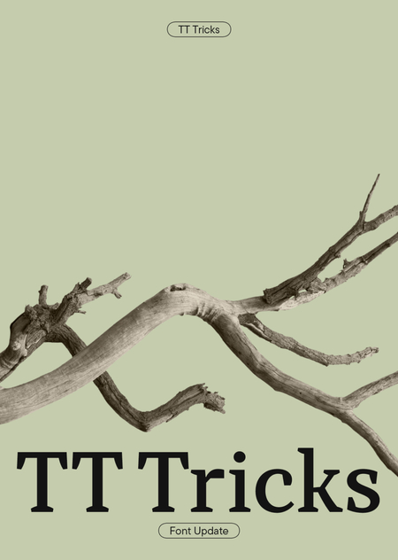
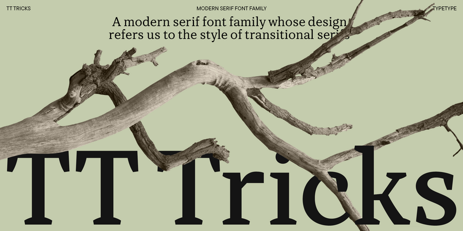
Обновление шрифта TT Tricks из коллекции шрифтовой студии ТайпТайп. Этот шрифт мы полюбили за спокойный и элегантный характер, поэтому в новой версии сделали упор на усиление этих черт.
Эта красивая презентация оформлена Златой Соколовой Автор идеи и дизайнер первой версии шрифта — София Ясенкова
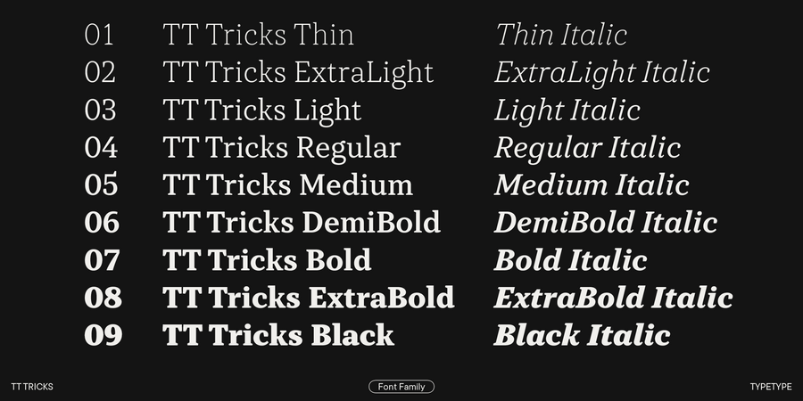
Перед нами стояла задача обновить шрифт как графические, так и технически. Поэтому был сделан пересчёт толщин, после которого мы добавили два новых светлых начертания и ещё одно промежуточное. Тру-италики были перерисованы с нуля в новых формах и в более сильном наклоне.
Некоторые приёмы из предыдущей версии TT Tricks показались немного устаревшими, поэтому в новой версии шрифта мы их убрали или преобразовали.
Старой версии шрифта засечки придавали мягкий и чуть шутливый характер. В новой версии они стали более строгими и текстовыми.
Помимо переработки графики, пересмотра контуров и добавления новых начертаний, TT Tricks вырос в знаковом составе, добавились новые языки. И, конечно же, он стал более совершенным и с технической стороны: добавились новые OT-фичи, полностью обновился кернинг и хинтинг.
Команда, работавшая над шрифтом
Версия 2.0: Марина Ходак — руководитель проекта, дизайн-лид Анастасия Погорелова — старший шрифтовой дизайнер Тома Стрельцова — старший шрифтовой дизайнер Антонина Самохина — шрифтовой дизайнер Лада Собченко — шрифтовой дизайнер, италики Ксения Карнаухова — младший шрифтовой дизайнер Юрий Наконечный — супервизия мастеринга Станислав Тихонов — мастеринг, супервизия хинтинга Иван Гладких — супервизия кернинга Елизавета Островская — кернинг Виктор Рубенко — хинтинг
Версия 1.0: София Ясенкова — дизайнер основного шрифта Филипп Нуруллин — арт-директор, шрифтовой дизайнер Вика Усманова — шрифтовой дизайнер Надыр Рахимов — шрифтовой дизайнер


