Original size 1140x1600

Mozhayskaya Burenka — Dairy Products

PROTECT STATUS: not protected
Original size 2800x1575

«Mozhayskaya Burenka» — natural dairy products produced according to traditional recipes in compliance with GOST standards (classifier of state quality standards of the USSR).

«Mozhayskaya Burenka» has own pastures located in the ecologically clean Mozhaysk district (Moscow region, Russia). The dairy plant is fitted with the modern equipment and has an established quality control system, as well as provided its own delivery service using specialized vehicles.

Original size 2800x2105

For one part, the main objective of the project is to create a visual brand image considering the historical value of the Mozhaysk plant (the Mozhaysk dairy plant is the oldest one) and the traditional recipe for the production of dairy products, for the other hand to represent the quality, price and technological features of the product.

The «Mozhayskaya Burenka» brand positions itself as «modern dairy foods with a history». Therefore, the original packaging design represents production of the traditional dairy products using modern technologies.

Original size 2800x1575

The jobbing font «MBurenka» was drawn especially for the new packaging, combining the sans-serif with «geometric structure» and traditional spelling of the classic Russian fonts.

The special font and identity of the outline itself allowed to display the brand positioning and include the product category in the brand (Mozhayskaya Burenka milk, Mozhayskaya Burenka kefir, Mozhayskaya Burenka yogurt, etc.). This action facilitates communication without the risk of losing brand identity. Beige color as the main one of the packaging provides the idea of the local character of the production, the individual approach to each product, as well as to be a link to the historical packaging, used before the rebranding.
Original size 2800x952
Mozhayskaya Burenka — Dairy Products
Александр Петухов создал визуальный бренд для молочных продуктов «Mozhayskaya Burenka» с учётом исторического наследия завода и традиционных рецептов. Проект включает уникальный шрифт и палитру цветов, отражающих местные особенности и связь с историческим дизайном упаковки.
Project description created with AI
Project created at 01.04.2023
More projects in packaging design
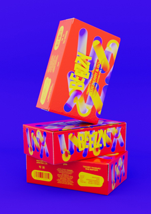
Полина Честнова создала протеиновый батончик BEEZZY с графическим дизайном, вдохновлённым движением насекомых. Визуальный стиль проекта включает анимированные насекомые, отражающие активность и занятость в его концепции.
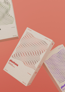
Алина Никитина создала бренд Plantuna, предлагающий растительные морепродукты из водорослей и бобовых для вегетарианцев. Экологичность и безопасность продуктов делают Plantuna подходящим выбором для перехода на растительное питание.
Анна Гулевская создала проект «ЭНТО ПАСТА!». Проект включает в себя несколько постов с CSS-кодом для адаптации видео на широких экранах.
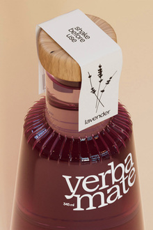
Юлия Селезнева создала упаковку для чая йерба-мате, которая после использования может стать вазой для цветов. Проект включает в себя устойчивый дизайн с широким горлом и цветочные названия SKU для поддержания концепции.
pro.hsedesign
Digital platform for creating presentations. An innovative online constructor where everyone can showcase their projects, proposals or educational courses in spectacular way.
lecture
landing
presentation
presentation of the course
tutorial
explainer
We use cookies to improve the operation of the HSE website and to enhance its usability. More detailed information on the use of cookies can be fou...
Show more